1. TATA Consultancy Services (TCS)
2021 - 2024
a. DIGITATE: UX Design/UX Research, 3D Modelling, UI Design, Consultant
2021 - 2024
*Images and Videos disclaimer:
I was not able to acquire all of my designs from my work laptop due to security restrictions within TCS's guidelines so the images and videos I do have are from the earlier projects I did when I first started at Digitate. Some of them are early mock-ups of how the app started before the final product.
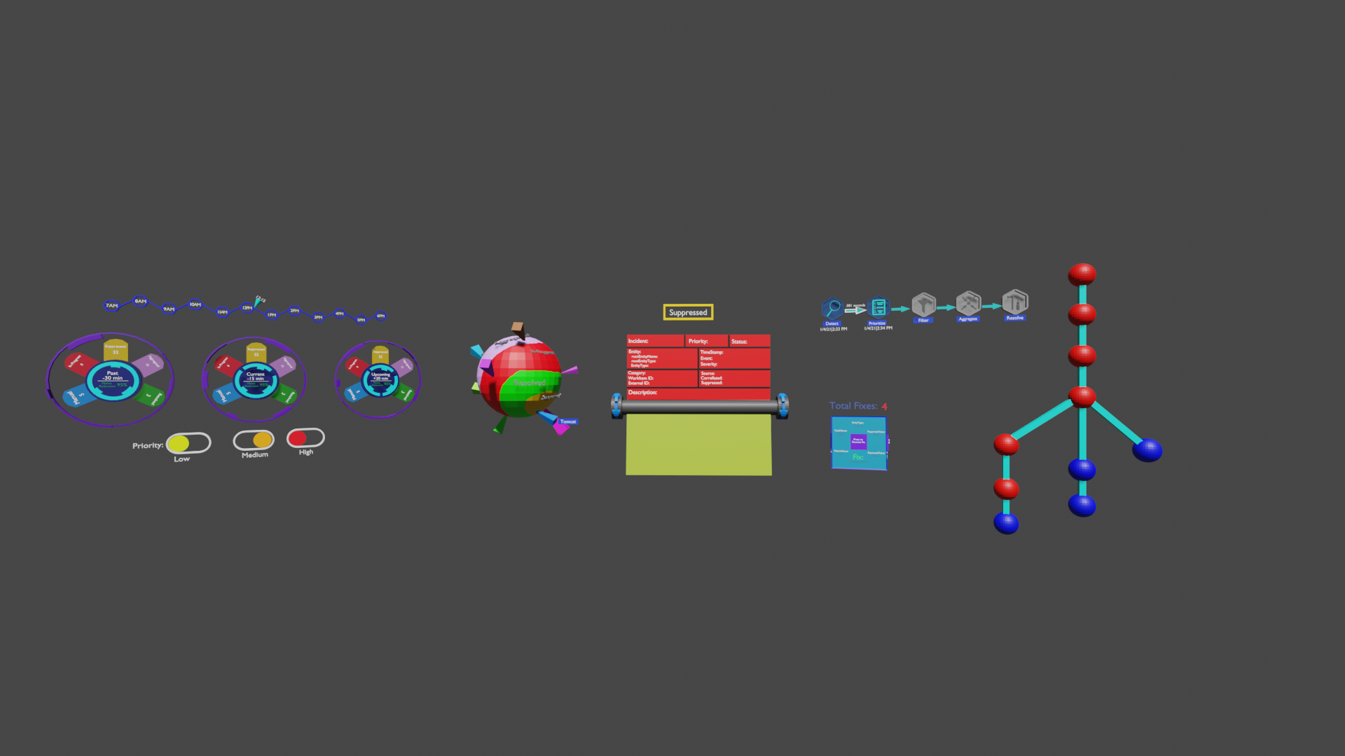
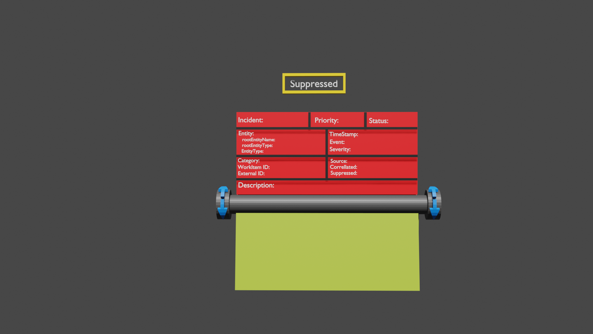
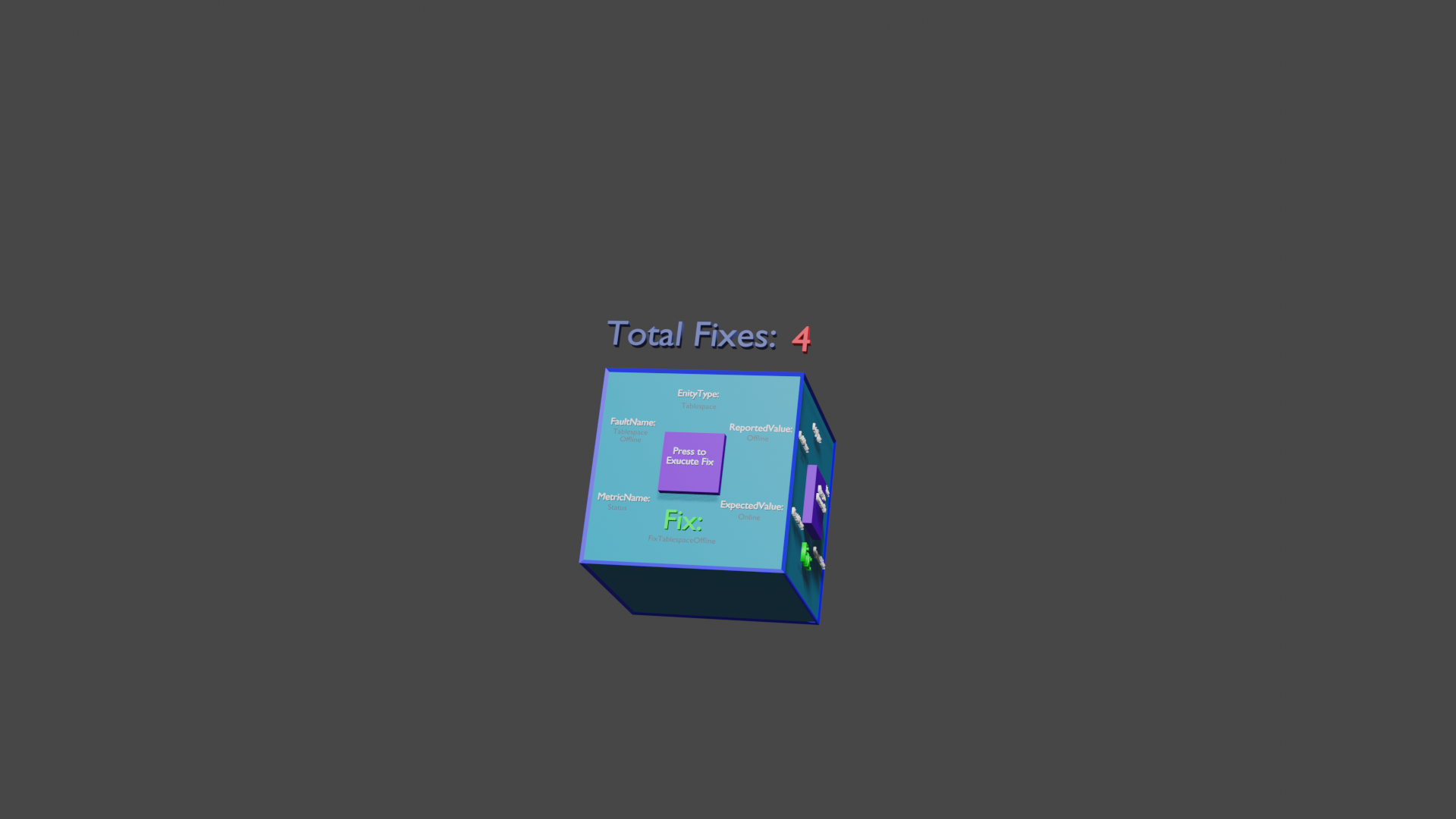
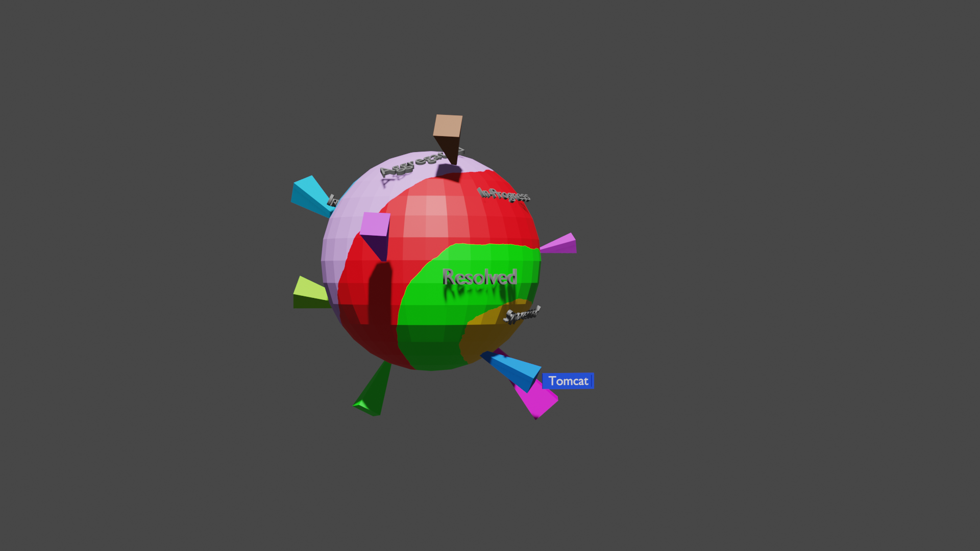
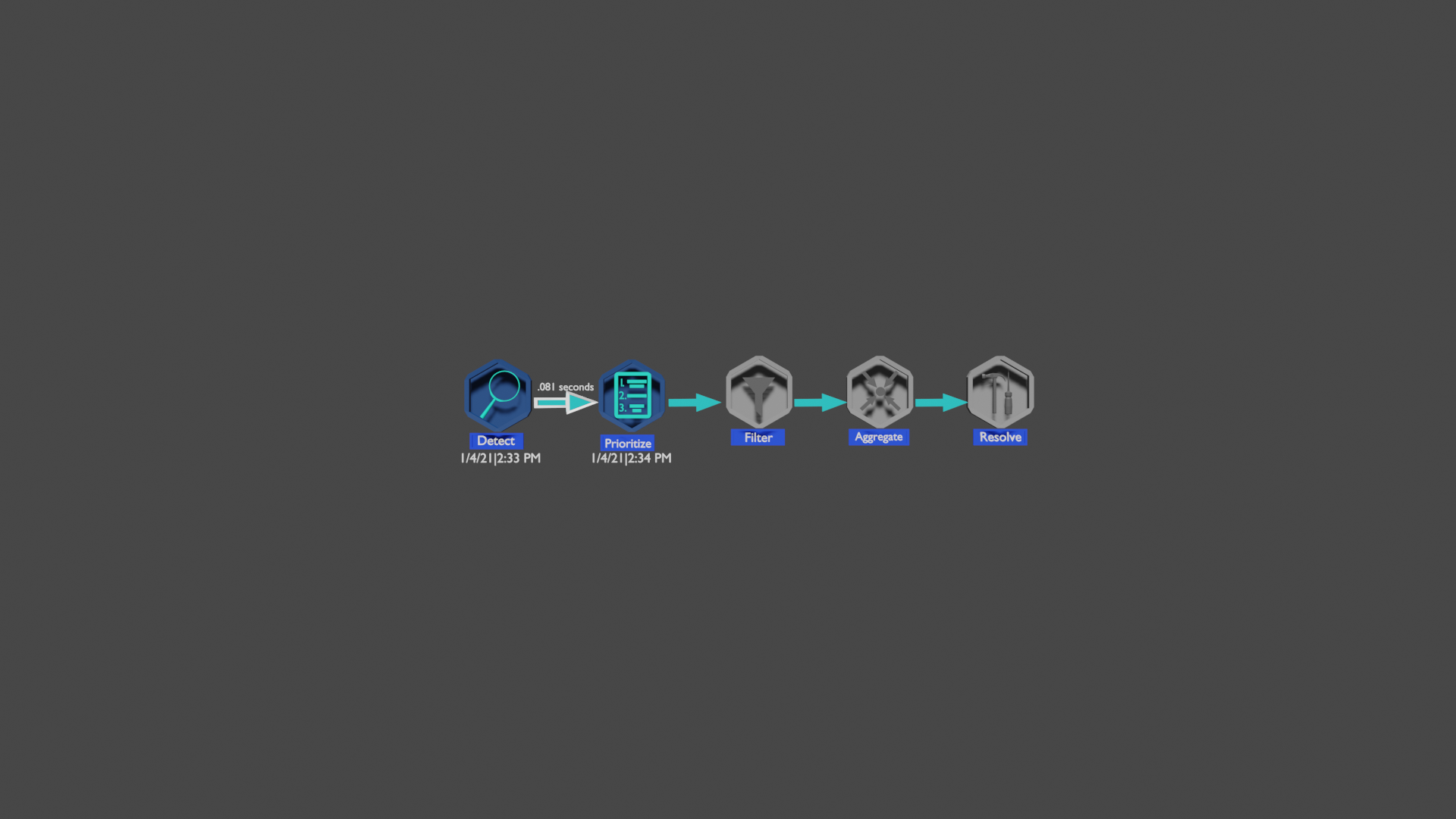
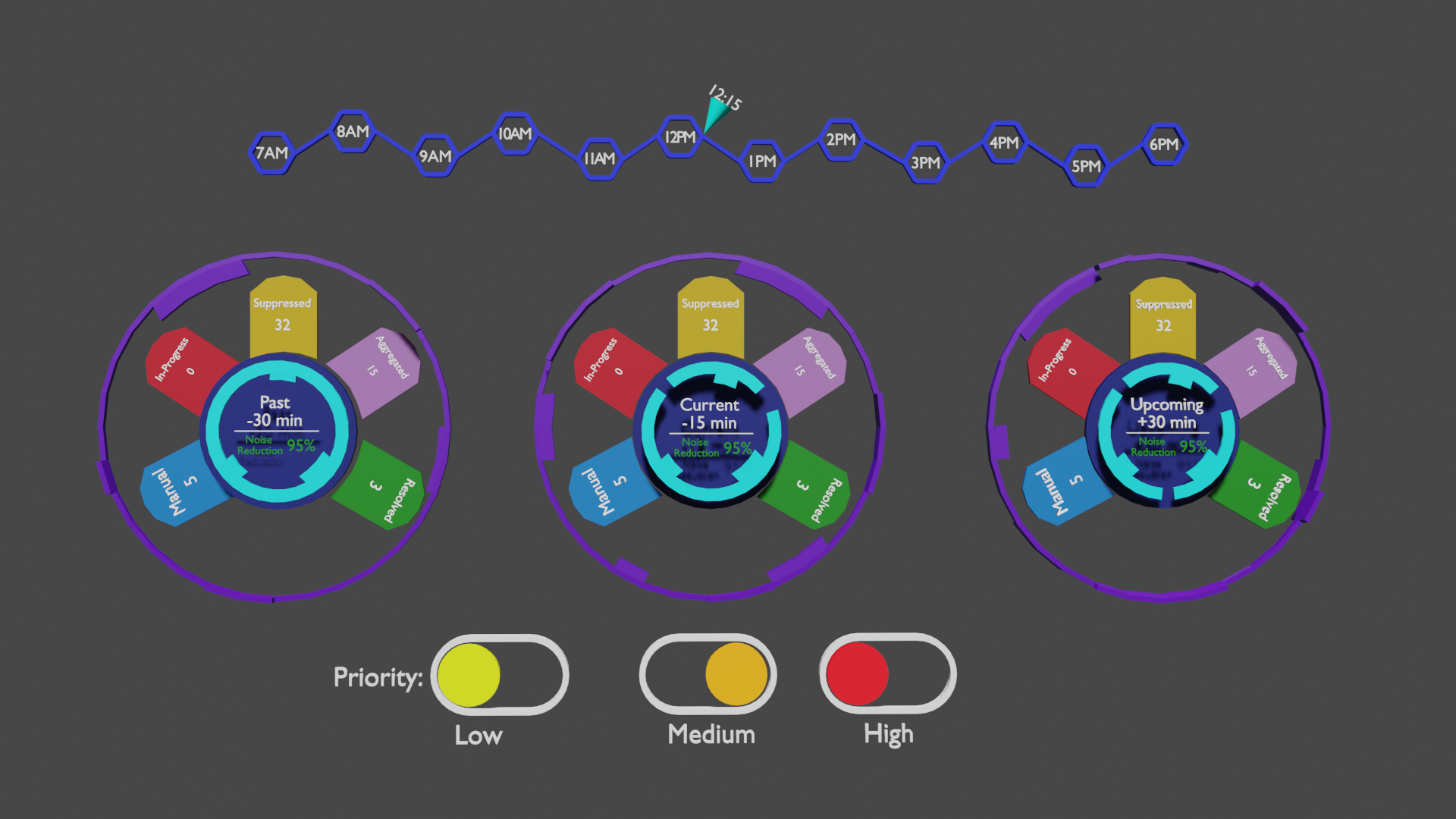
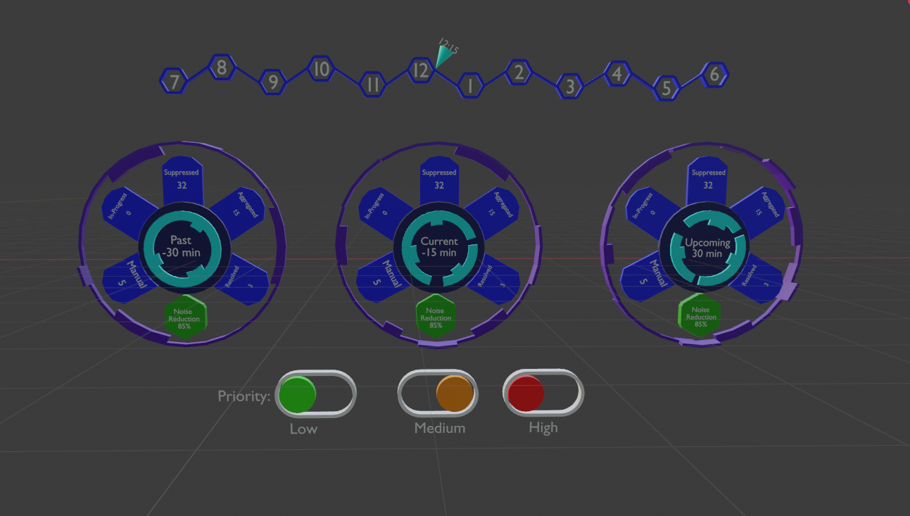
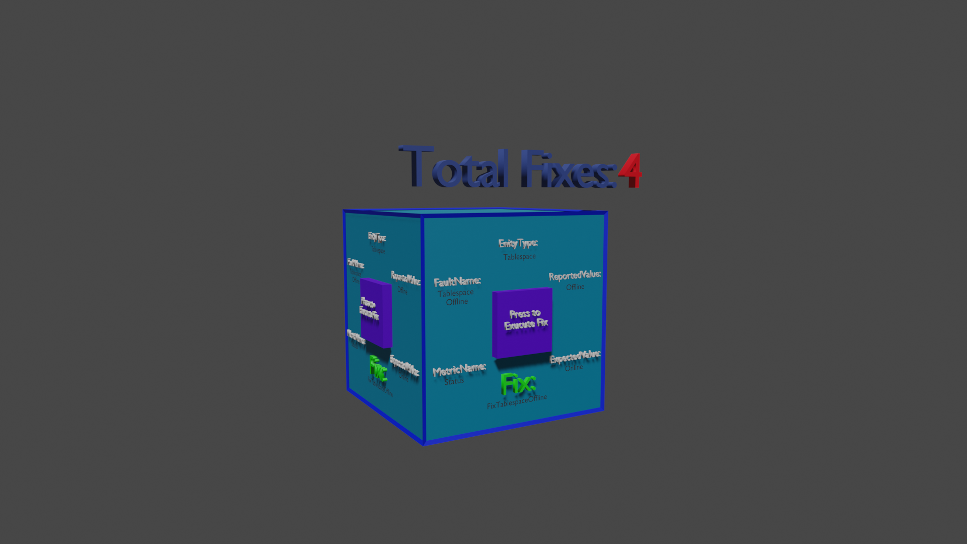
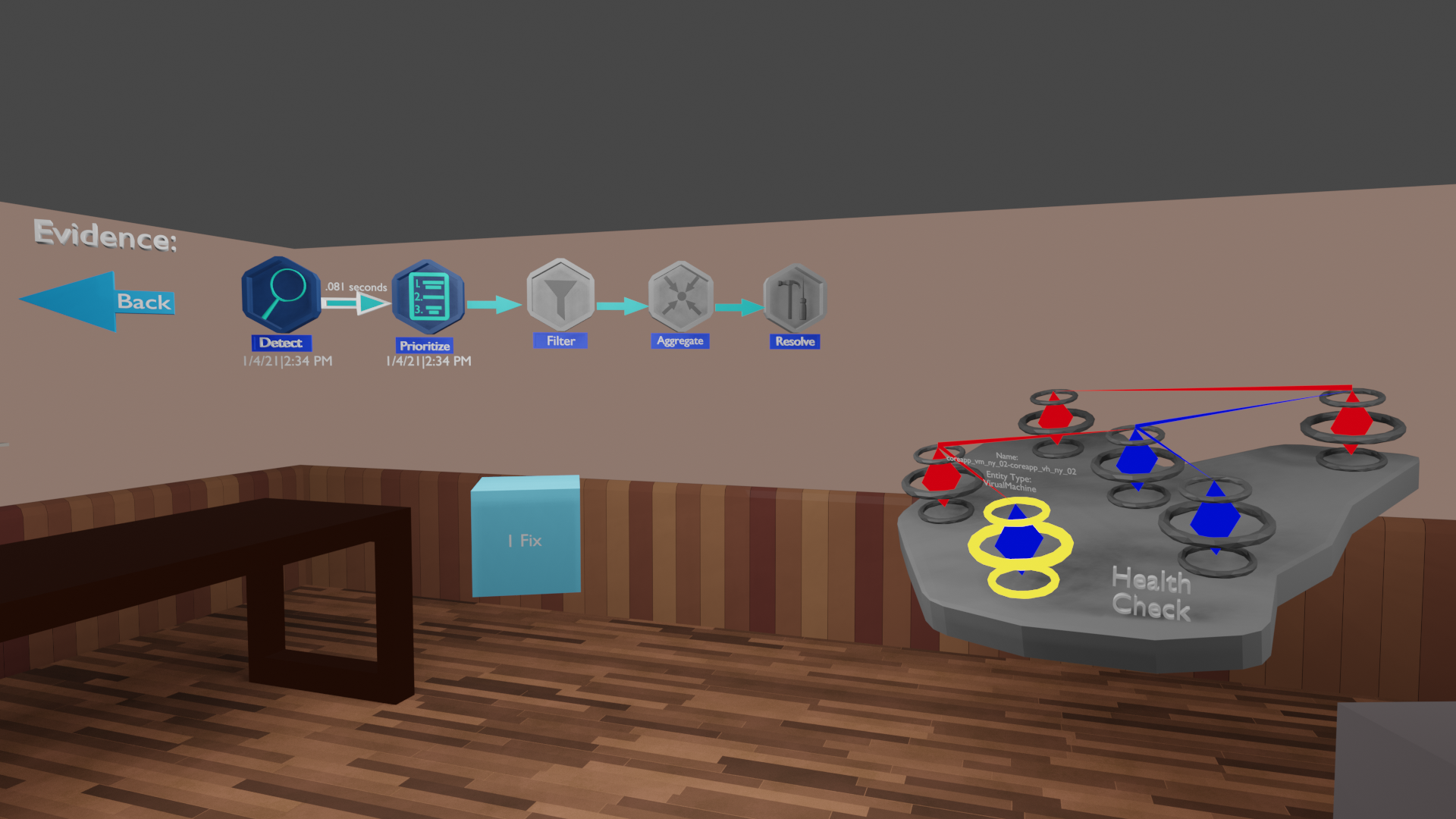
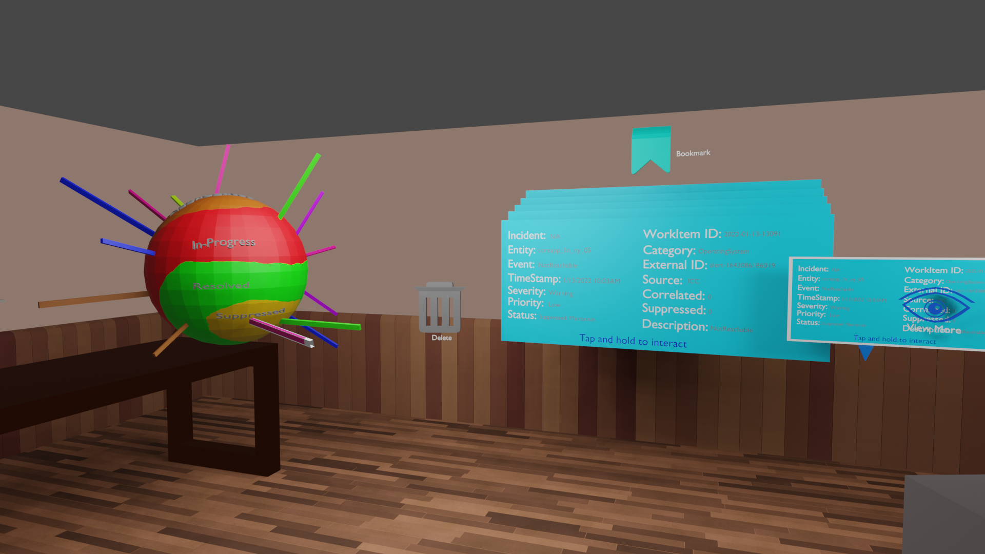
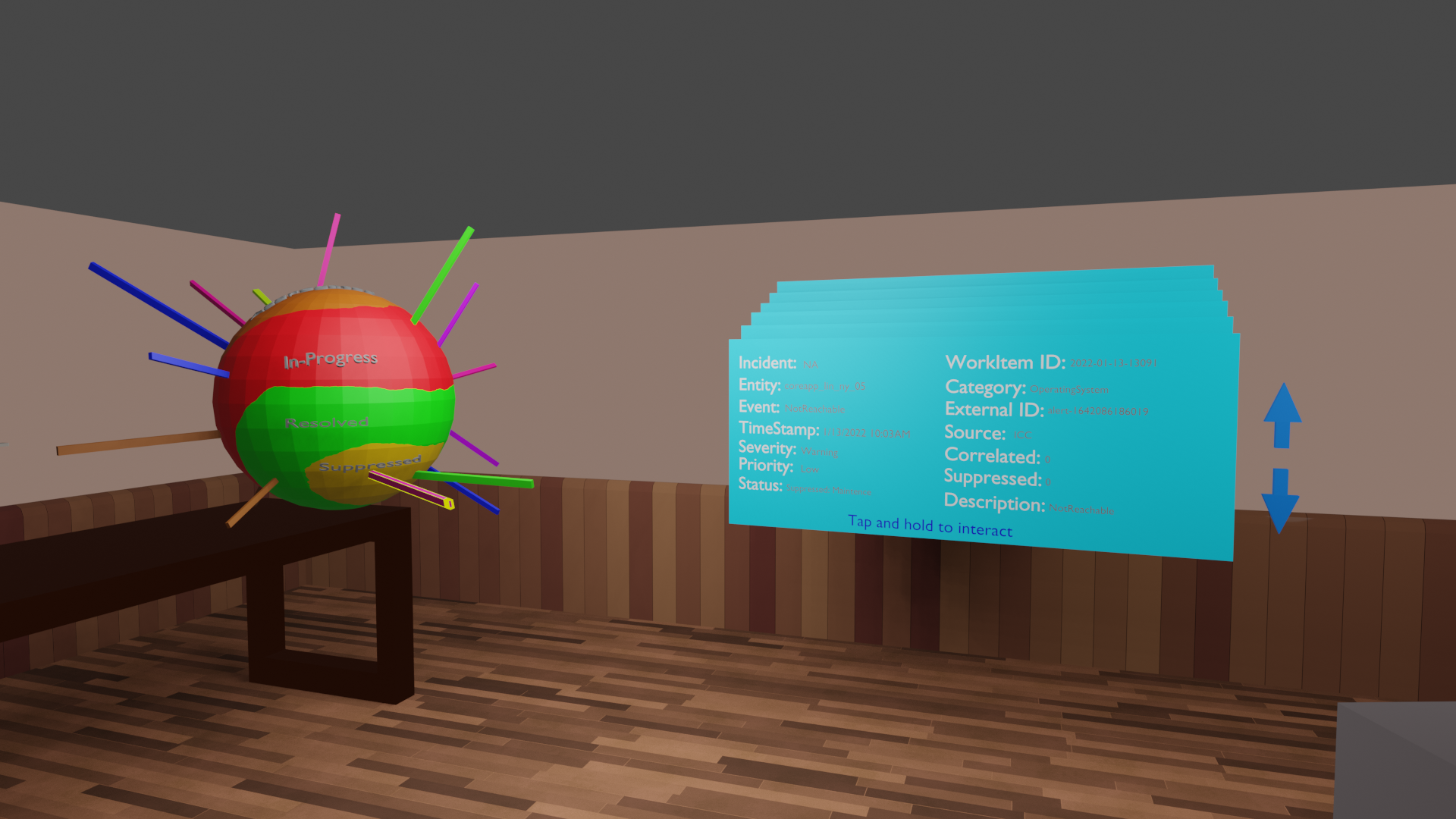
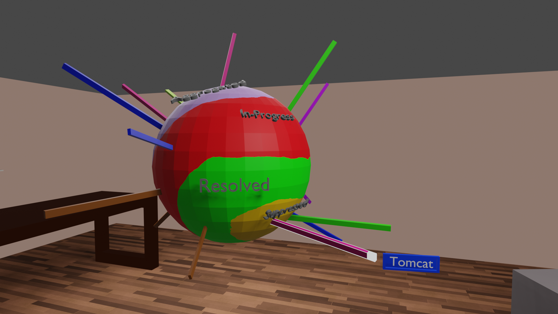
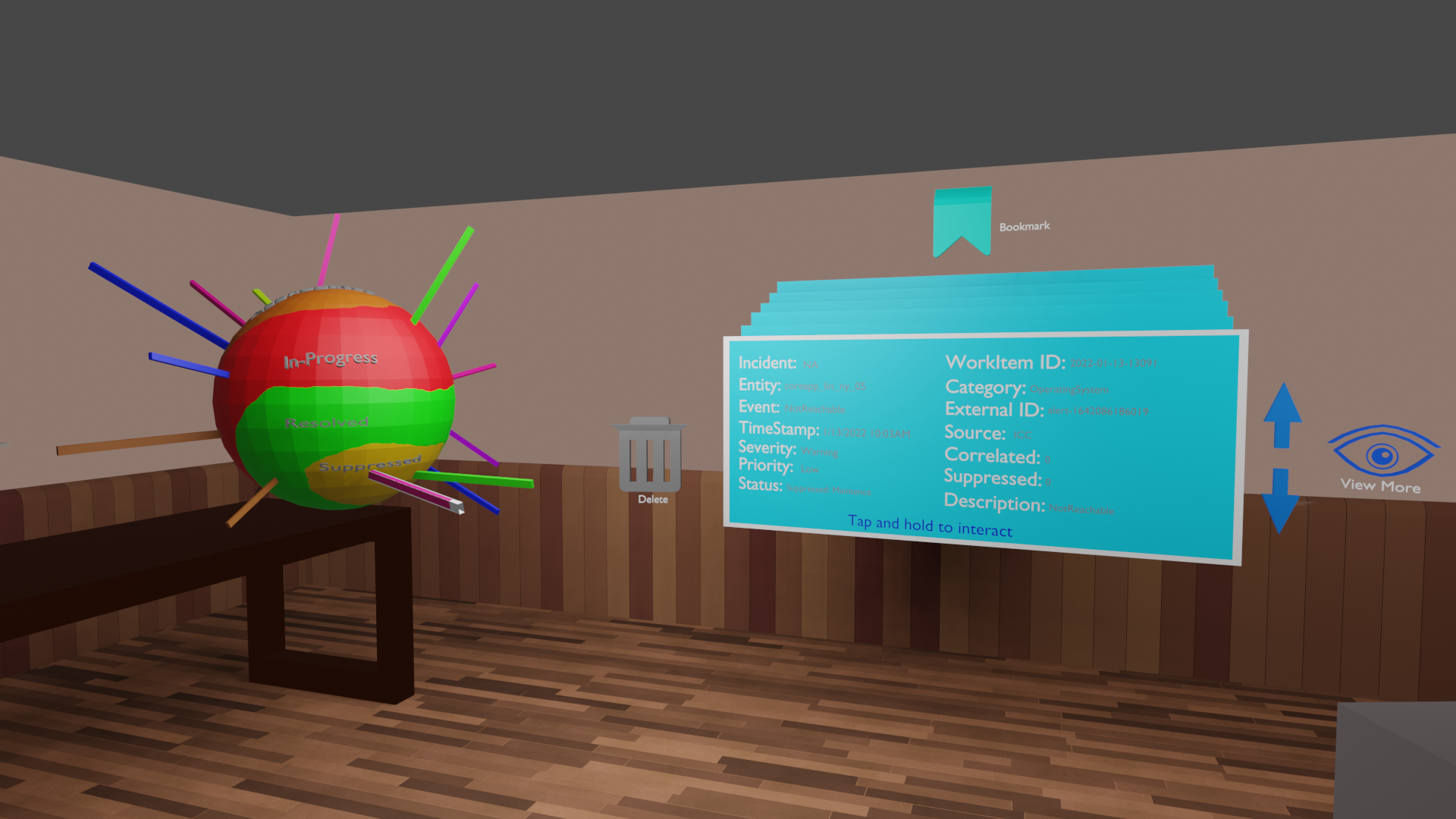
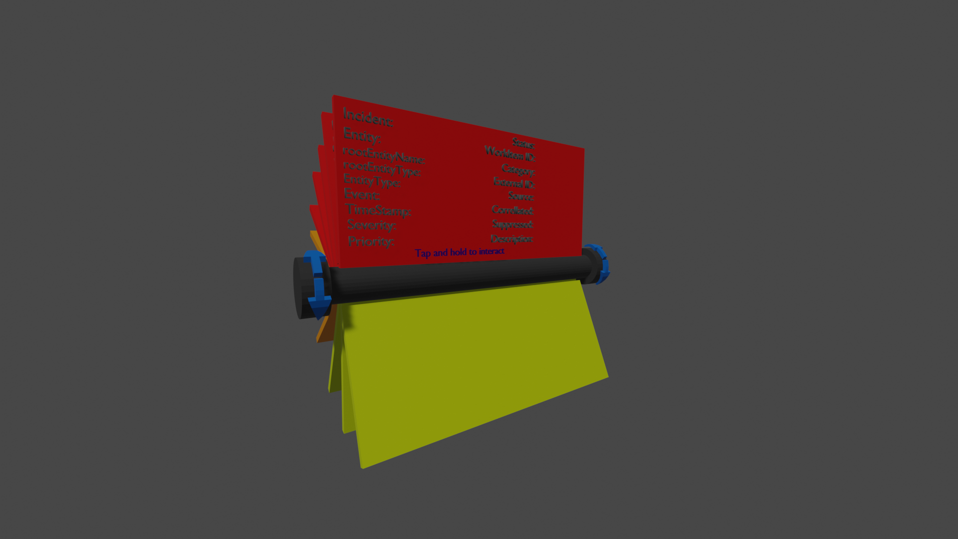
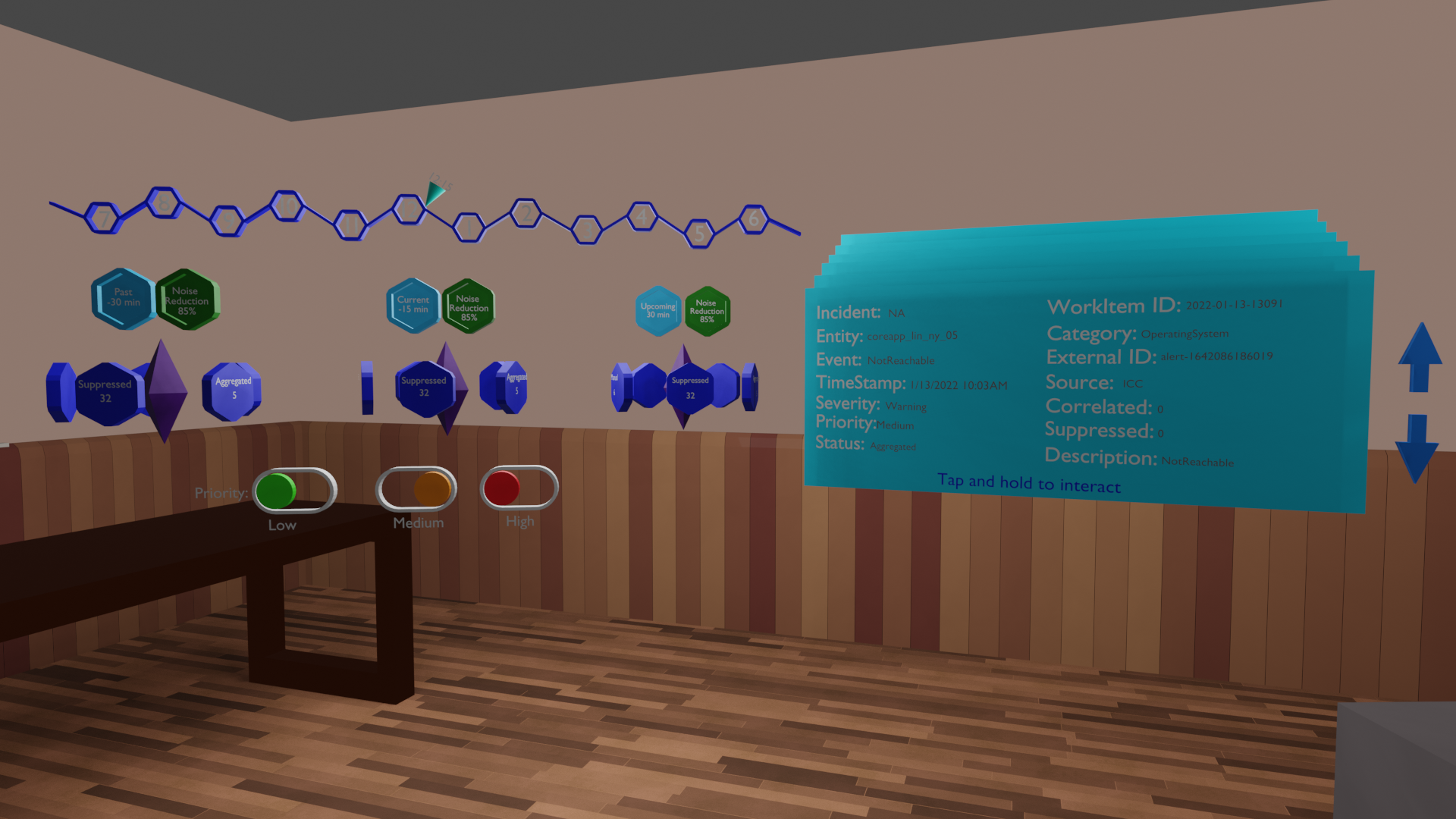
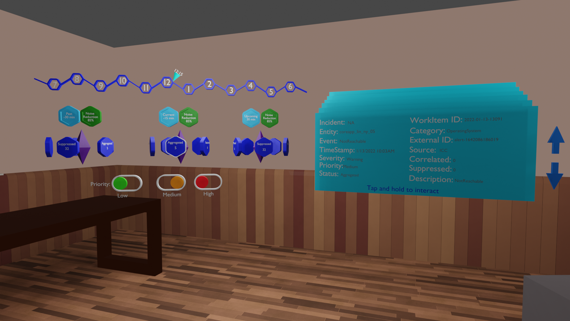
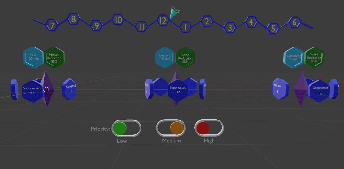
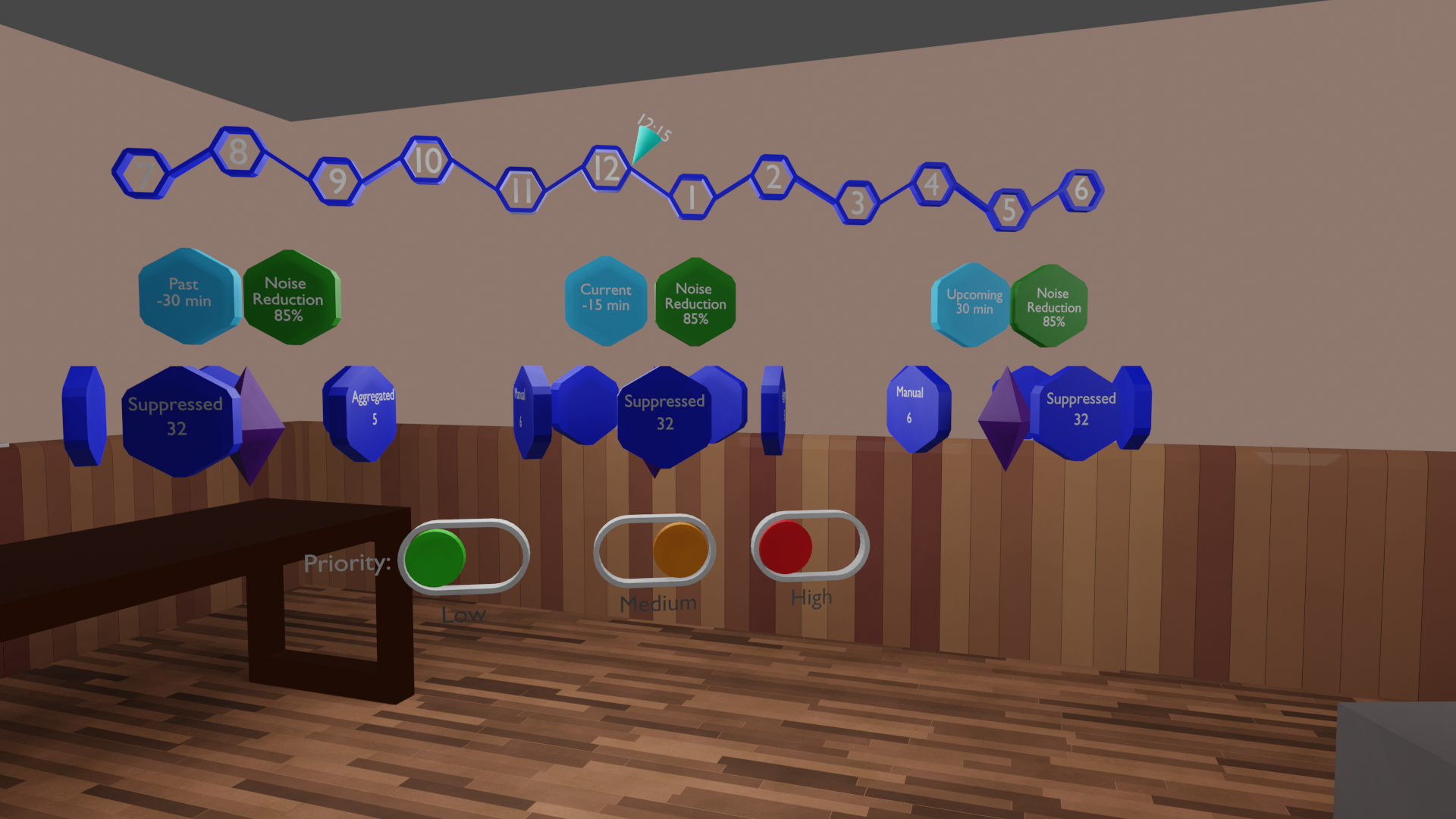
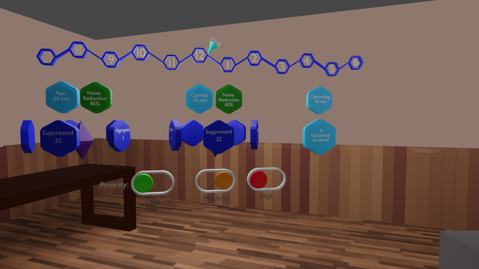
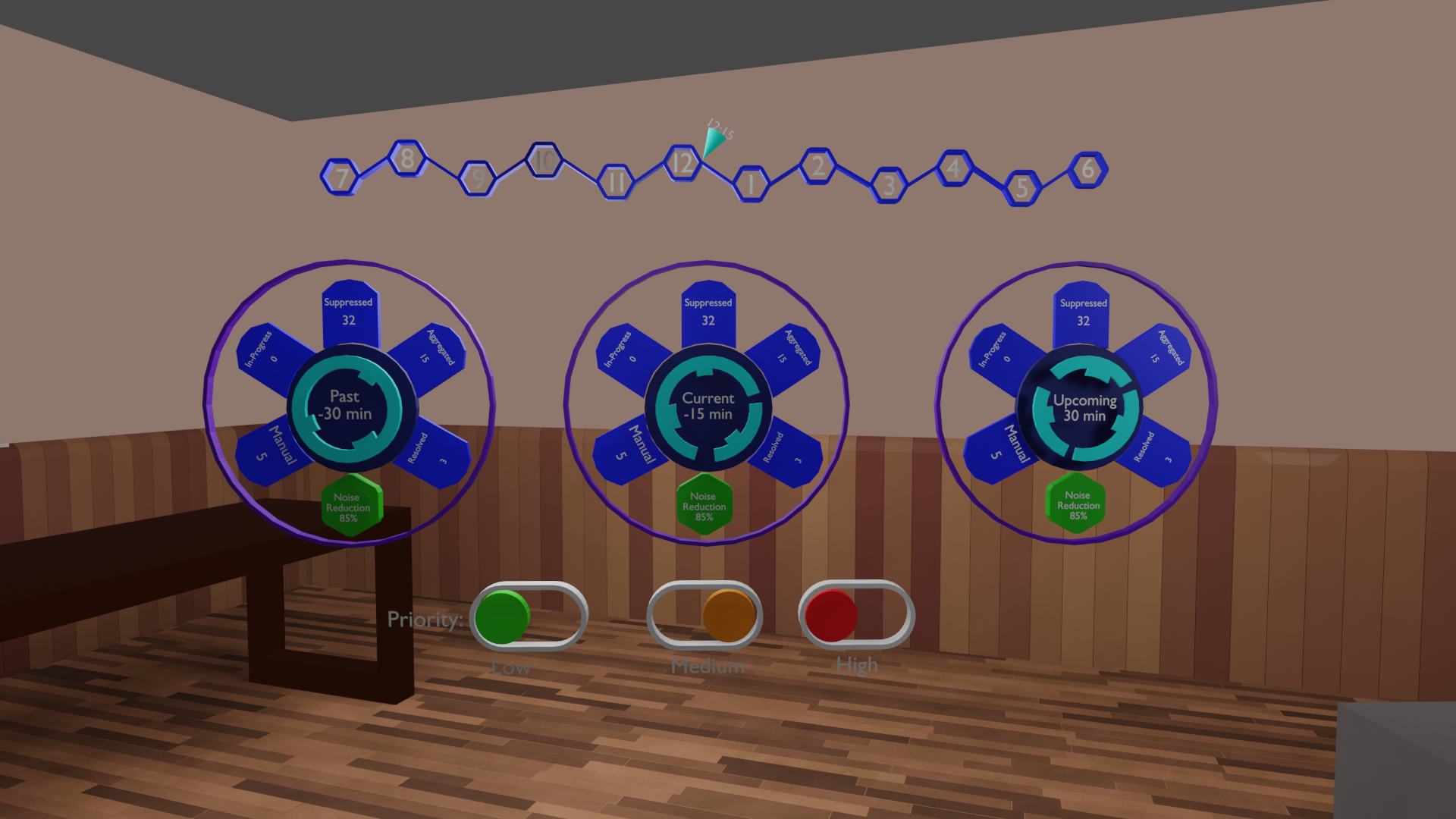
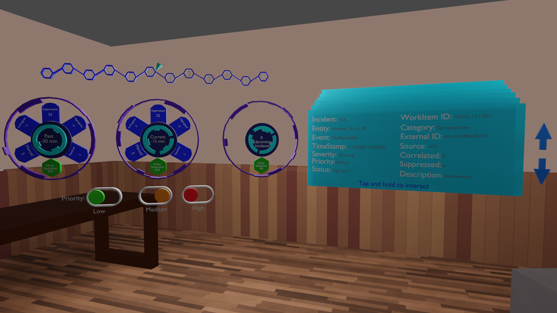
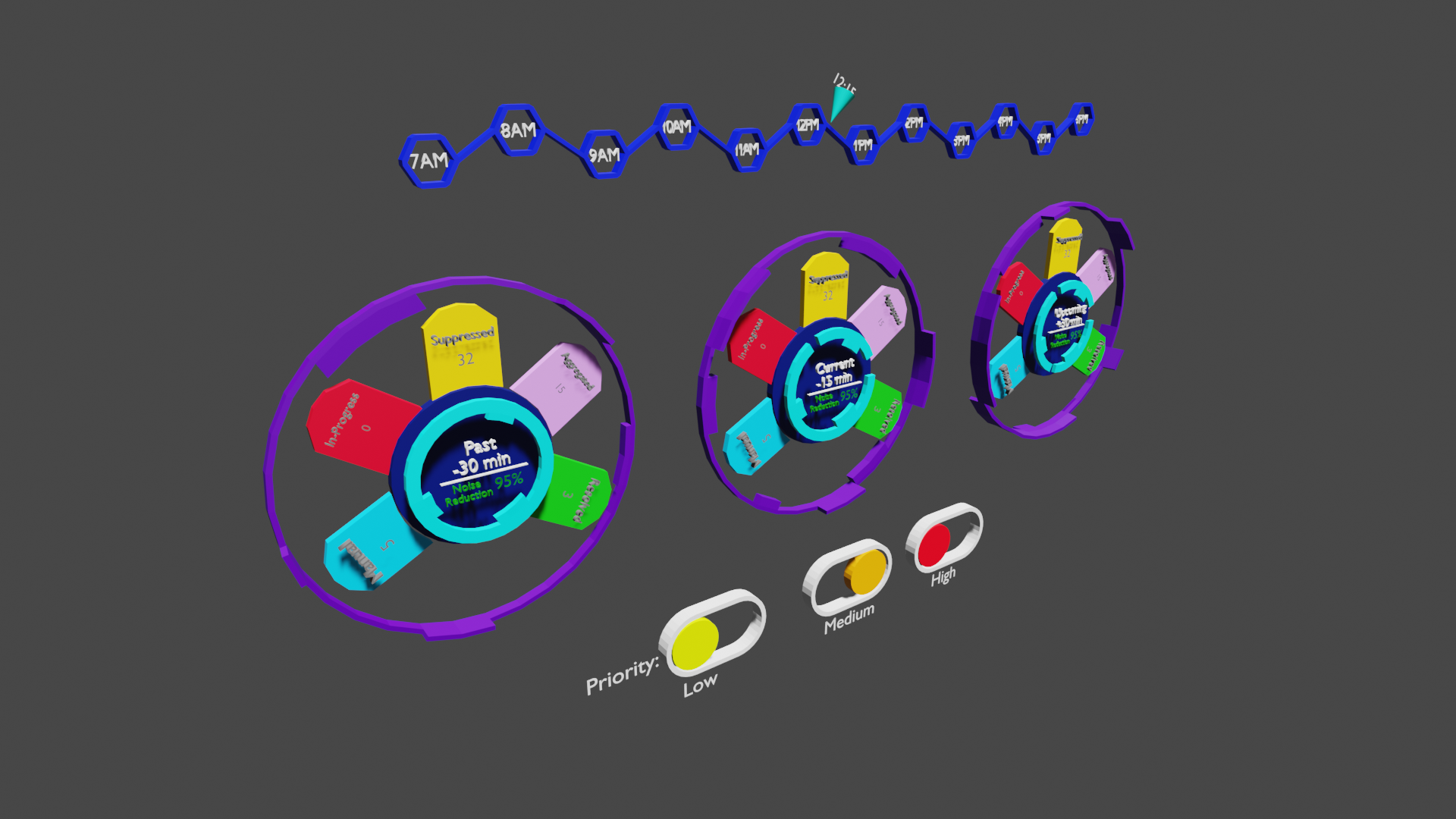
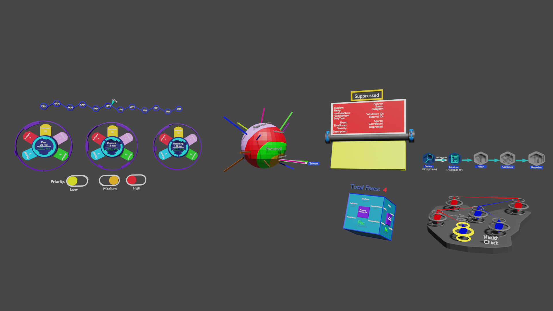
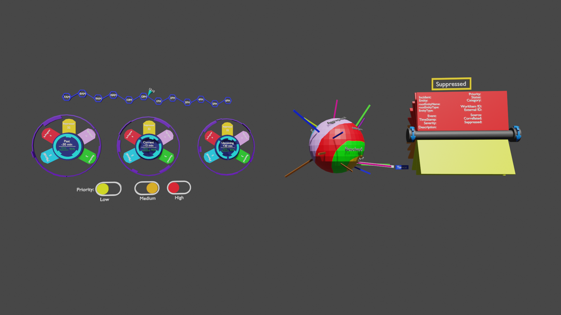
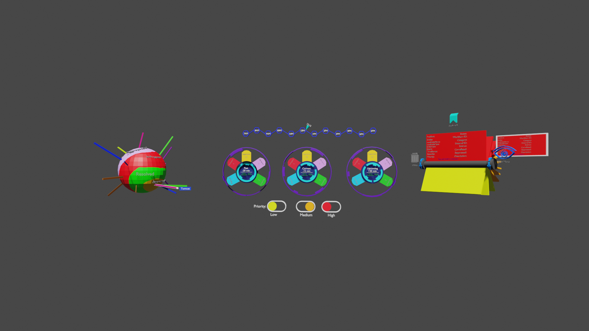
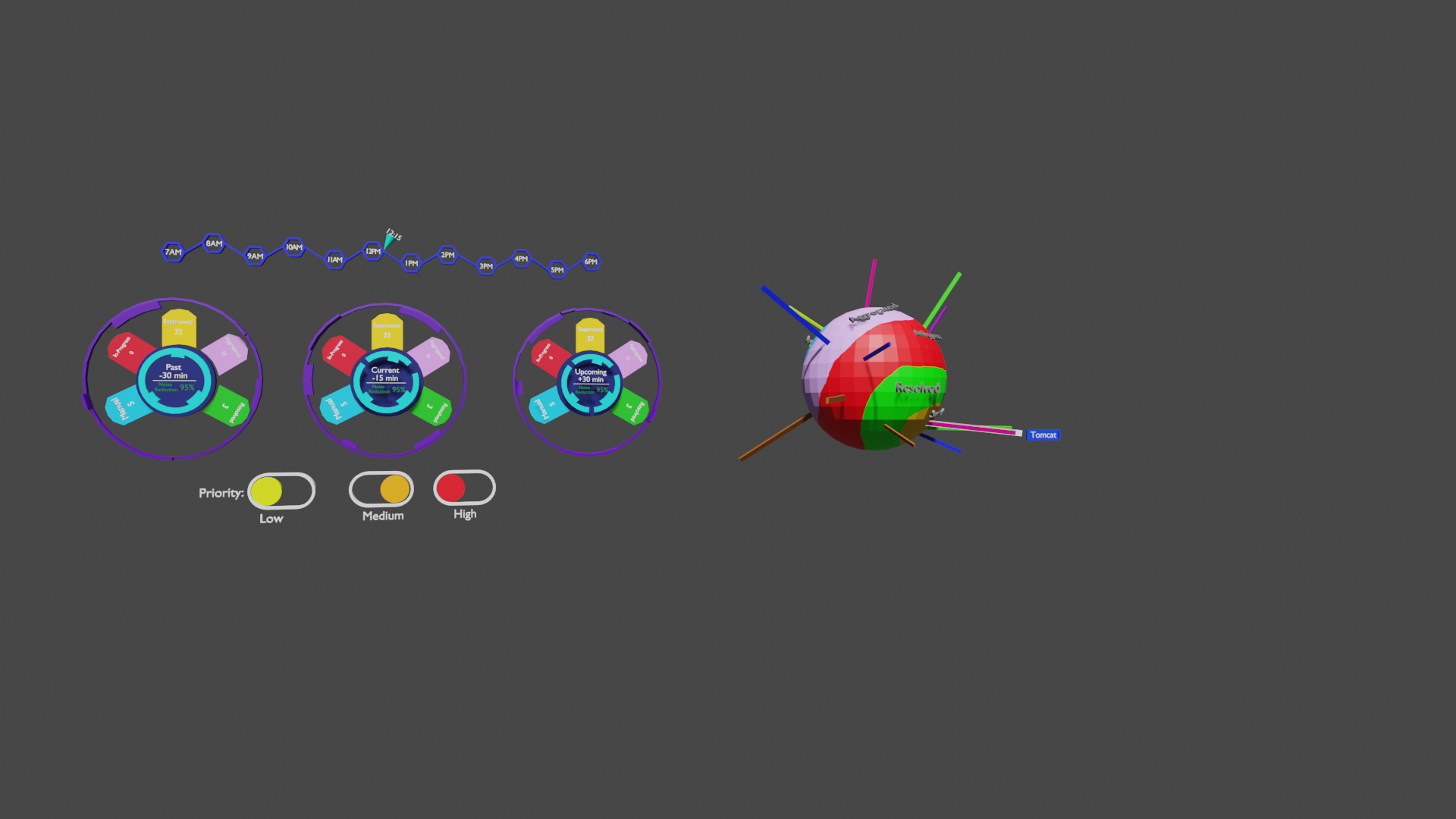
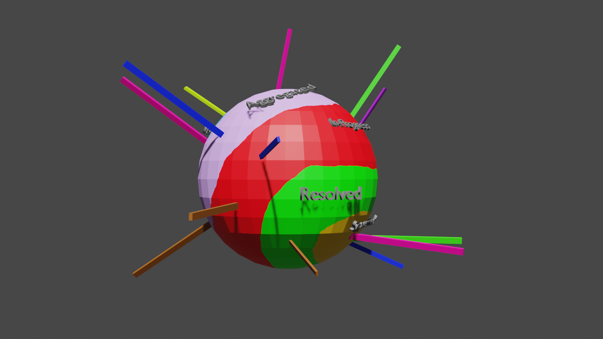
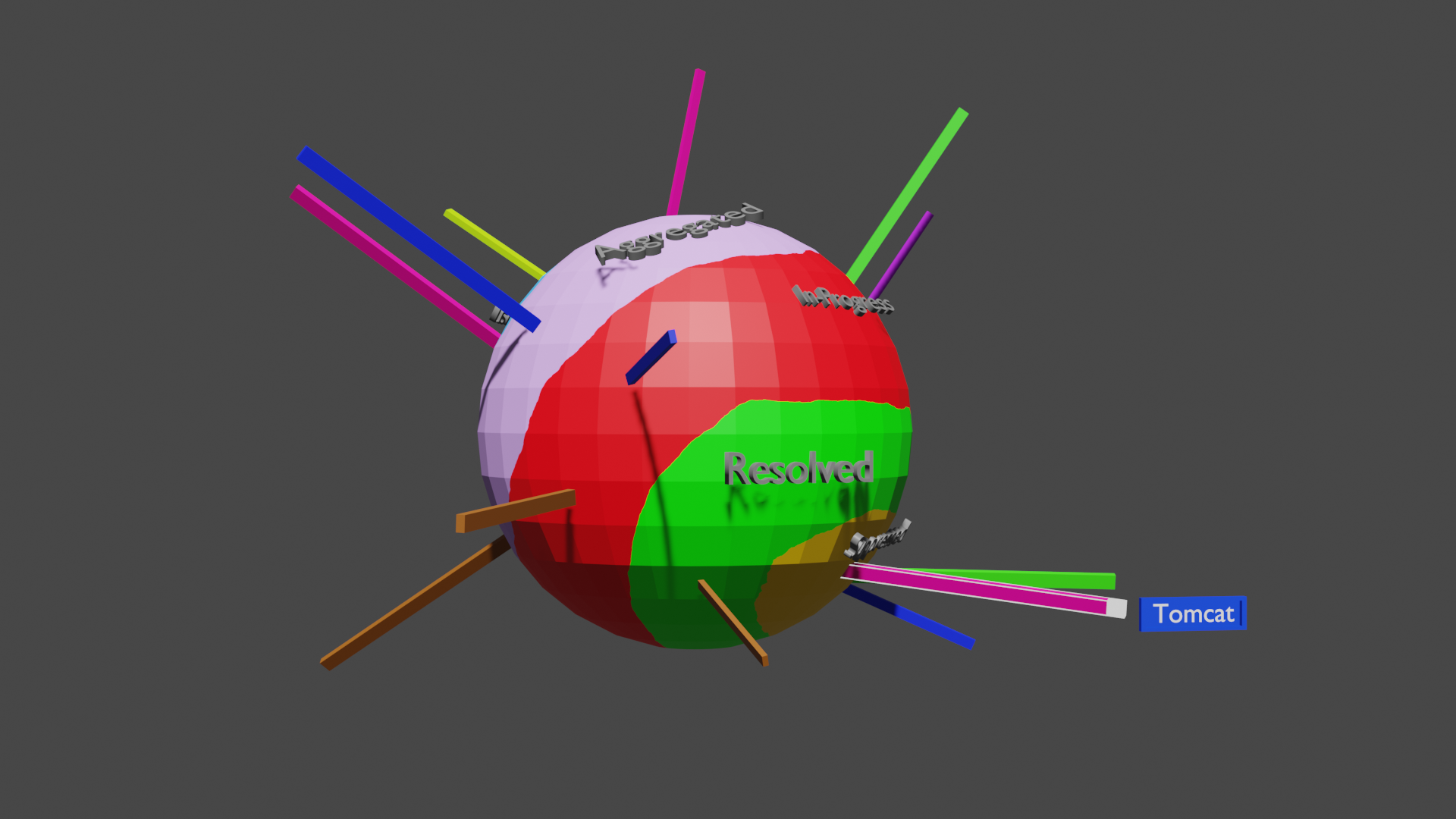
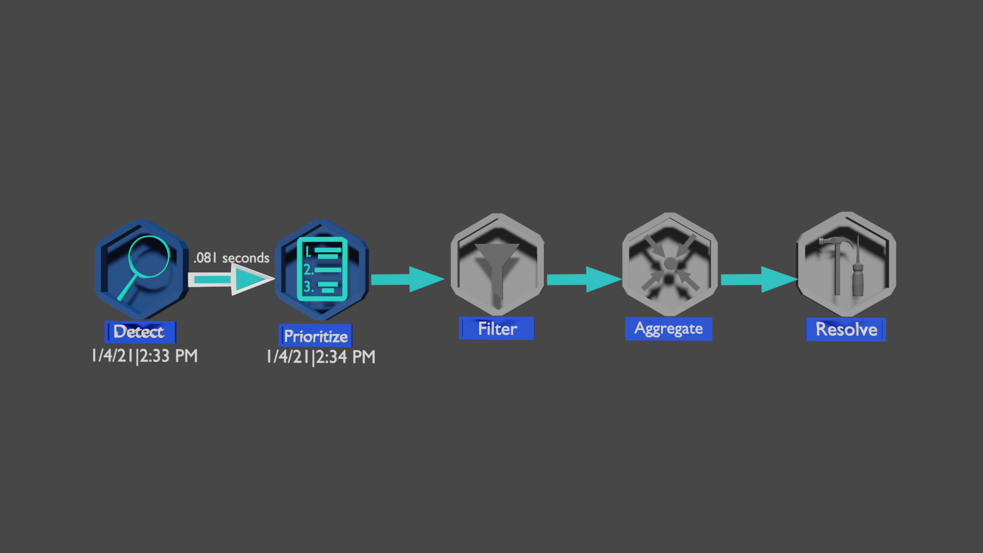
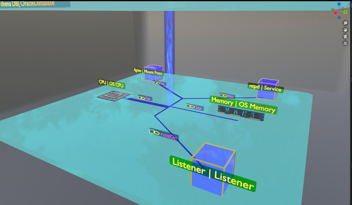
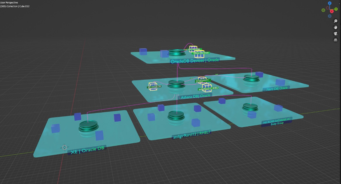
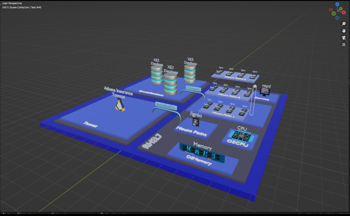
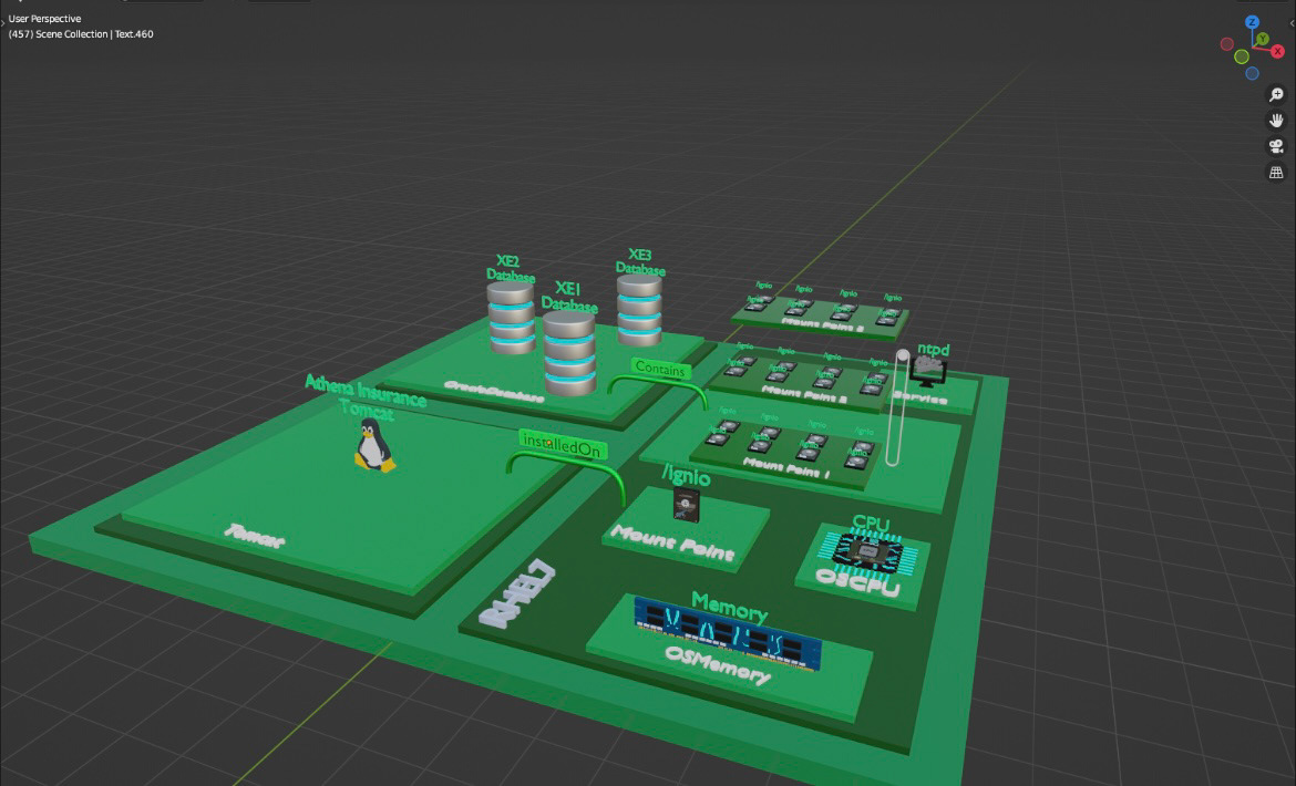
Project Name: Immersive AIOps
Project Overview:
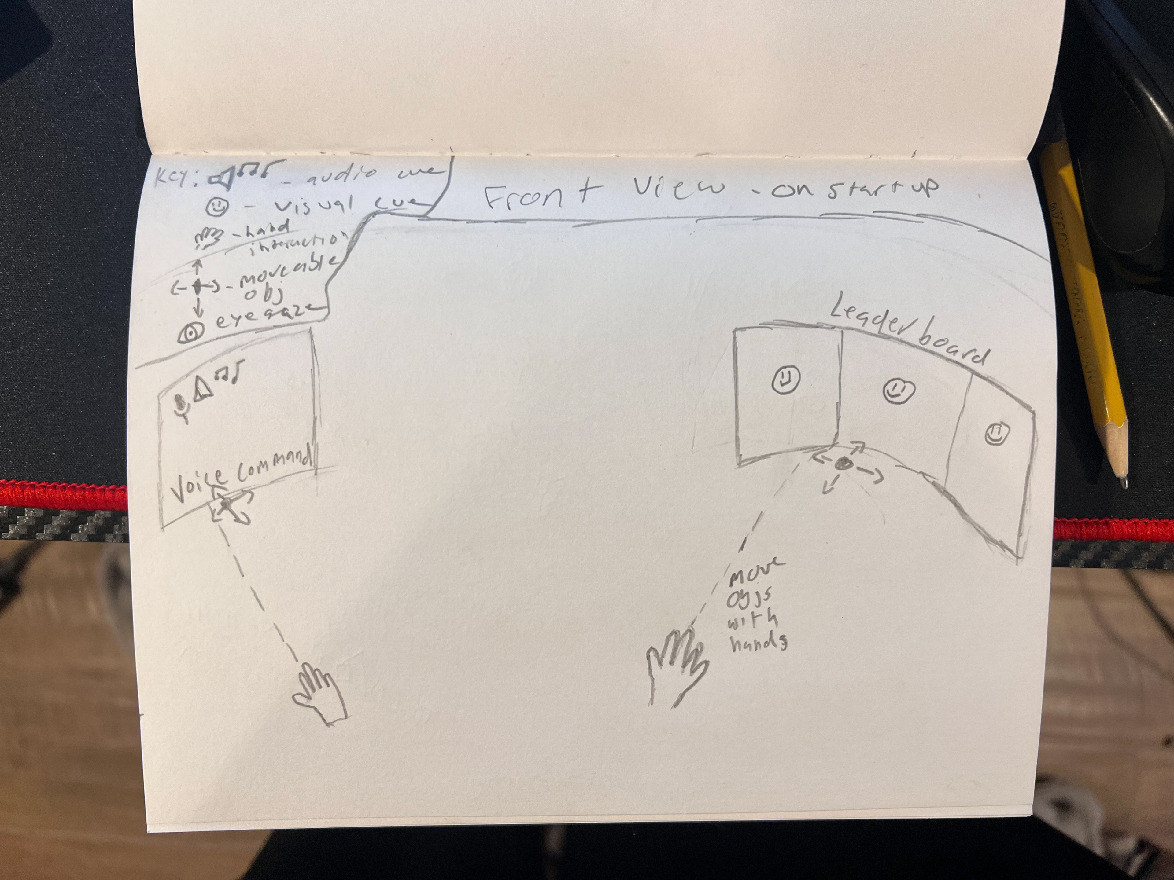
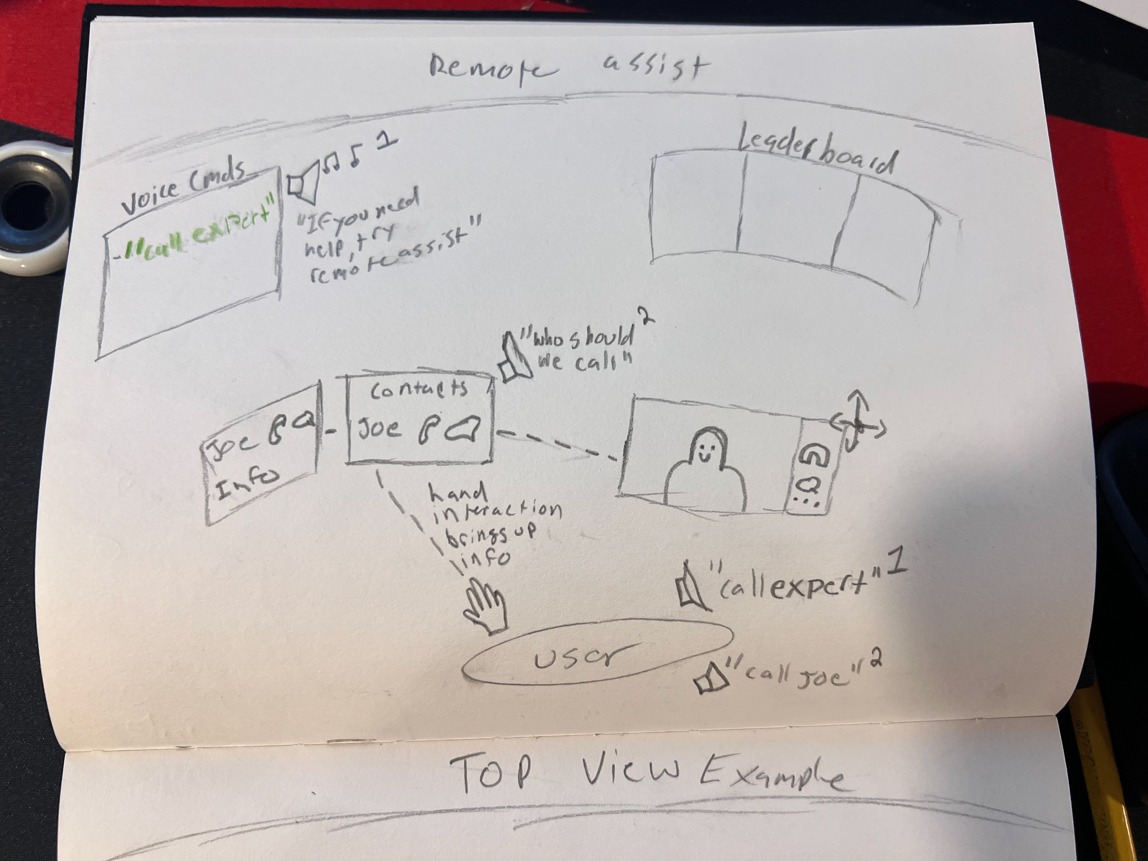
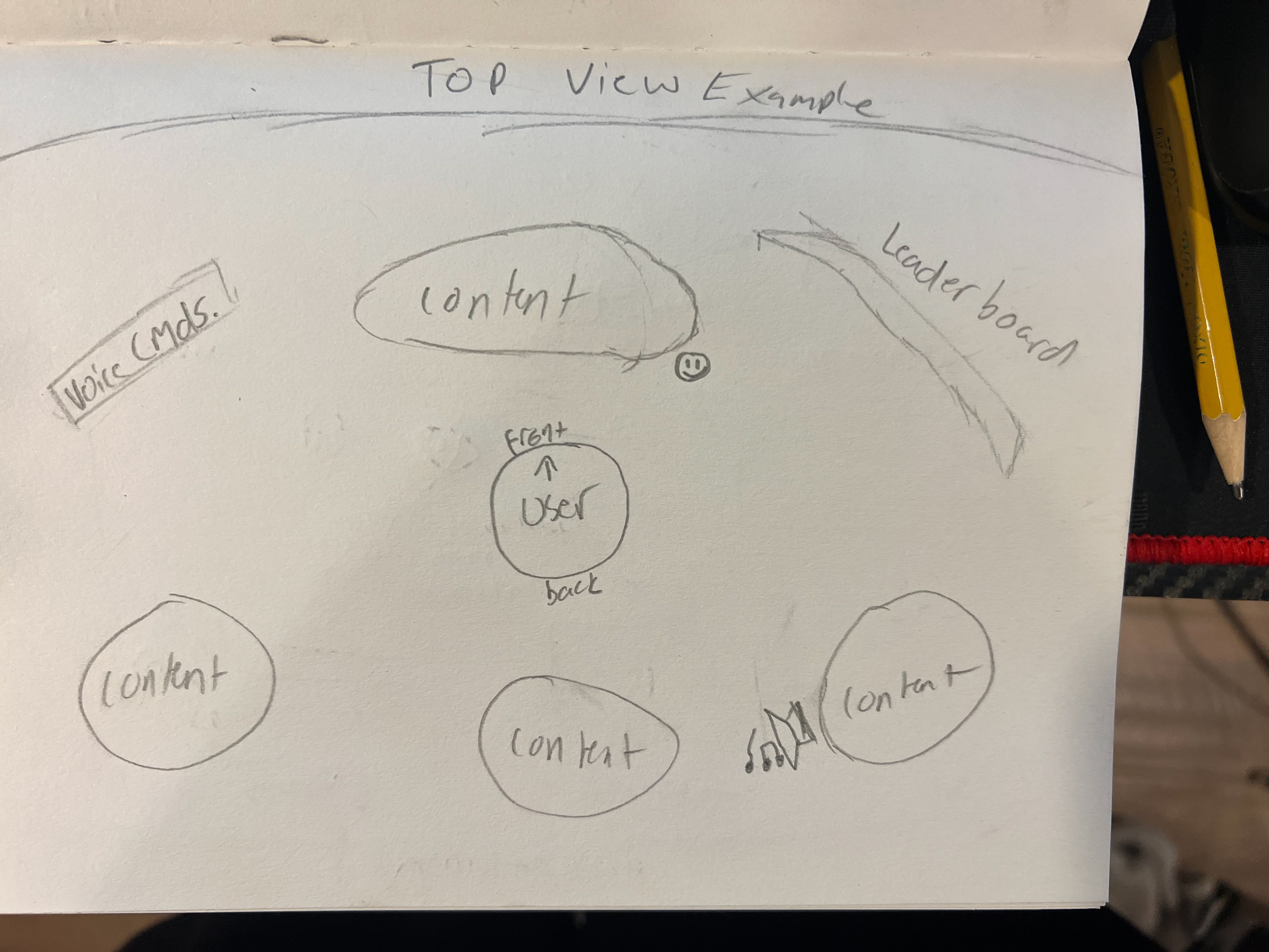
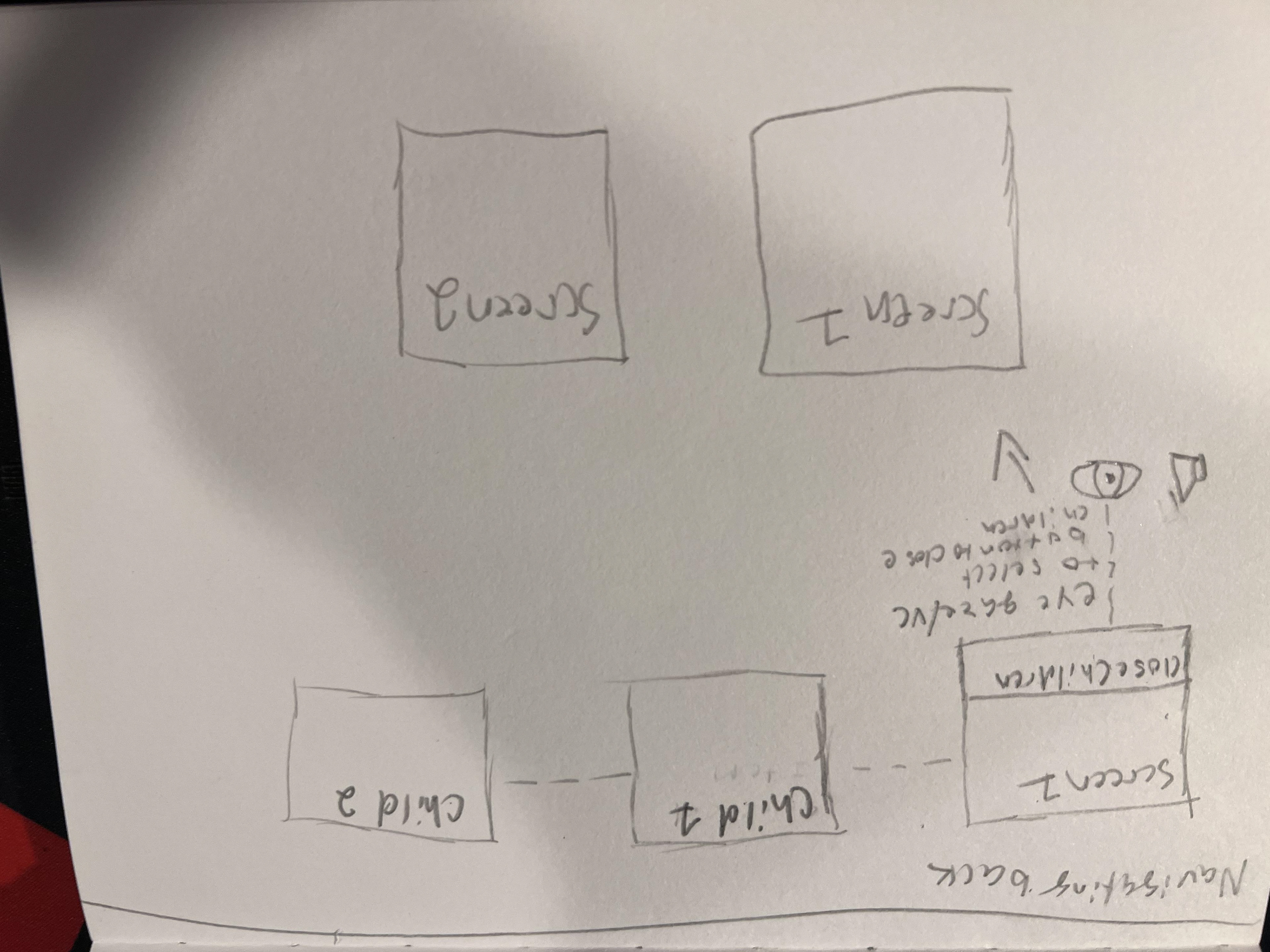
Immersive AIOps was my first professional project as a UX/UI Designer. For this project I was assigned to design a mixed reality solution to help IT administrators and operations teams monitor and manage autonomous systems in real time. Using the Microsoft HoloLens, the platform displayed live updates from IT environments in a spatial interface, enabling faster awareness, troubleshooting, and decision-making.
The Challenge:
Enterprise IT environments generate massive amounts of live data. Traditional dashboards struggled to present this information quickly and clearly, creating a steep learning curve for new users and delays in critical decision-making.
The challenge was to:
- Visualize real-time IT updates in an intuitive way
- Reduce onboarding time for new operators through audio and visual guidance
- Create gesture based interactions that communicated system changes at a glance
- Ensure accessibility and ease of use in a 3D mixed-reality environment
My Role:
As UX/UI Designer, I was responsible for:
- Concept design, scene design, 3D objects and data representation
- Designing mixed reality mockups and user flows in Blender
- Animating user-flows and interactions in Blender
- Incorporating client and stakeholder feedback through iterative sprints
- Researching accessible design patterns for AR/VR/XR, head-mounted display devices
- Writing documentation including user flows/journeys, ands design documentation
The Process:
Research & Discovery
- Reviewed feedback from IT administrators to identify workflow pain points
- Conducted competitor analysis of existing AIOps dashboards and AR/VR solutions
- Researched best practices for accessible design in MR environments
Design & Prototyping
- Created end-to-end spatial experiences using mixed reality design principles
- Designed unique objects for interactions (gesture-based, gaze-based, and voice cues) for task completion
- Built dashboards with real-time metric visualization, making complex system data more approachable
Iteration & Collaboration
- Presented prototypes to stakeholders and product owners for continuous review
- Adjusted layouts and interaction models based on feedback around scale, legibility, and task efficiency
- Worked in Agile sprints, delivering iterative improvements aligned with development
Results:
- Faster onboarding for new users due to simplified visual cues and guided flows
- Reduced the learning curve for interpreting complex IT environments
- Created an immersive dashboard experience that aligned with the live- service mindset of AIOps
- Positive stakeholder feedback on usability and potential scalability across IT operations teams
Post Mortem:
As my first professional design project, Immersive AIOps gave me the foundation for my career. It taught me how to balance creativity with technical constraints, simplify complexity through spatial design, and collaborate effectively in Agile teams.
This project also prepared me for future successes, including, Business Health Management, Immersive Maps (simplifying large-scale IT environments into intuitive 3D visualizations) and KPMG Clara (modernizing enterprise workflows for Fortune 500 clients). Each project built on the lessons of AIOps, strengthening my ability to deliver impactful, user-centered solutions at increasing scales
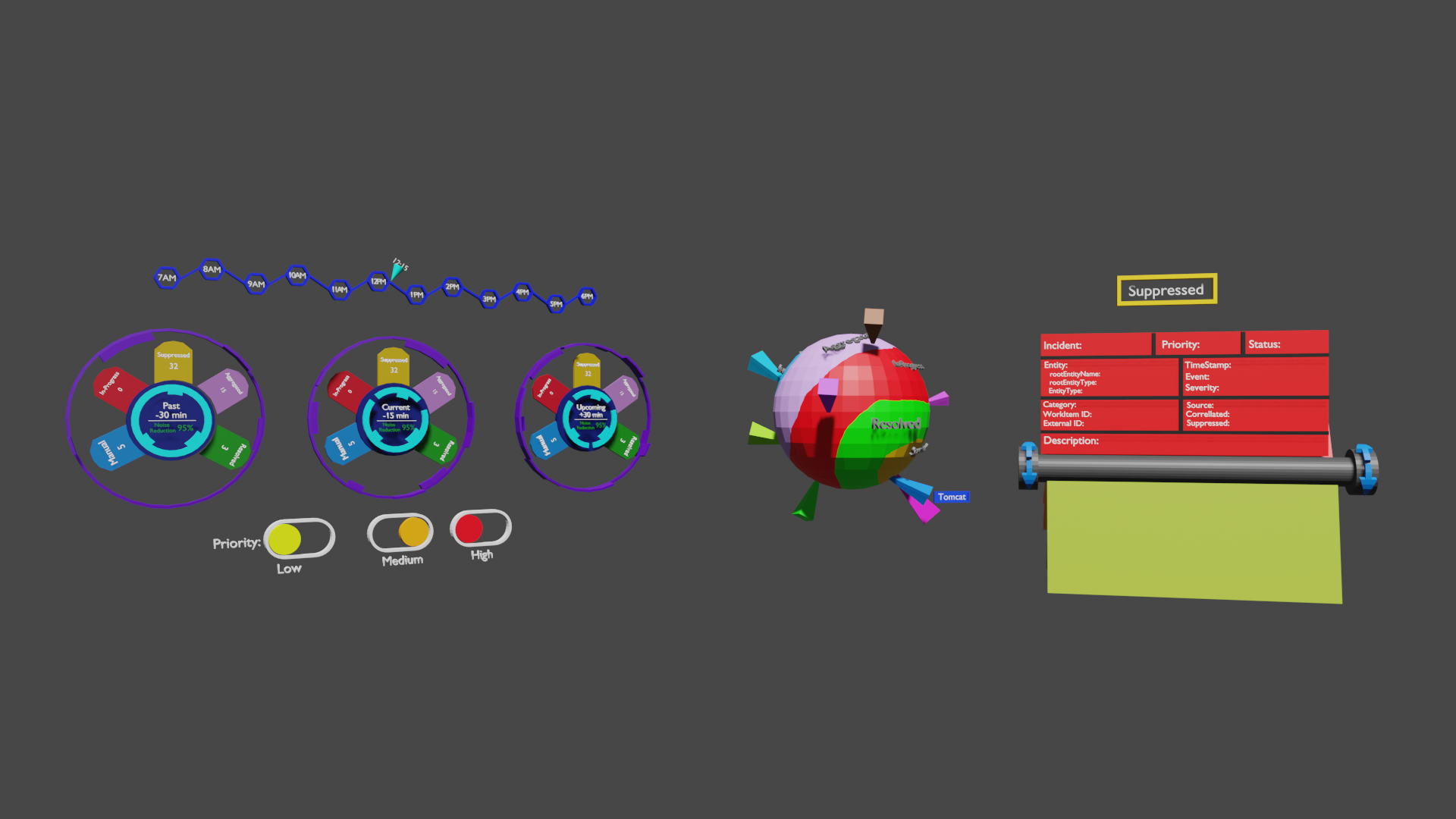
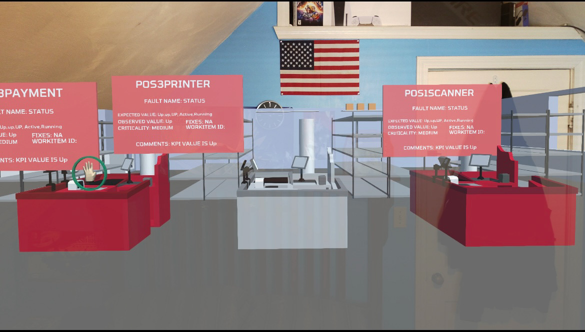
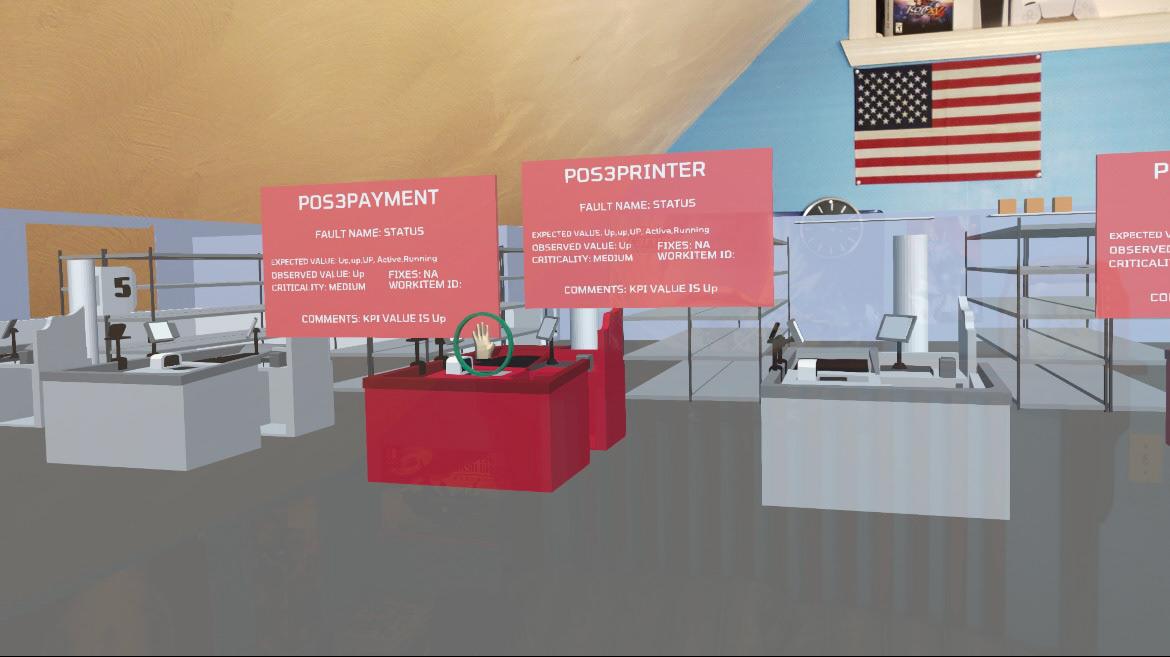
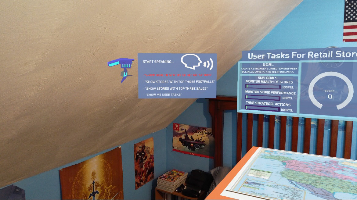
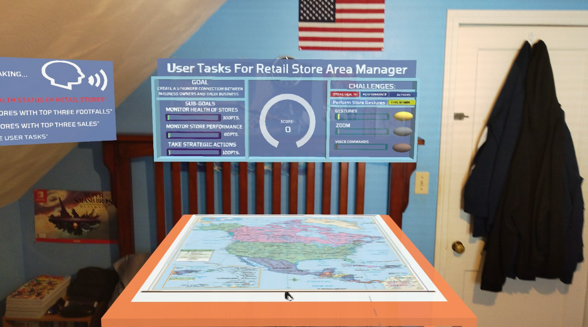
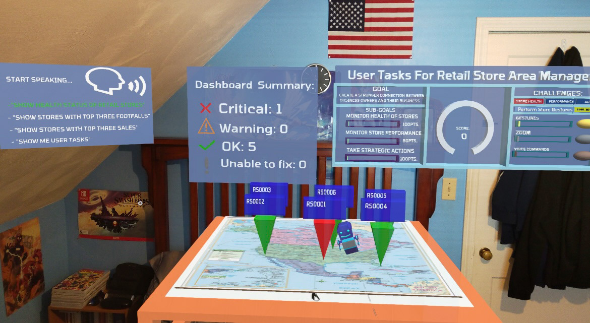
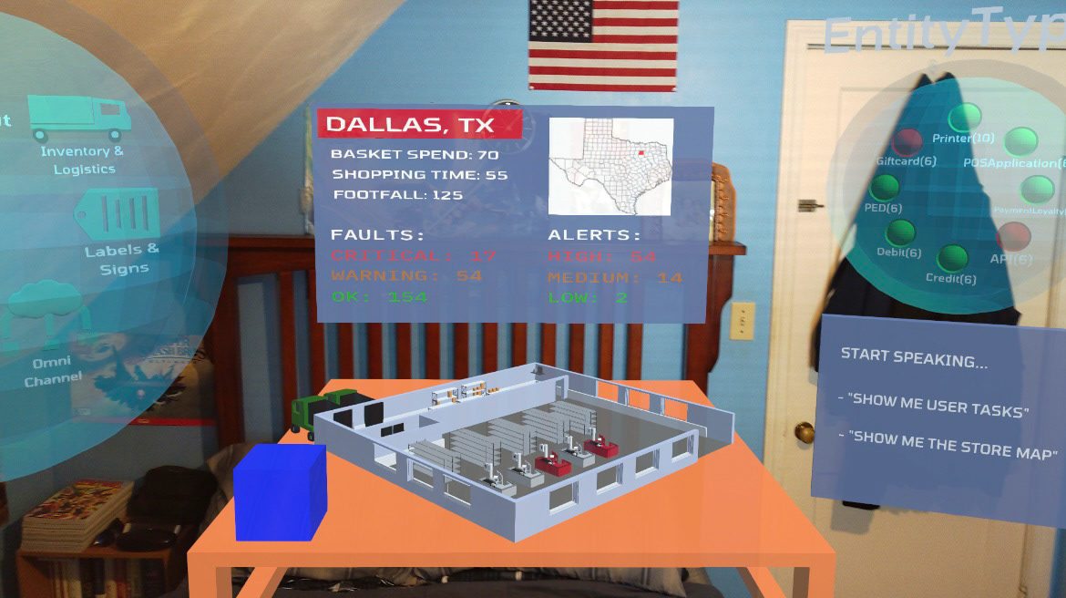
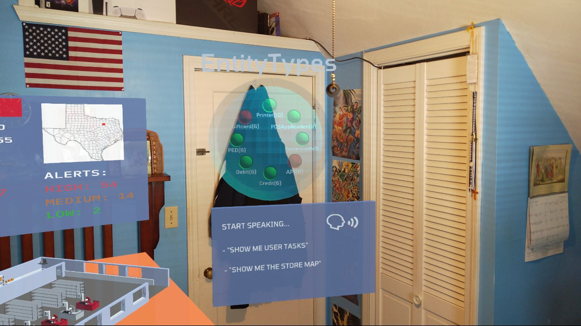
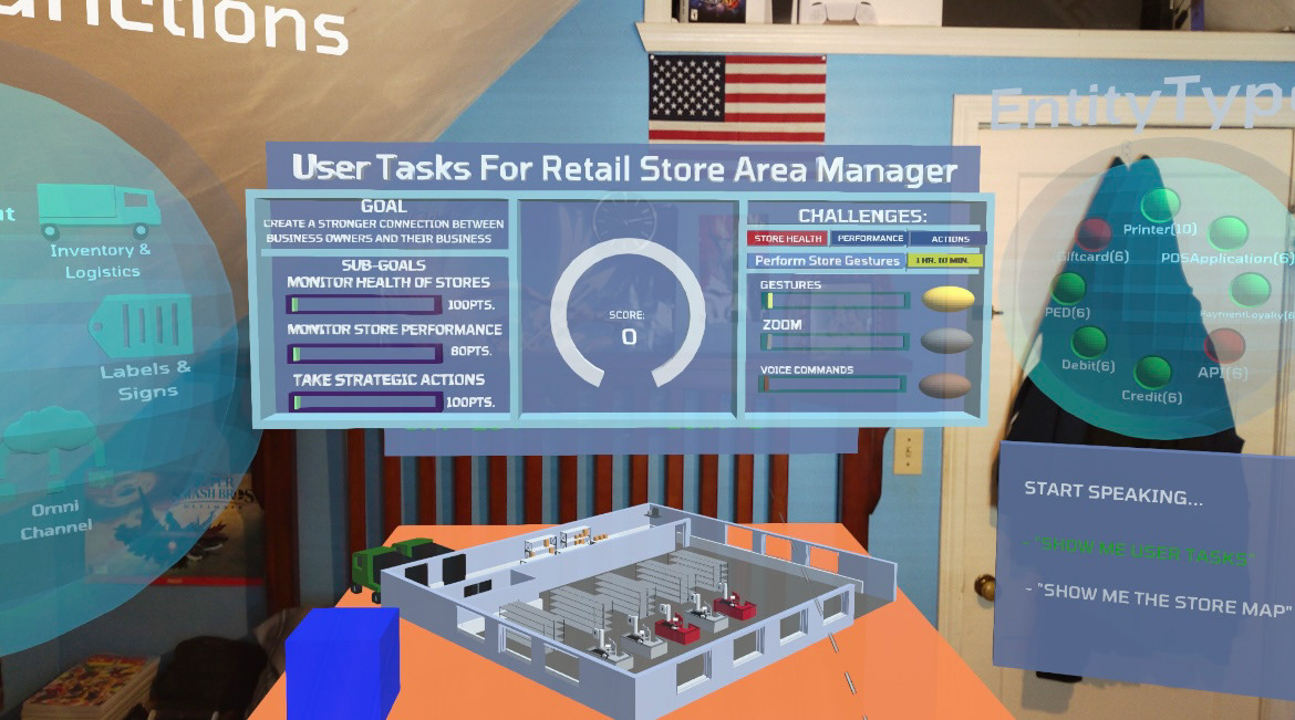
Project Name: Business Health Management:
Project Overview:
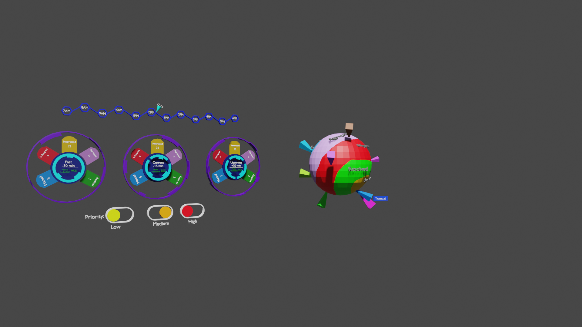
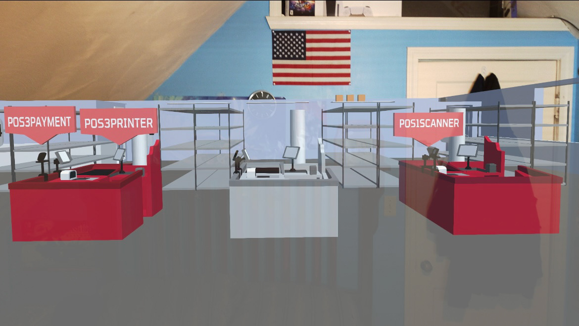
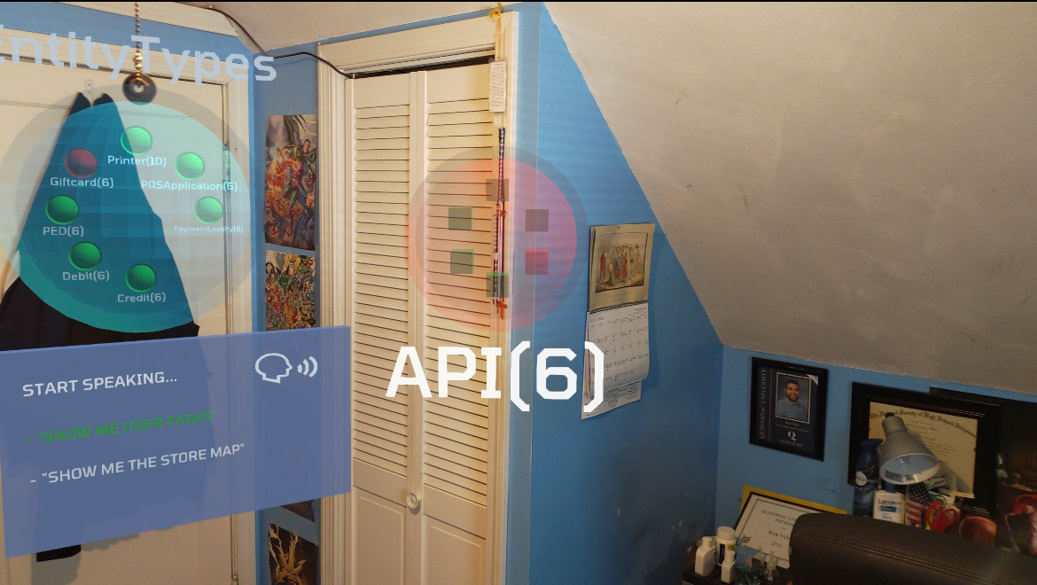
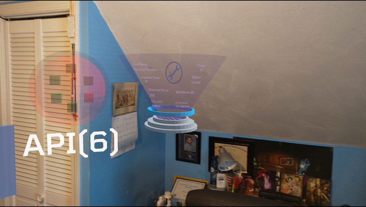
The Business Health Management (BHM) dashboard was designed as a real-time operations tool for enterprise retail. My design gave executives and IT managers a map-based view of store networks, where they could drill down into individual locations to monitor critical services, infrastructure, and business functions.
I introduced concepts like digital twins to provide a live digital representation of stores, enabling more accurate monitoring, and incorporated gamification and AI assistance to make complex operational data intuitive, immersive, and actionable.
The Challenge:
Enterprise retail operations span thousands of stores with diverse systems. Traditional dashboards provided fragmented visibility, leaving decision-makers struggling to:
- See real-time status across locations at a glance
- Understand the impact of infrastructure failures on business outcomes
- Train non-technical users to navigate complex IT metrics
The challenge was to create a visually engaging, intuitive dashboard that could scale across a massive retail footprint while keeping information digestible.
My Role:
- Designed and modeled map-based dashboards and digital twin store environments in Blender
- Prototyped immersive interactions by exporting Blender assets into Unity for spatial and interactive testing
- Experimented with gamification mechanics (progress indicators, scoring, and visual cues) to encourage adoption and simplify complex tasks
- Designed an AI assistant concept to provide contextual guidance and bridge gaps for non-technical users
- Collaborated with product managers and engineers in Agile sprints to test and refine ideas
The Process:
Research & Discovery
- Interviewed IT operations managers to understand monitoring and reporting pain points
- Studied smart city dashboards and other visualization systems for inspiration
- Explored digital twin modeling to represent physical environments as live digital replicas
Design & Prototyping
- Built 3D map-based environments in Blender, enabling users to drill down from a global view → regional → store-level
- Created digital twin store models to display infrastructure, services, and functions in real time
- Integrated gamification components like visual/audio cues, progress markers and health states to simplify adoption
- Prototyped an AI assistant concept for proactive alerts and guided decision-making
Iteration & Collaboration
- Validated early concepts with stakeholders, refining based on feedback around clarity, scale, and usability
- Adjusted 3D environments to balance detail with performance and readability
- Worked in Agile sprints with developers to test feasibility and scalability of dashboard components
Results:
- Delivered a scalable operations dashboard that unified monitoring across thousands of retail stores
- Reduced time-to-insight through map-based drill-down navigation
- Increased user adoption and engagement through gamification and AI support
- Demonstrated how digital twins could redefine enterprise monitoring and decision- making
Post Mortem:
As one of my first explorations into immersive enterprise design, this project showed me the potential of blending 3D modeling, gamification, and AI into practical tools for large organizations. This project was one of my first big tests in my career and I believe I built something to be proud of.
The experience laid the groundwork for my later projects like Immersive Maps and KPMG Clara, where I continued applying lessons in simplifying large-scale, data-heavy environments into intuitive user experiences.
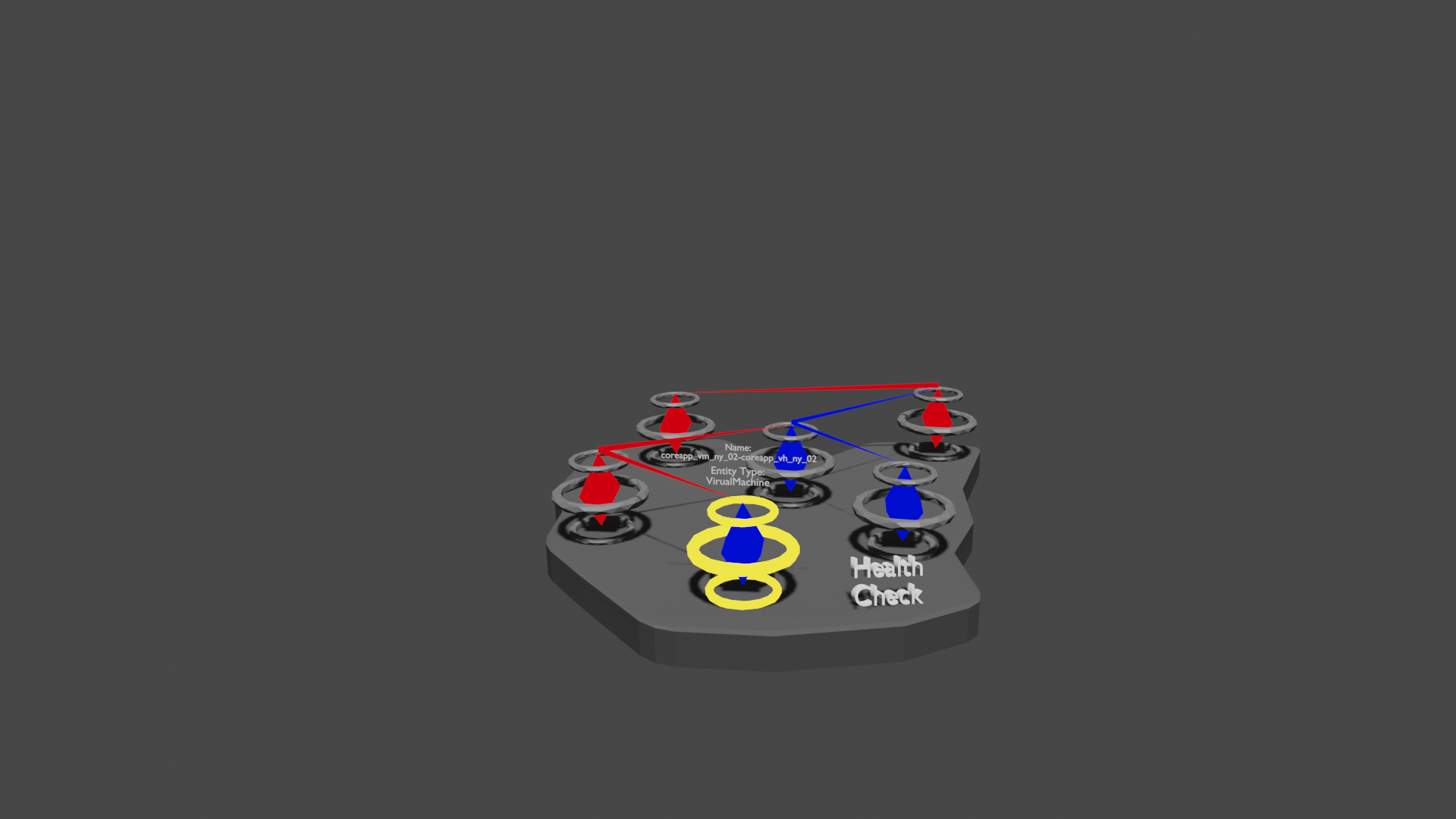
Project Name: Immersive Maps
Project Overview:
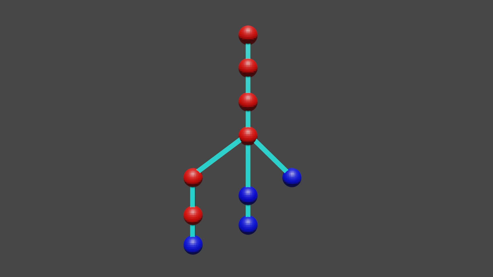
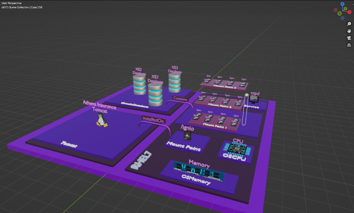
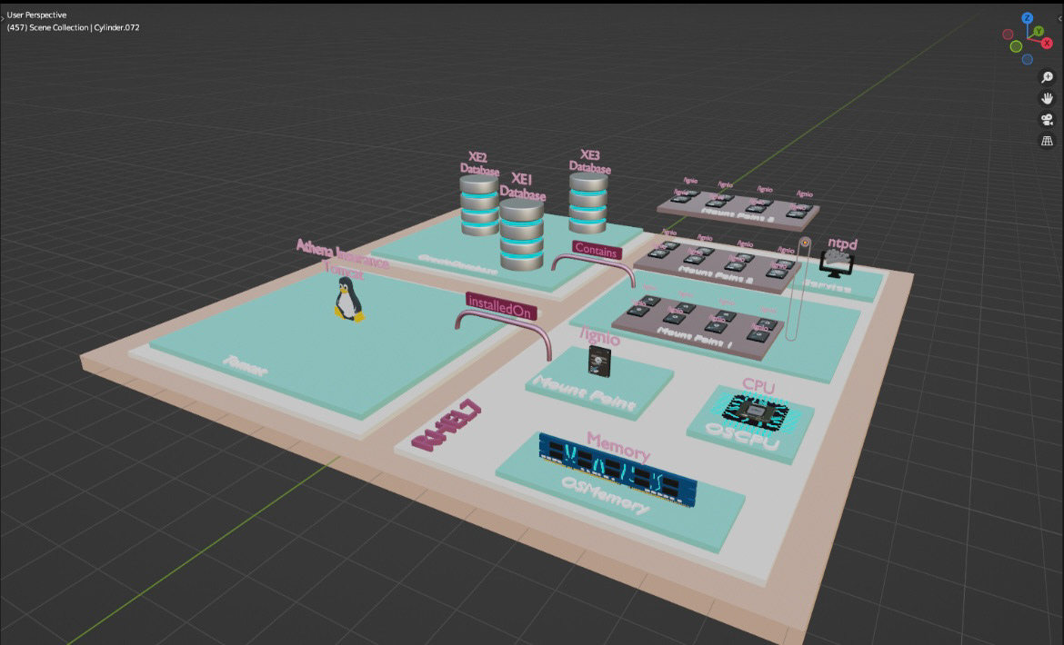
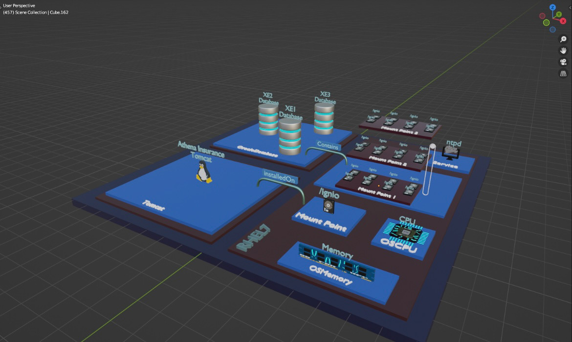
Immersive Maps is a 3D web application solution designed to help enterprise IT teams visualize complex infrastructure environments through a 3D interface. The feature displays every node in an organization’s IT stack—from databases to switches, routers, and POS systems—within a spatially aware, interactive 3D environment.
The goal: make a massive, high-complexity system instantly understandable.
The Challenge:
Enterprise IT environments are incredibly dense, and traditional dashboards often overwhelm users with data and are visually confusing. Our challenge was to reimagine how system admins and analysts could interact with this information—using spatial design to reduce cognitive load and allow users to see exactly what they need, when they need it.
Designing for scale was a major hurdle. With hundreds, even thousands of nodes connected to one another, we had to develop a concept that could simplify complexity without losing critical detail and was able to work for 10, 100, and 1000+ nodes.
Designing for scale was a major hurdle. With hundreds, even thousands of nodes connected to one another, we had to develop a concept that could simplify complexity without losing critical detail and was able to work for 10, 100, and 1000+ nodes.
My Role:
As the lead UX and 3D designer, I was responsible for:
- Modeling interactive spatial environments using Blender
- Texturing assets in Substance Painter for clarity and consistency
- Building and testing interactions in Unity
- Collaborating with developers and product stakeholders to align the visual experience with real-time backend data
- Iteratively refining the concept based on usability concerns around scale, discoverability, and performance
The Process:
Research & Concepts
We explored how users interact with dense data in flat dashboards, and interviewed stakeholders about their most urgent pain points. The common need? “Just show me what matters—don’t make me dig.”
Creating a concept to base the design off of was a big time sink. I tried mock-ups based off of galaxies, cities, different 3D trees etc. Eventually we found something that clicked and were able to combine a lot of the concepts into something new. We combined a circuit board design concept with a city concept to create a design and user flow that worked in 3D, improved user experience, and was scalable.
Design & Prototyping
I mapped out potential interaction models using wireframes and mockups, then brought them to life in Blender and Unity. The environment allowed users to walk through a room-sized network, filter by node type, and highlight system alerts in real time.
Simplification Strategy
One of the core breakthroughs was introducing progressive disclosure. Rather than show everything at once, users could toggle visibility, focus on one system at a time, or use gestures to drill deeper into node details. This kept the environment clean, usable, and not visually overwhelming.
Results:
- Reduced visual clutter by introducing a layer-based filtering system
- Created a live prototype that stakeholders could walk through in a WebGL
- Helped internal teams reimagine how infrastructure monitoring could work in 3D
- Received positive feedback from IT leads for clarity, interaction smoothness, and reduced learning curve
Post Mortem:
Designing for spatial interfaces requires a whole new lens on hierarchy, proximity, and interaction. Through Immersive Maps, I learned how to adapt core UX principles to 3D environments—and how to distill complexity into something immediately understandable. Balancing visual fidelity with usability at scale was the hardest part—and the most rewarding.
b. KPMG: UX Design, UI Design, Consultant
Aug 2024 - Oct 2024
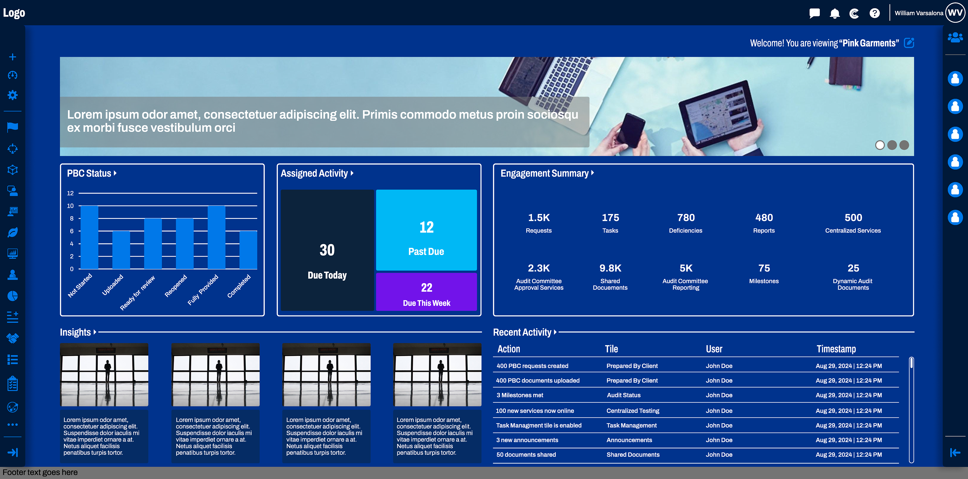
Project Name: KPMG Clara Modernization
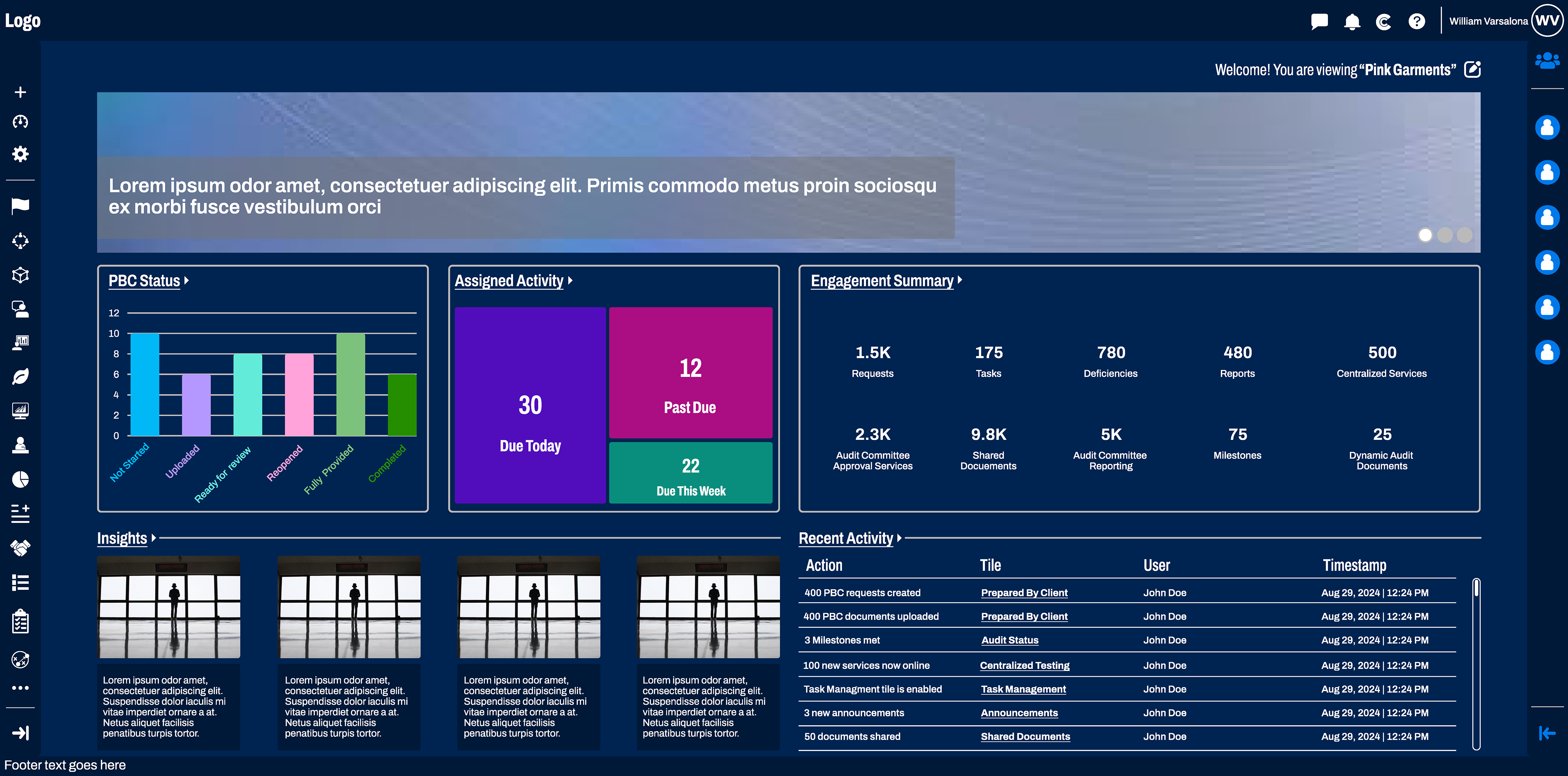
Project Overview:
The KPMG Clara Audit Platform is a global enterprise tool, that supports every stage of the audit process. It was my responsibility to modernize the platform's UX/UI, create a consistent and cohesive design system, and improve usability.
The Challenge:
There were many issues I noticed right off the bat: circular navigation pattern, inconsistent layouts, poor visual design, and lack of brand identity. These were issues that you met with your eyes, but these key issues you met just by using the site:
- Lack of onboarding guidance for new users
- Unorganized and redundant user flows
- Accessibility issues impacting usability
- Lack of discoverability for important features
- Lack of user retention (users only use the platform for 1 task)
These issues led to a frustrated and confused user base and ultimately limited the platform's value
My Role:
As the UX/UI Designer, I was responsible for:
- Redesign key tiles and pages with a focus on discoverability and usability to increase user efficiency (less mouse-clicks)
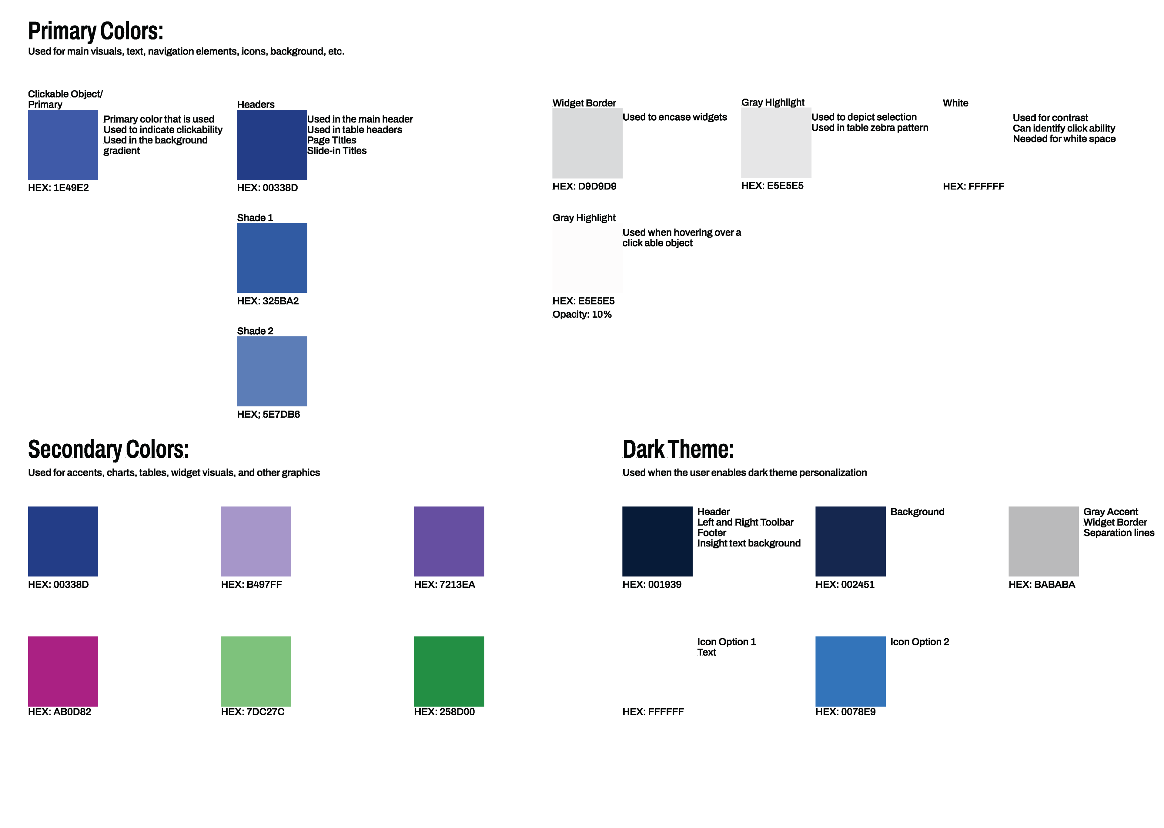
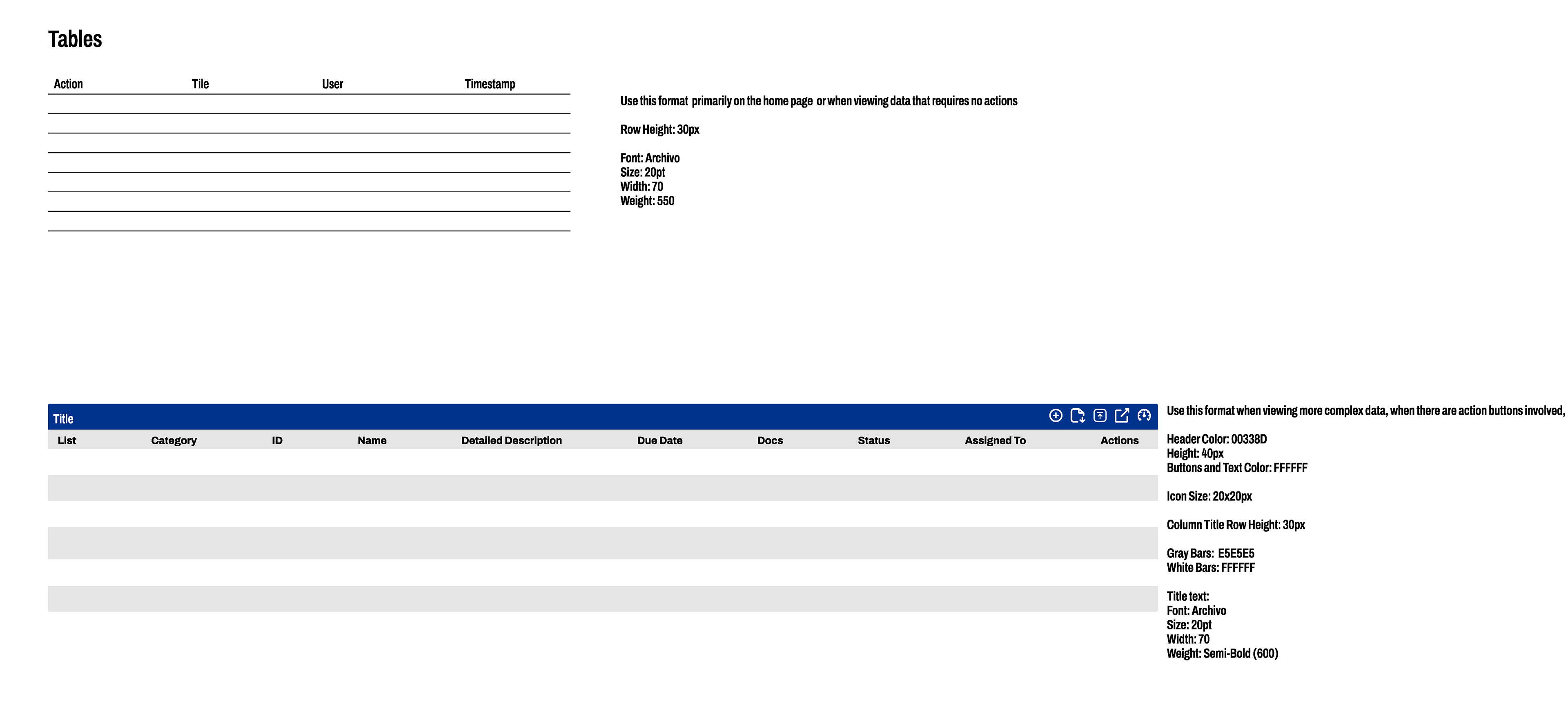
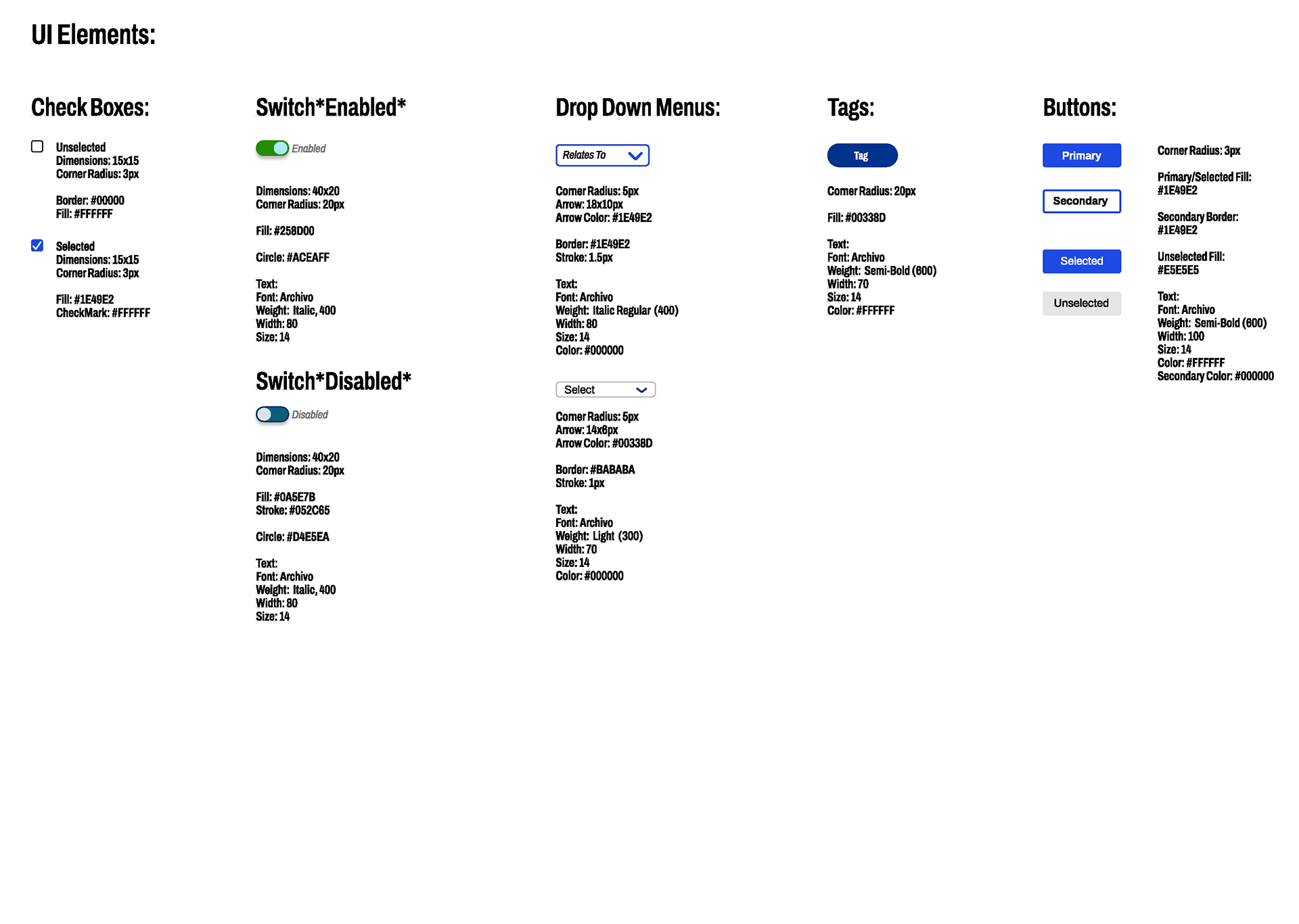
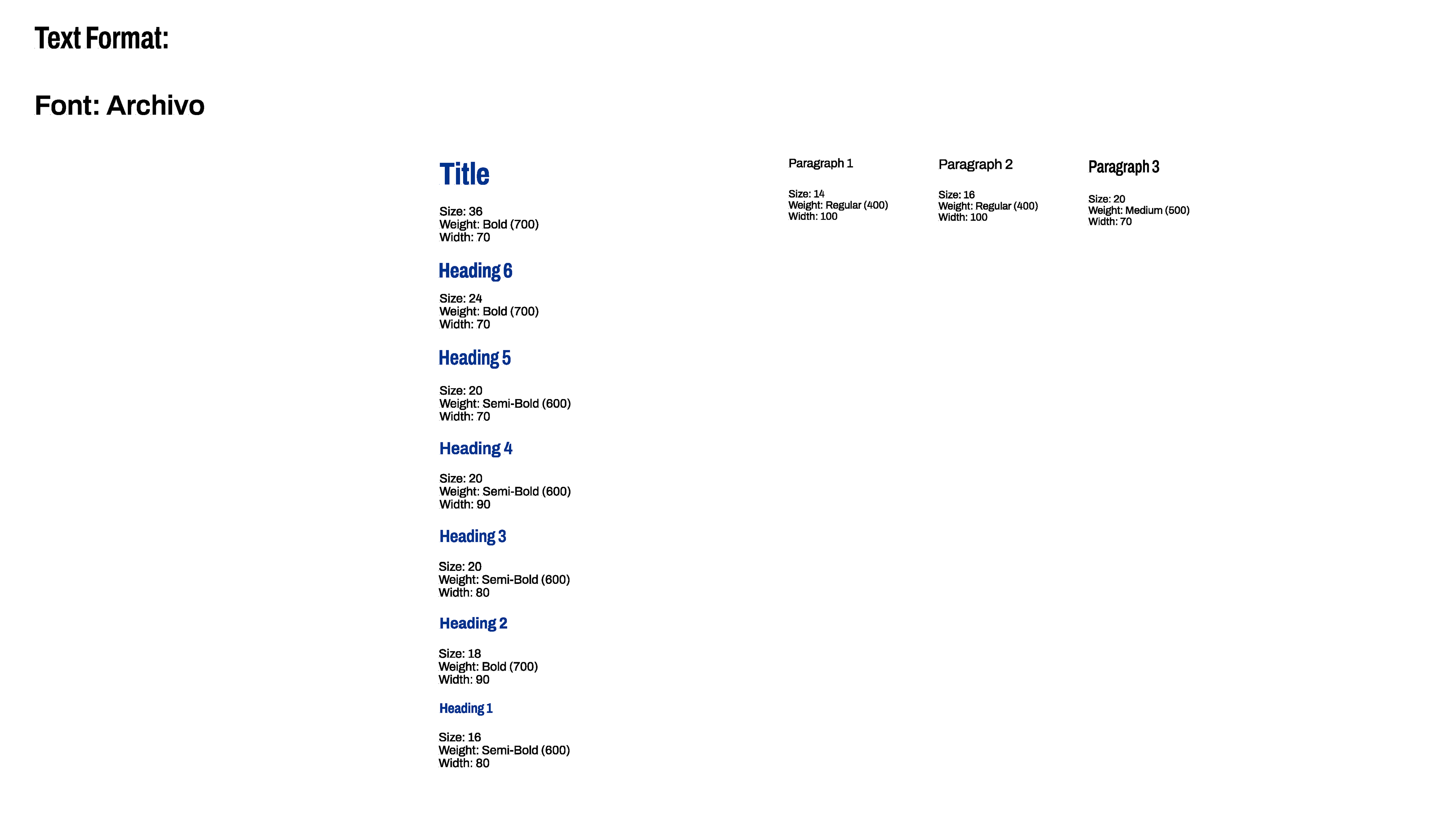
- Created a centralized design system:
- Consisted of a WCAG- compliant color palette, and various table styles
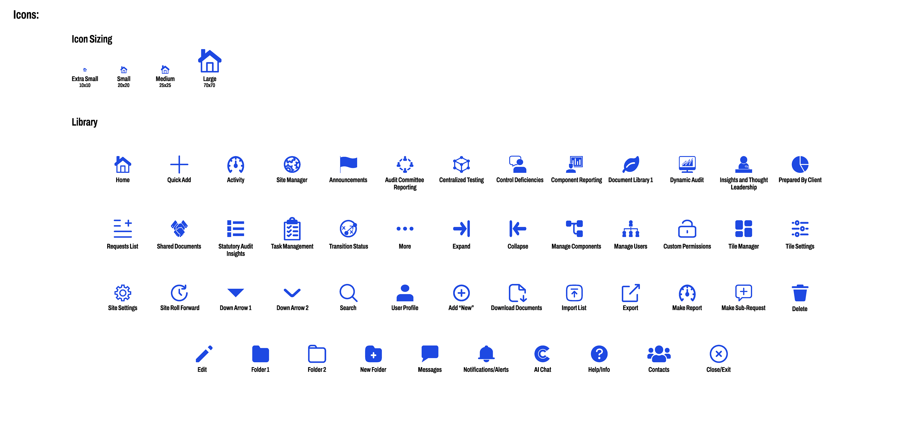
- Icon library for more than 50 functions and features with various sizes
- Typography guidelines, navigation patterns, and important UI elements and interactive features
- Craft interactive prototypes for usability testing, and stakeholder presentations
- Collaborate with Project Managers, Product Owners, and developers using an agile development structure holding 3 meetings a week and working in 14 day design sprints to ensure rapid iteration and requirement compliance.
The Process:
Research and Evaluate
The research phase included:
- UX Audit: Discovering site pain points through stakeholder interviews, user feedback reviews, and site exploration
- Reviewed current layouts, navigation patterns and accessibility gaps
- Noting visual inconsistencies in typography, white space, and iconography
- Analyzing user flows to uncover navigation friction, dead ends, and circular paths
Designing and Prototyping
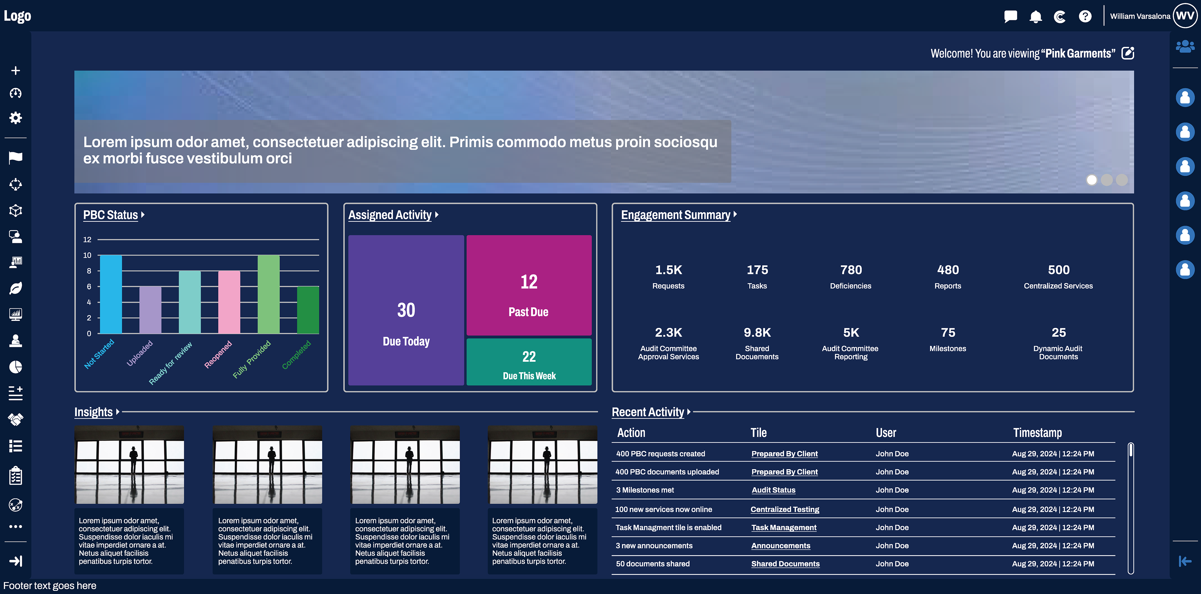
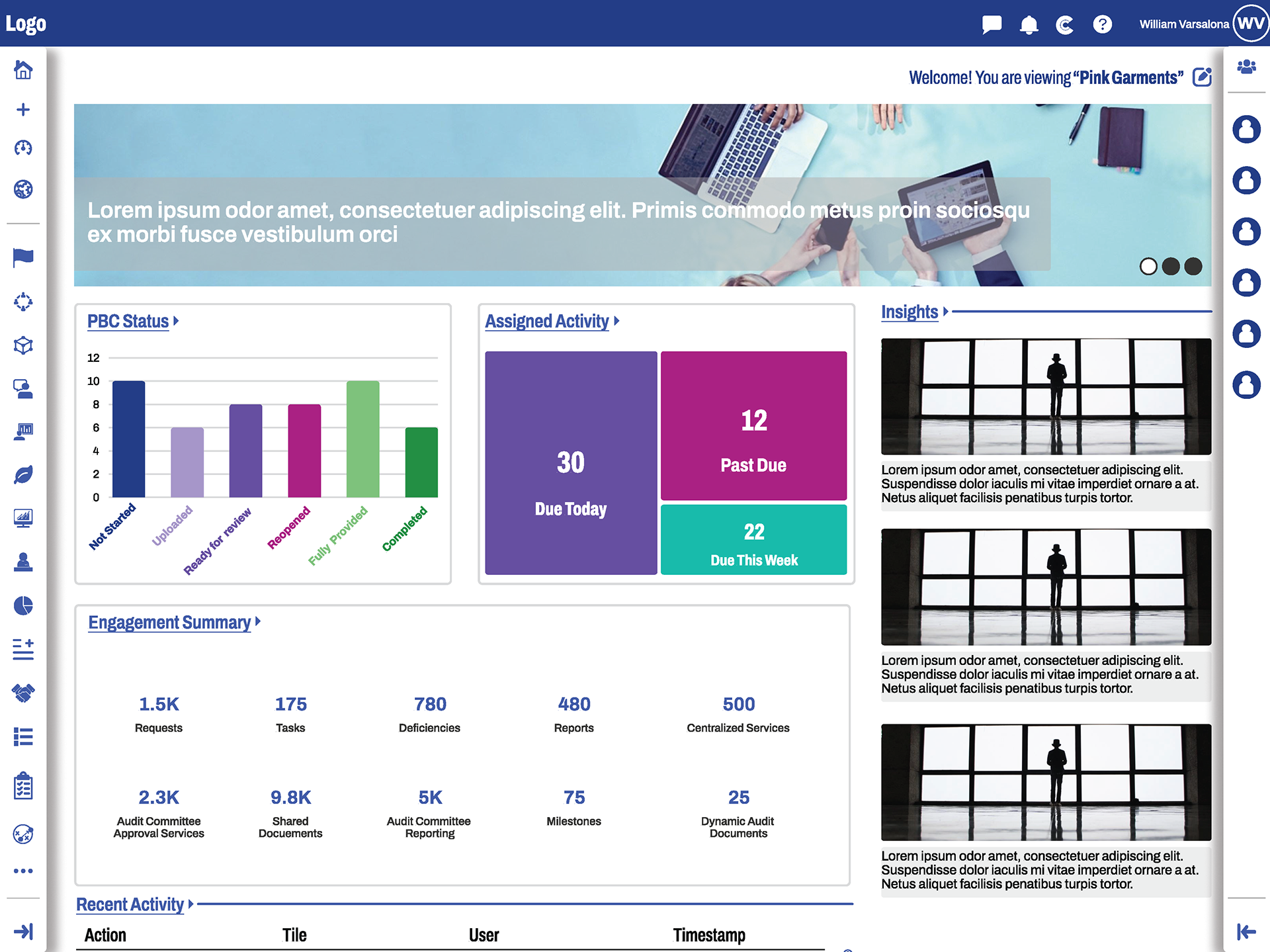
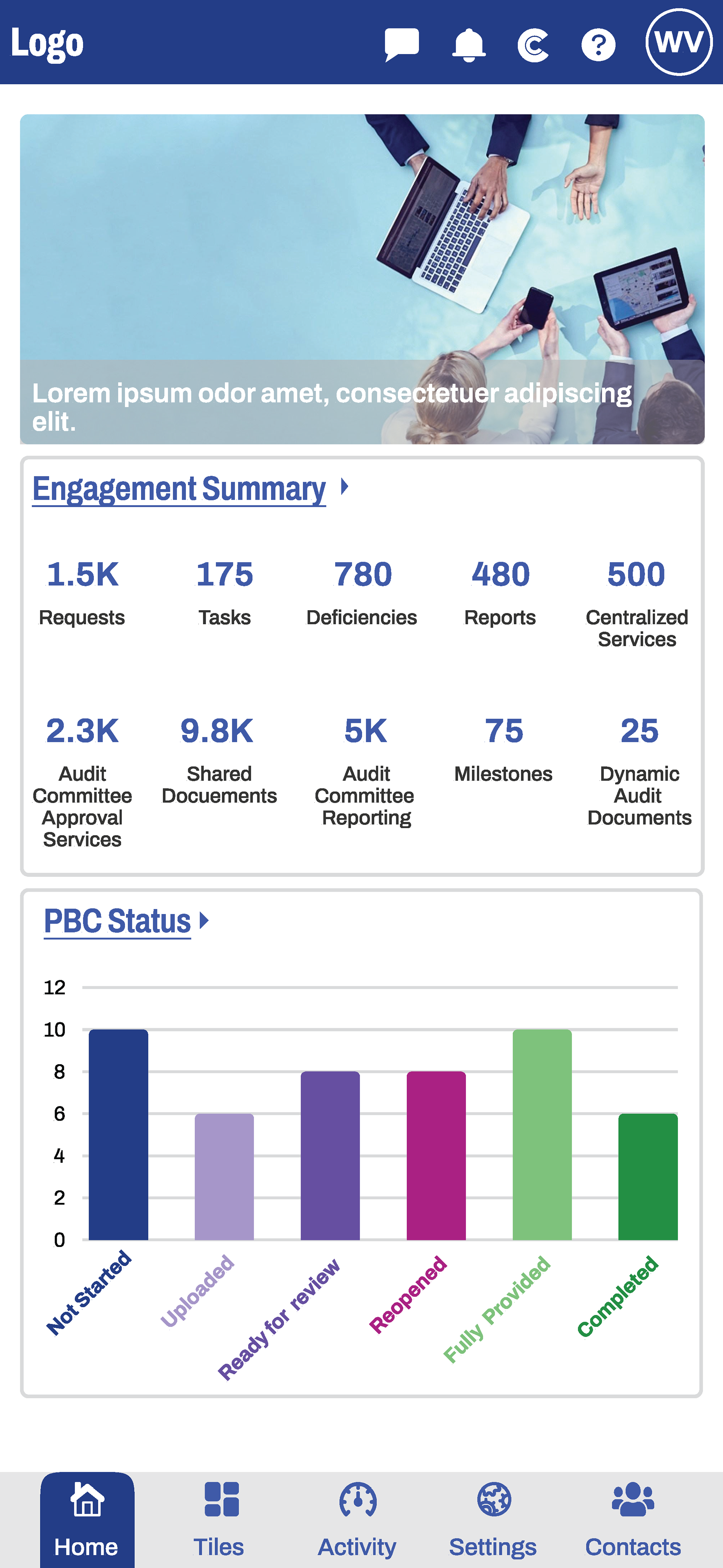
- Home Page: Evolved the tile concept to widget based dashboard, showcasing most used features and recent updates are displayed after login
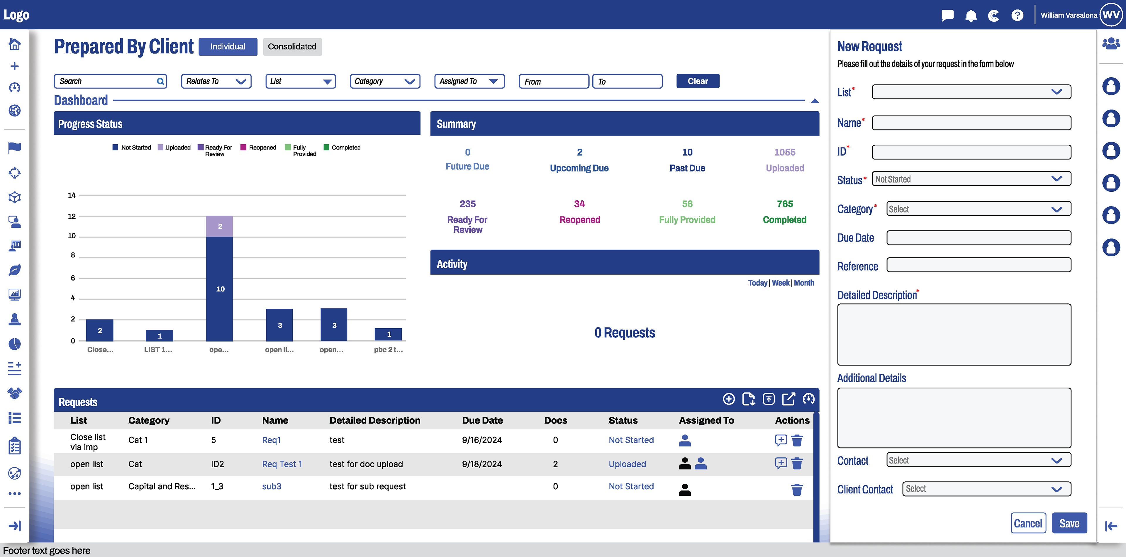
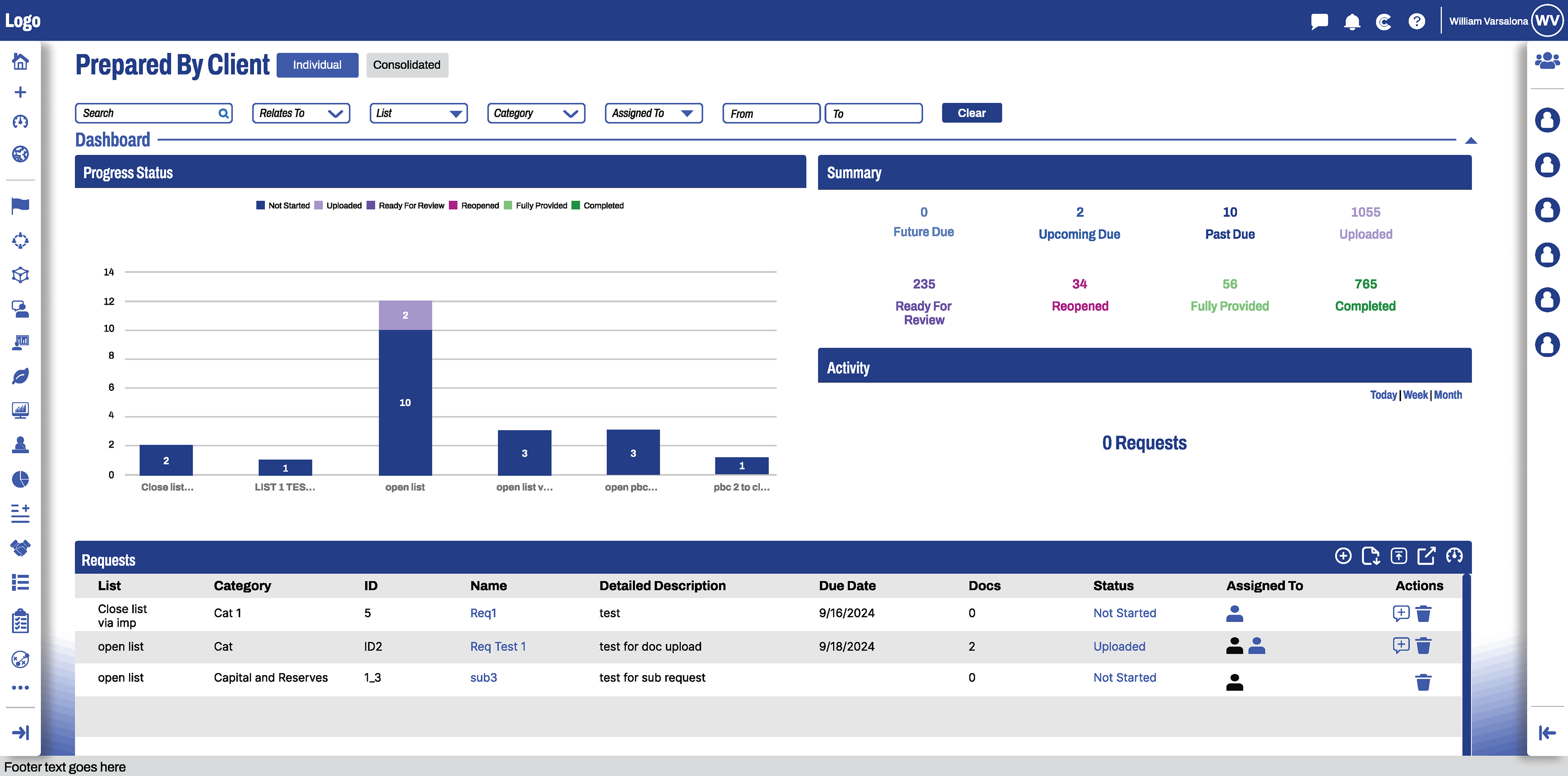
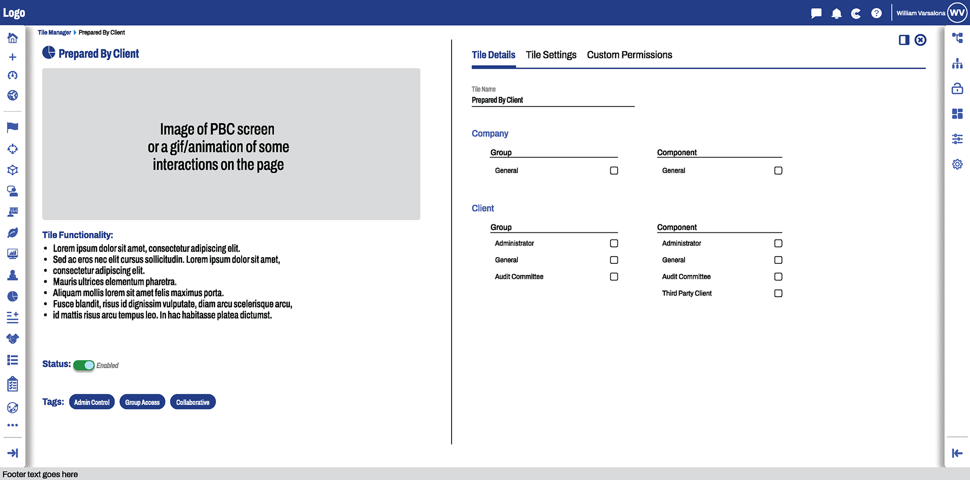
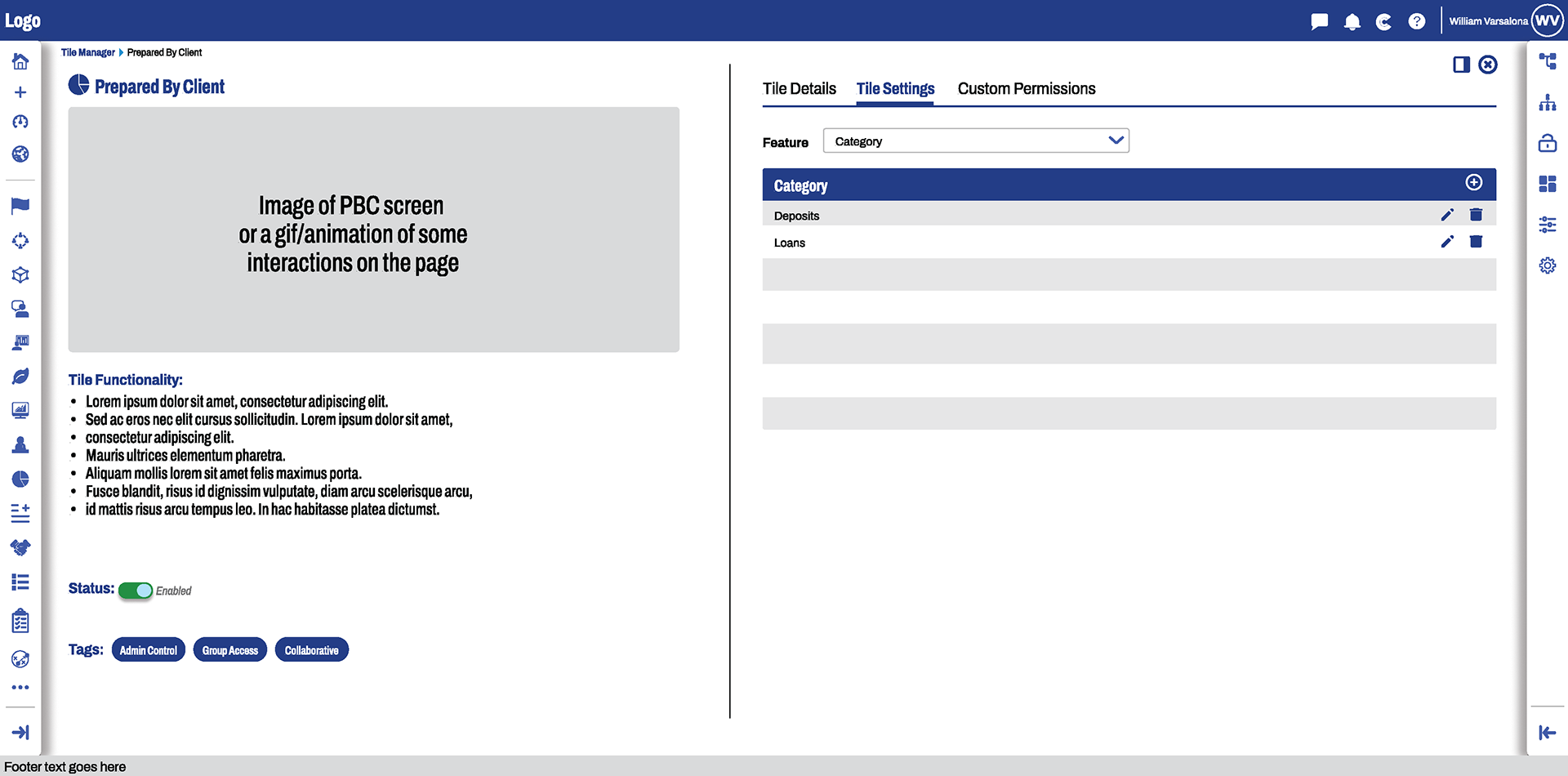
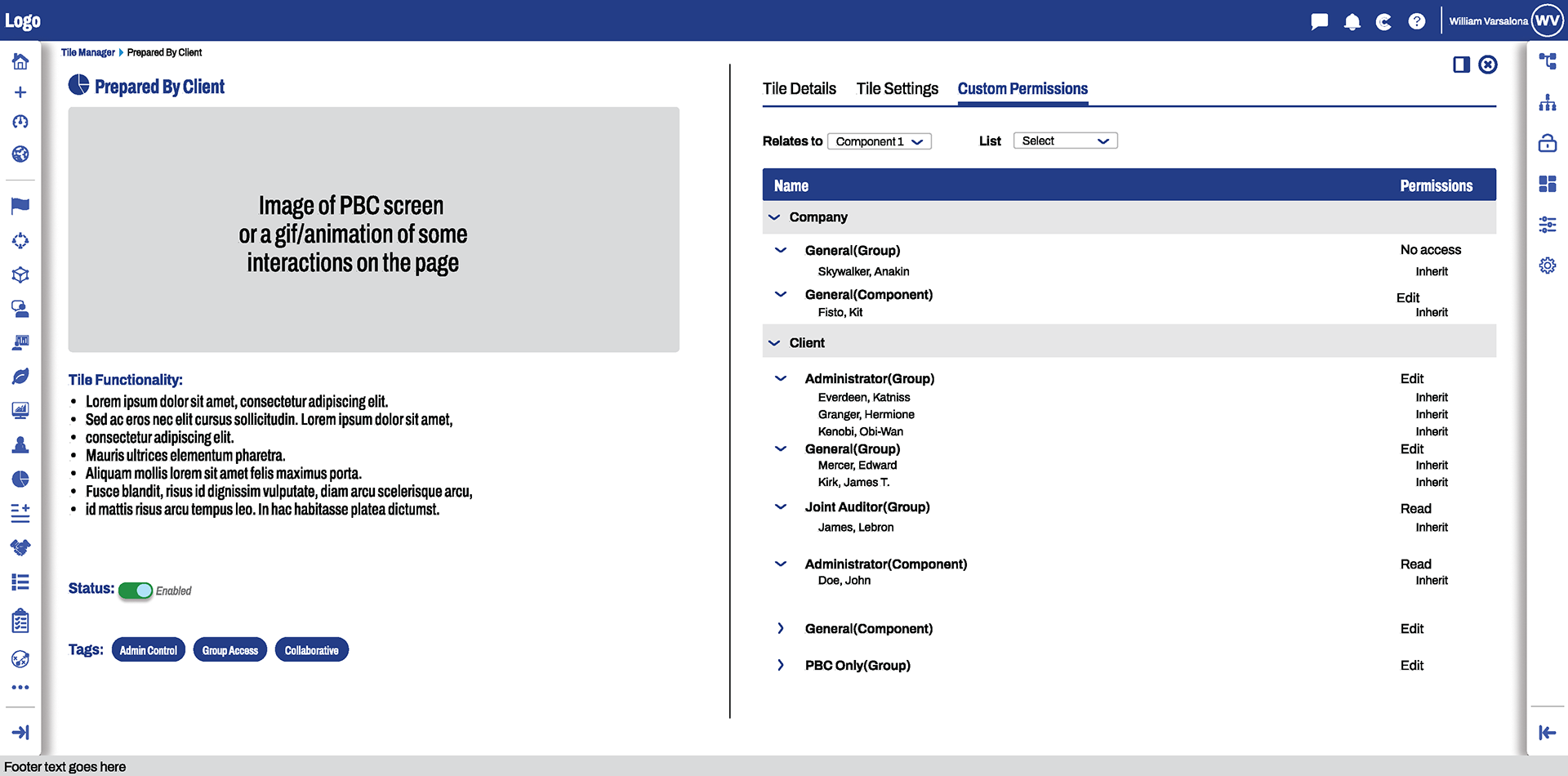
- Prepared By Client: Reorganized dashboard with cleaner visuals, redesigned tables and filters, reduced scroll by 100%
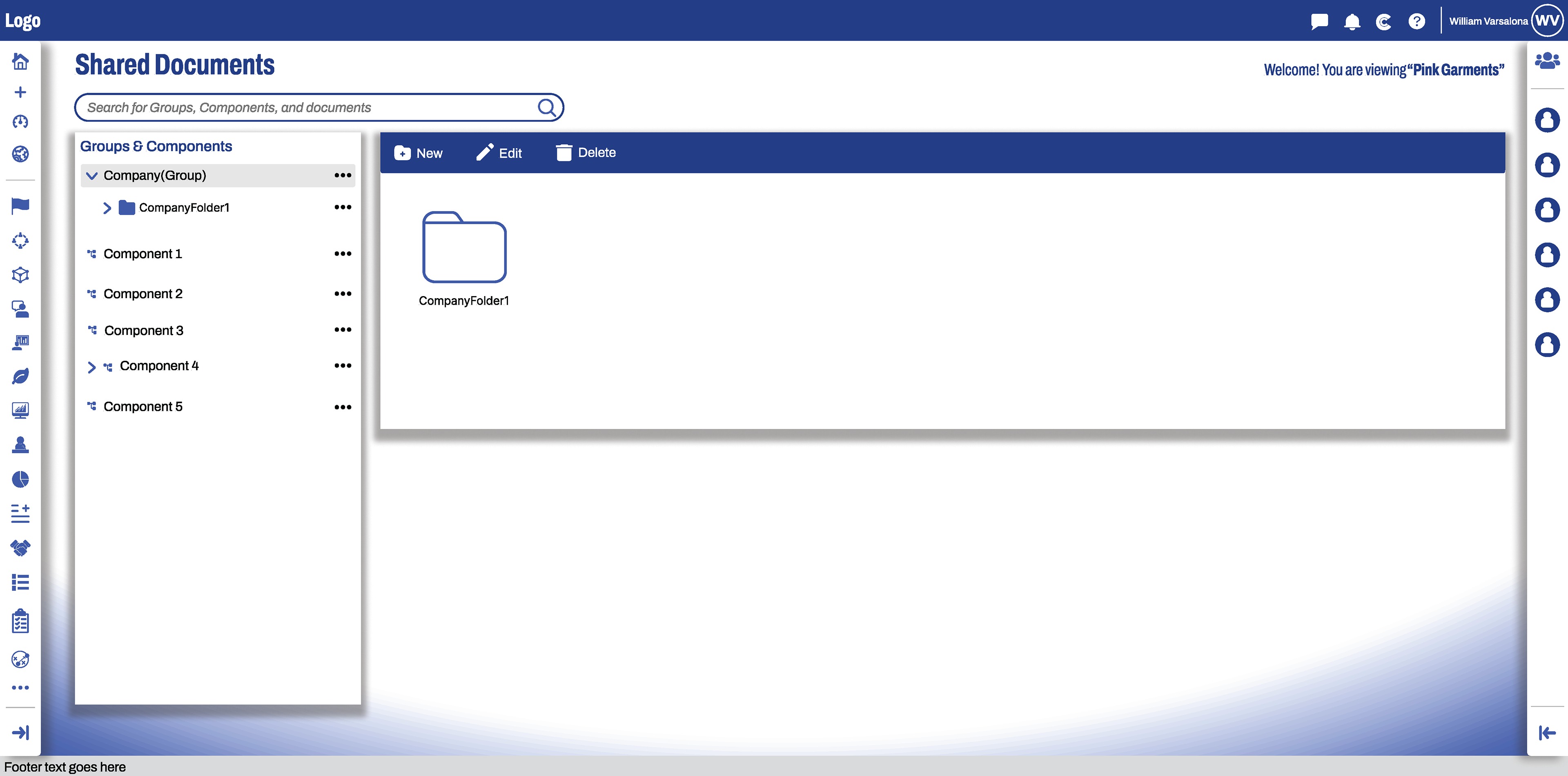
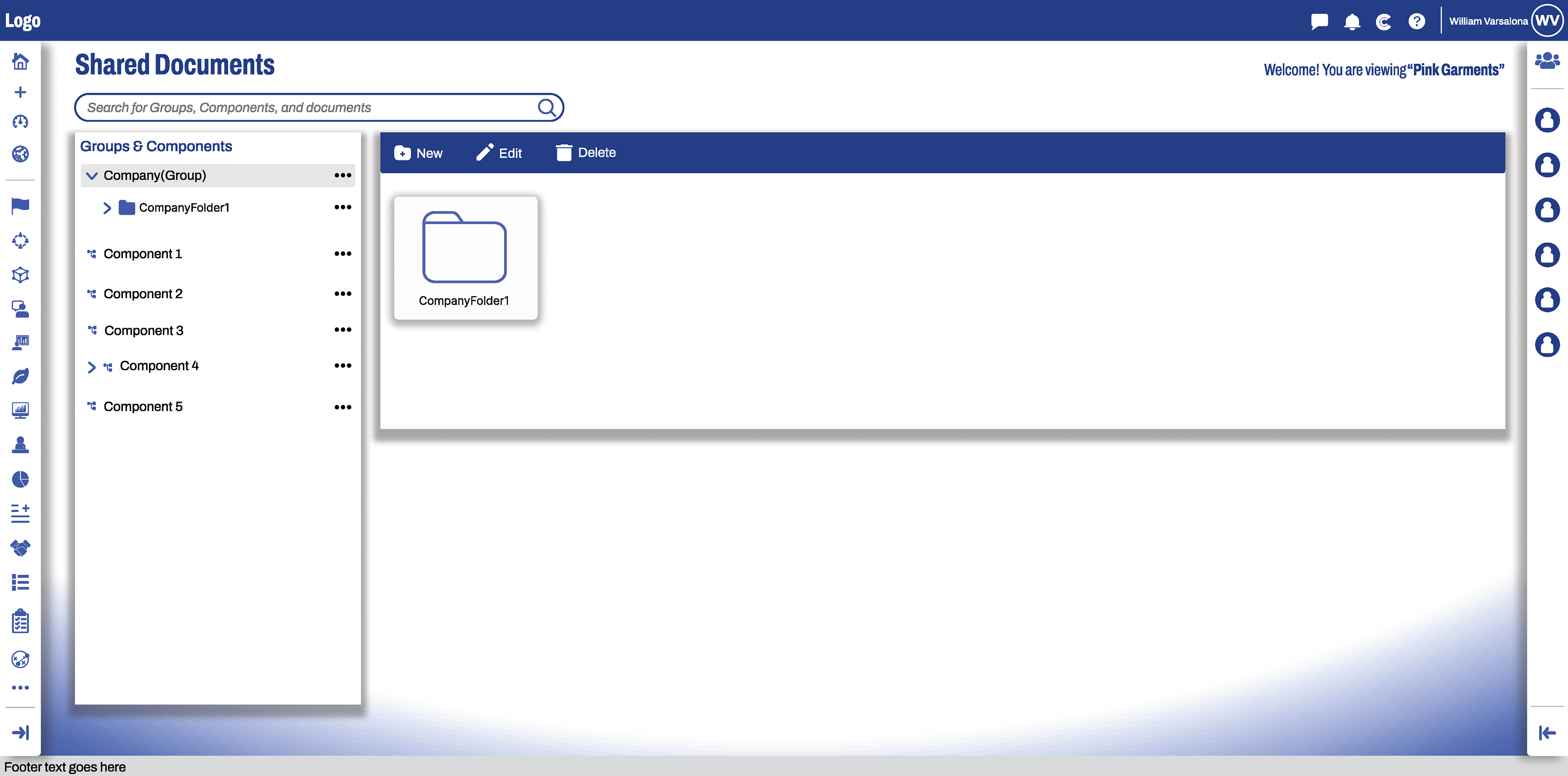
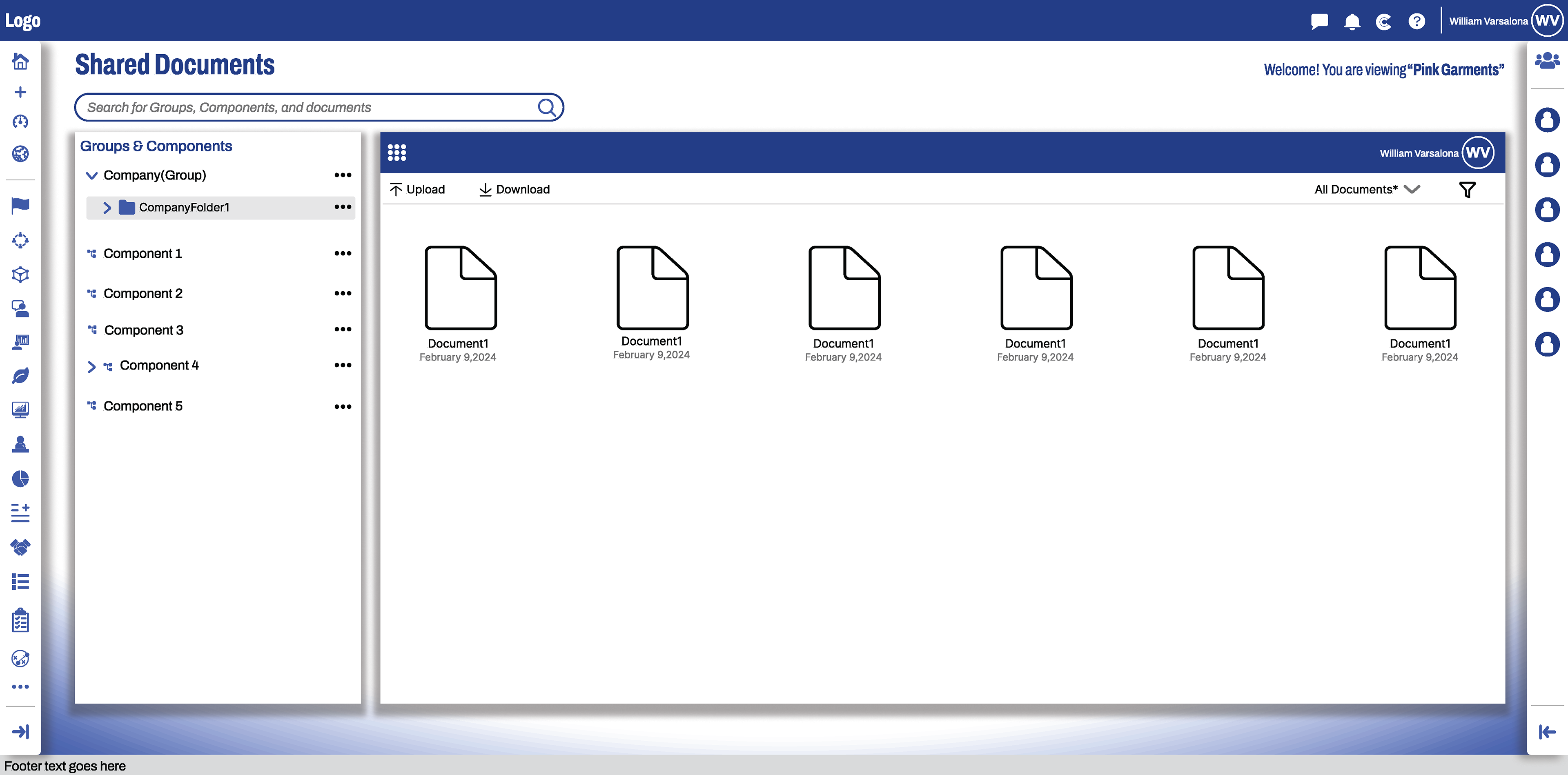
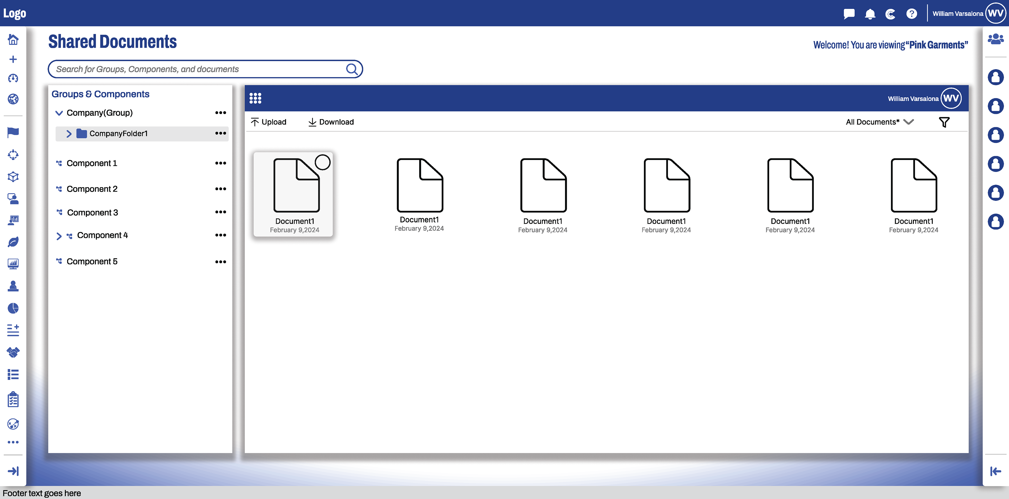
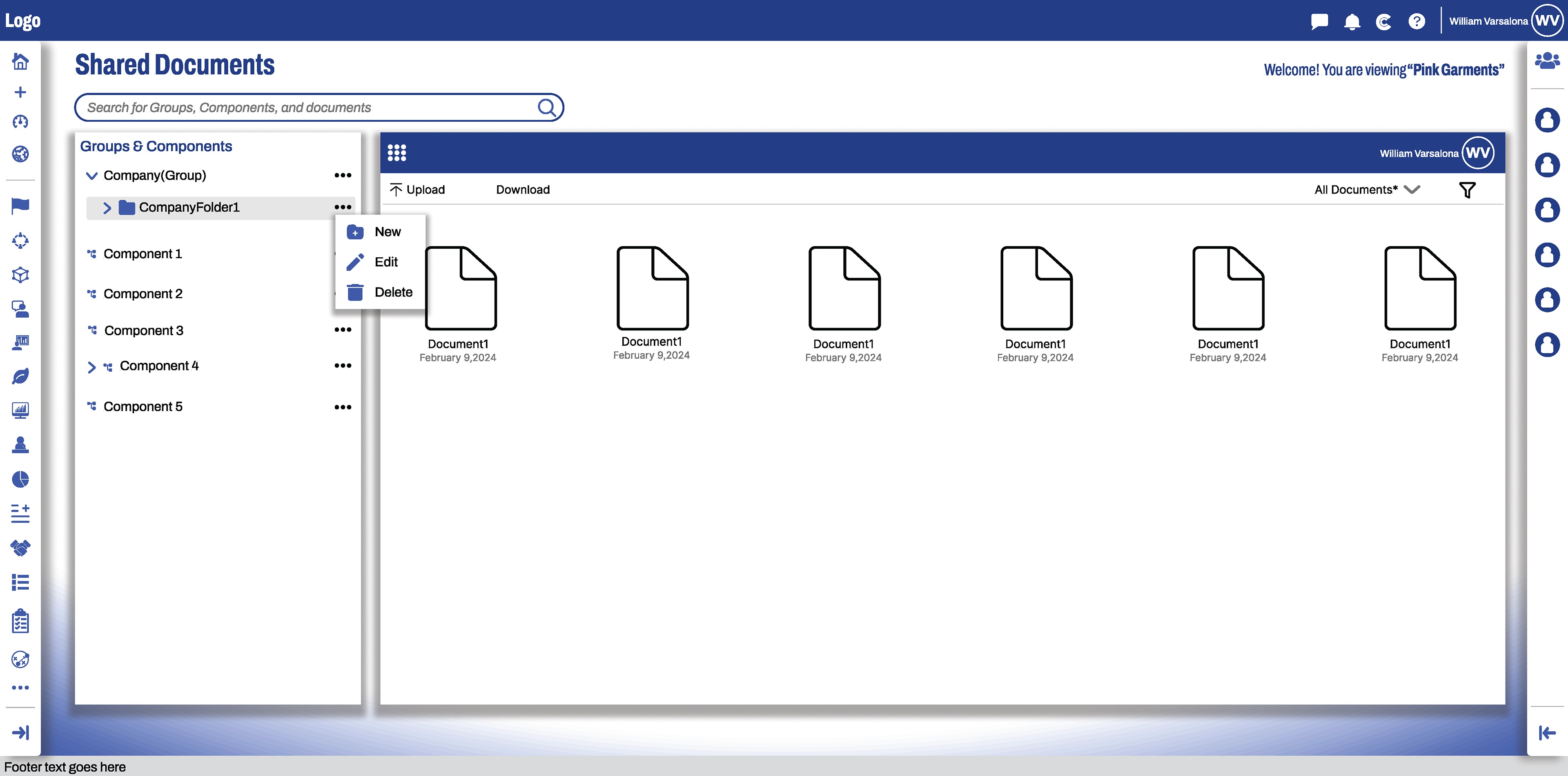
- Shared Documents: Improved visual design, clearer hierarchy
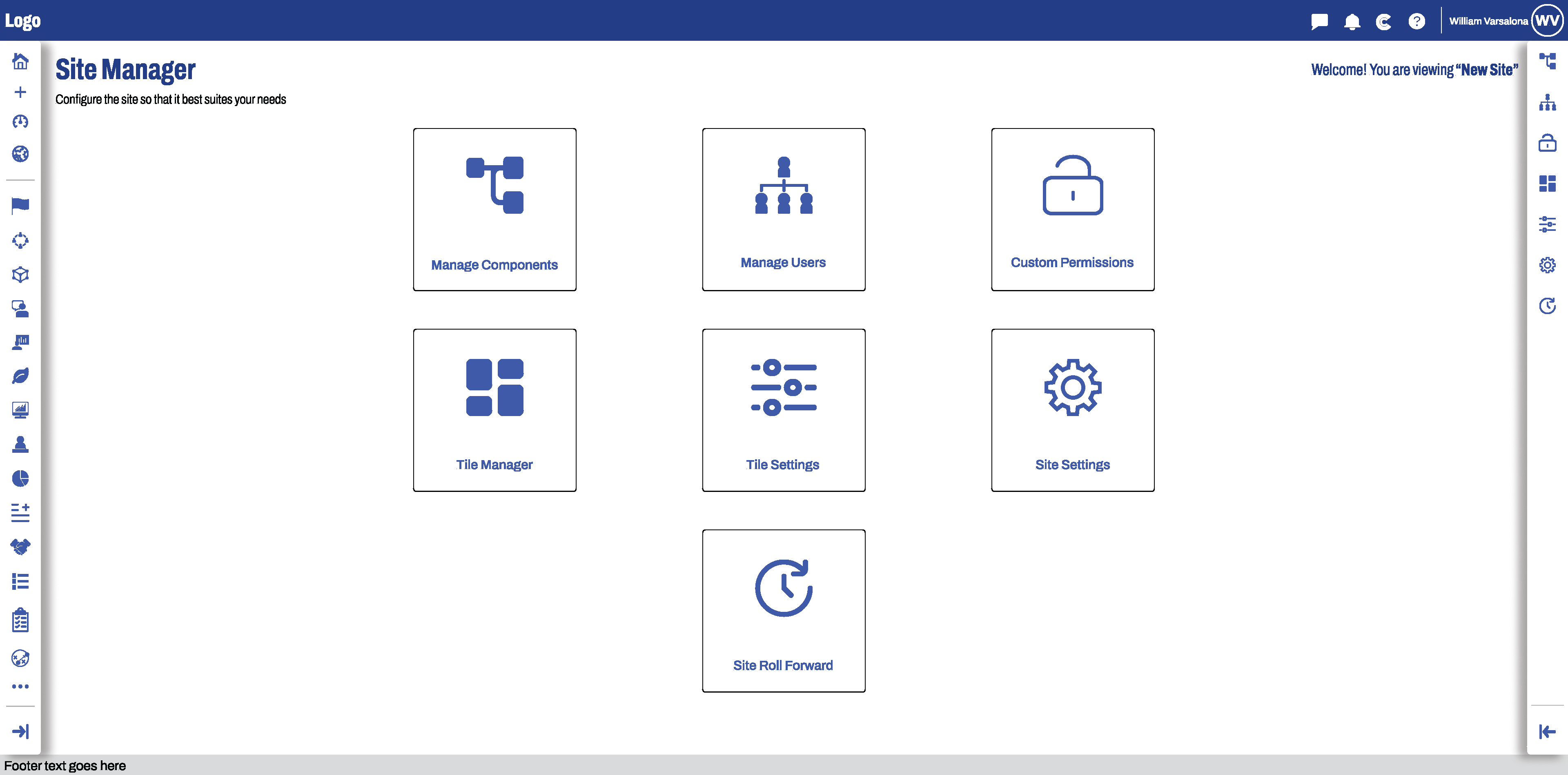
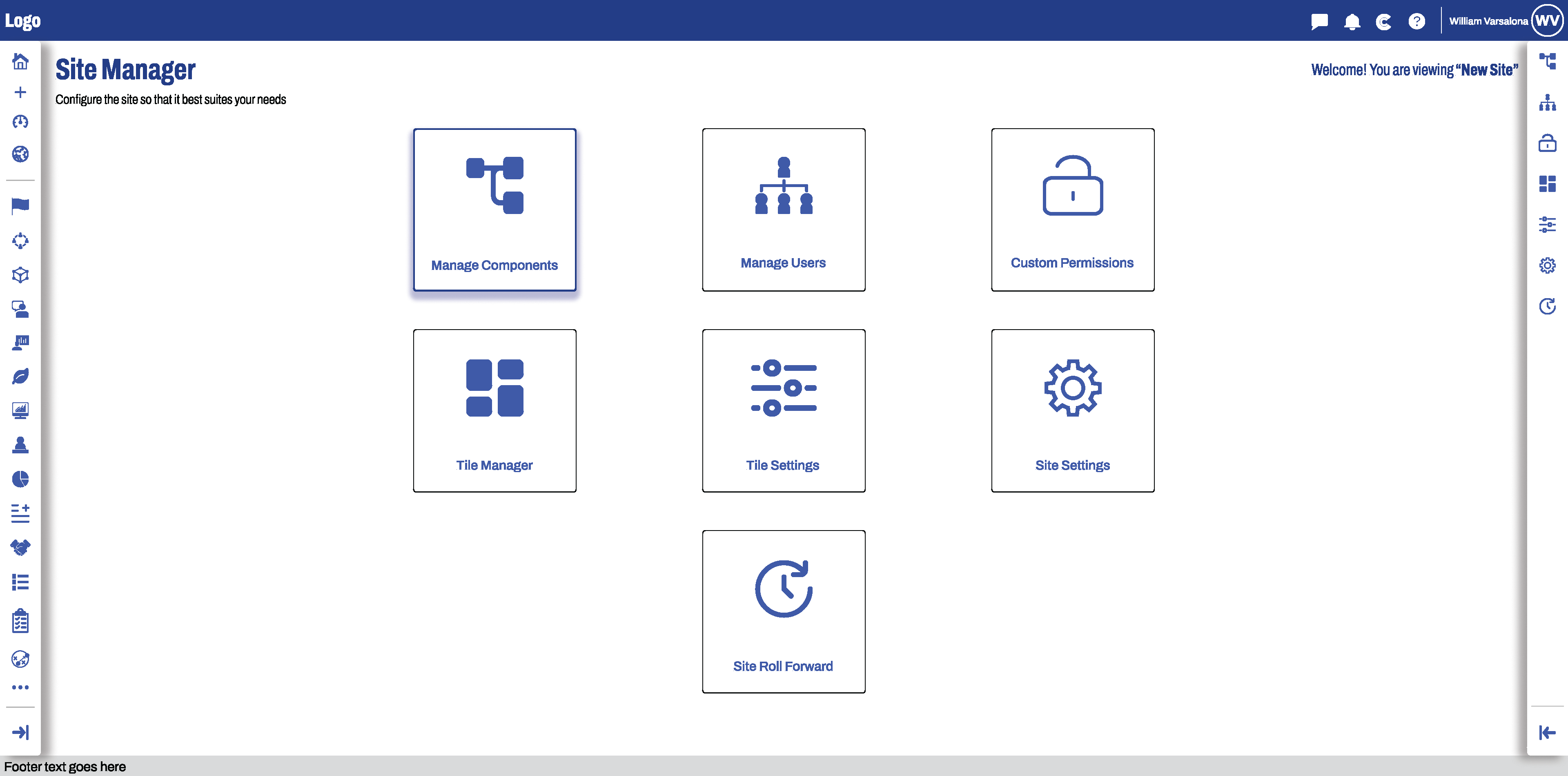
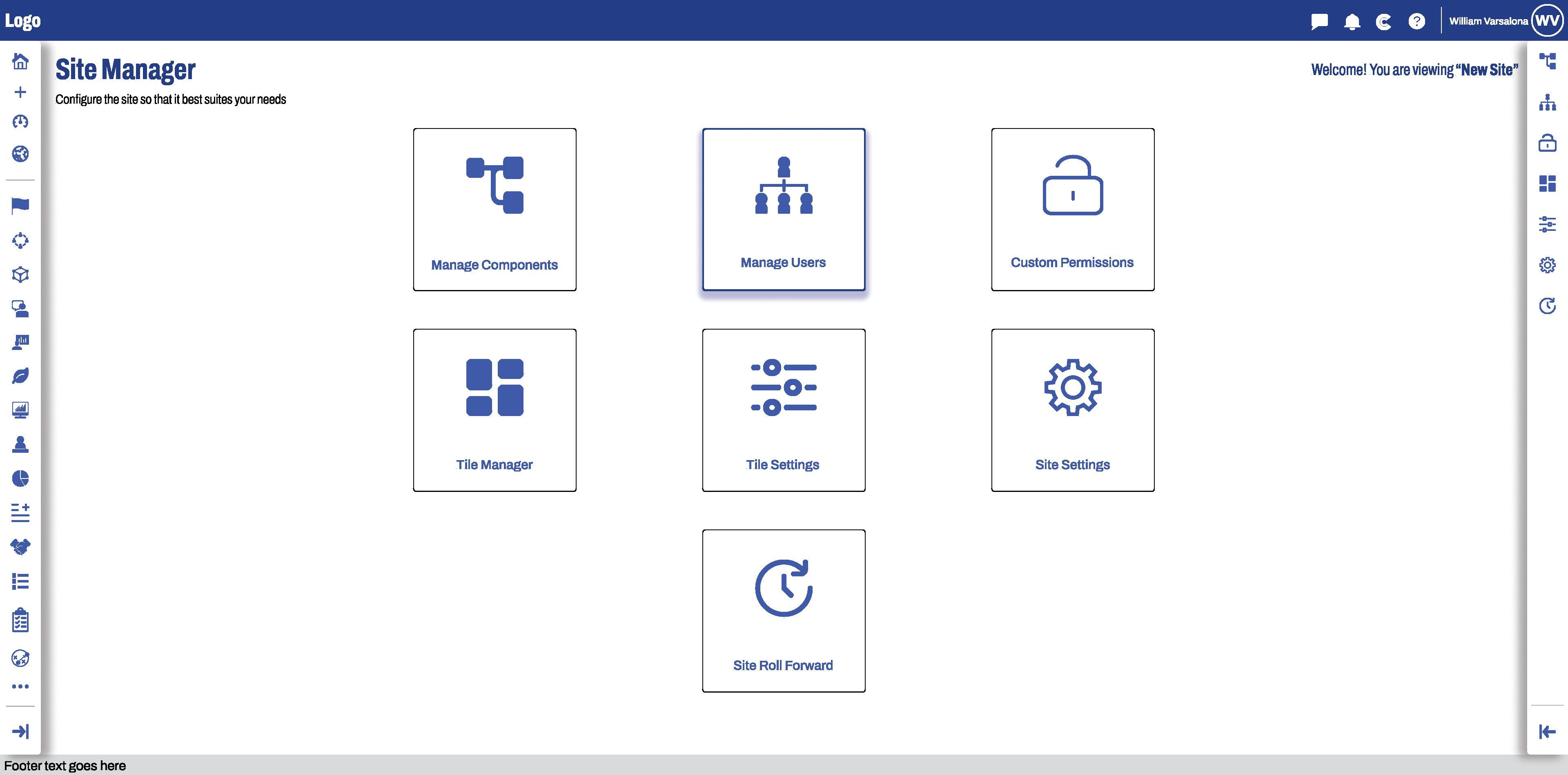
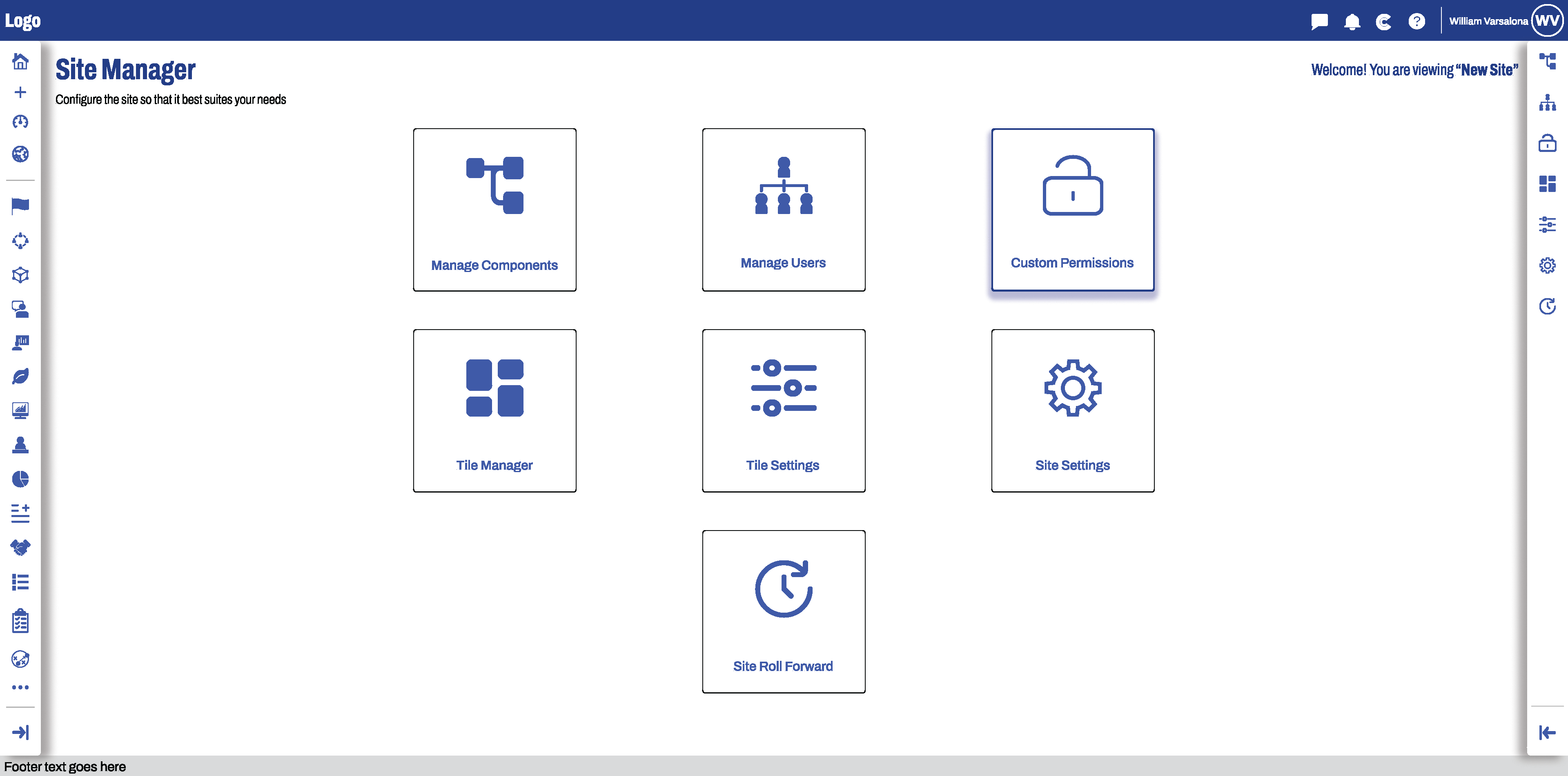
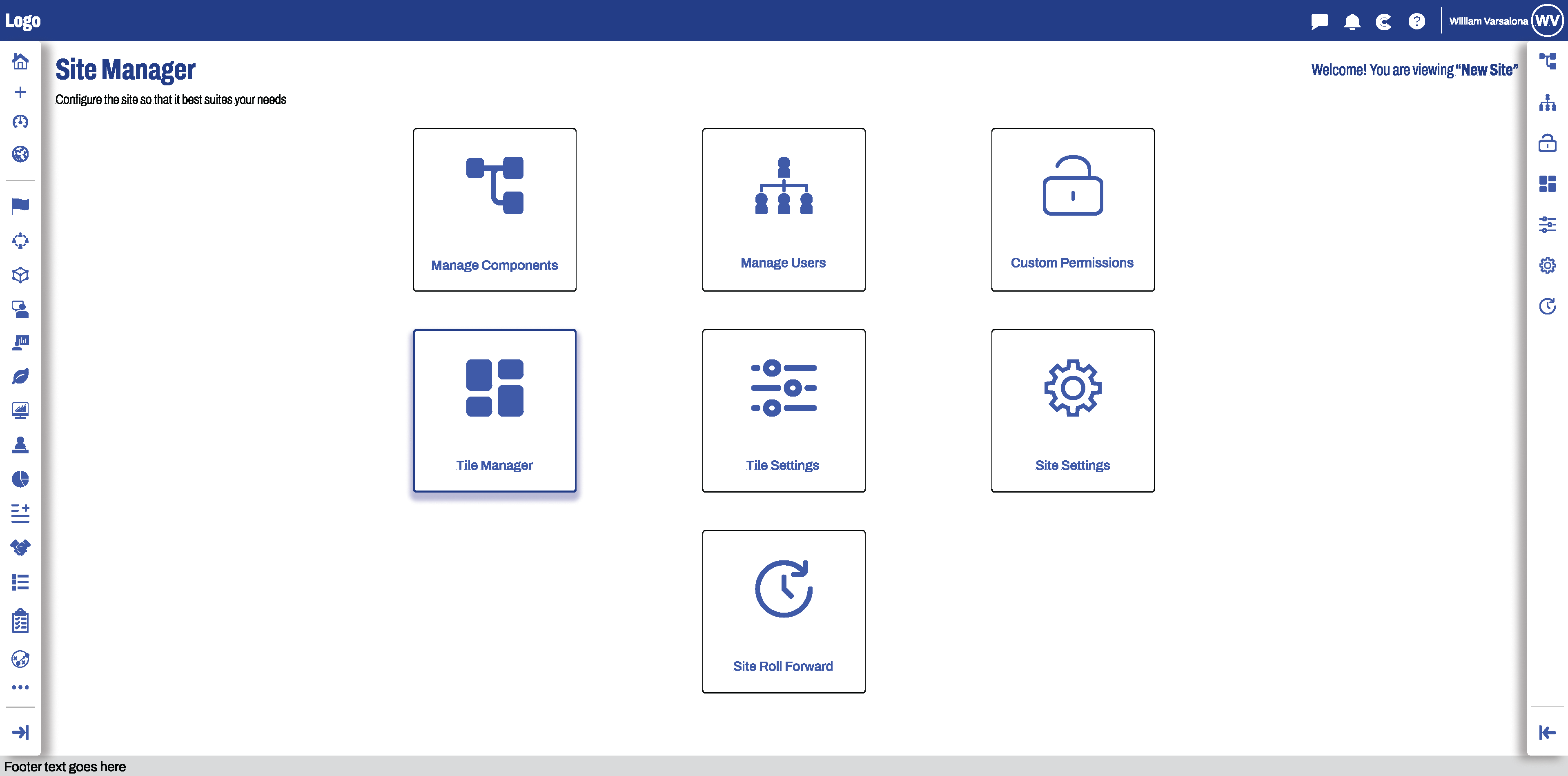
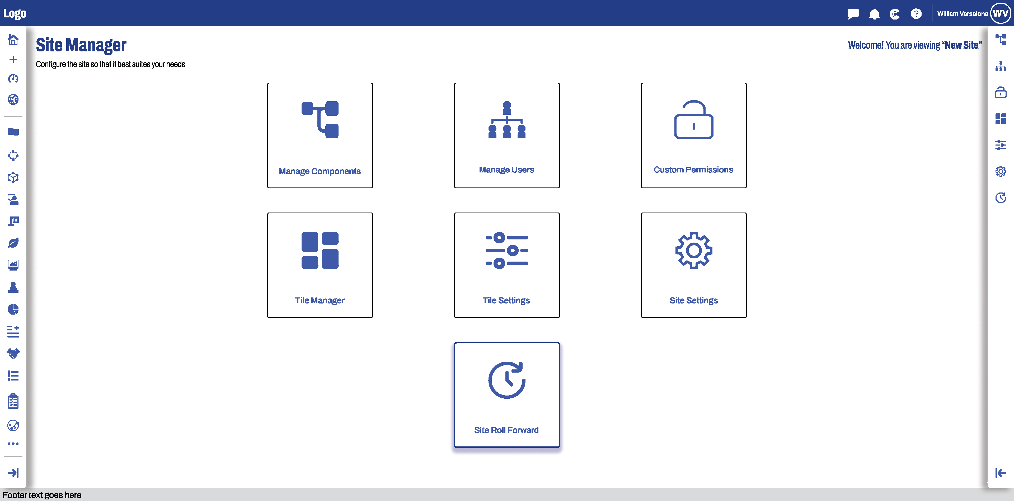
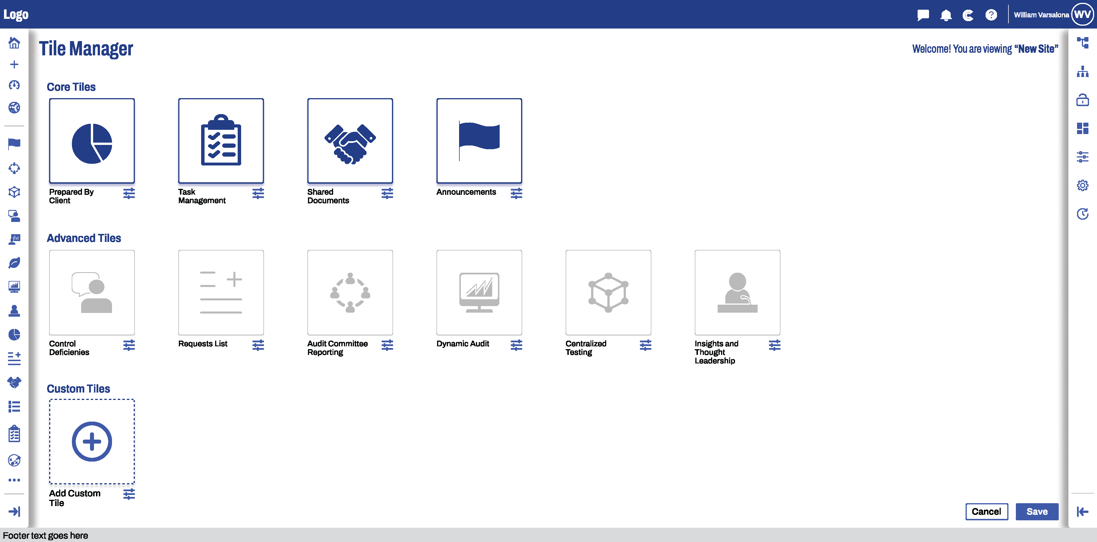
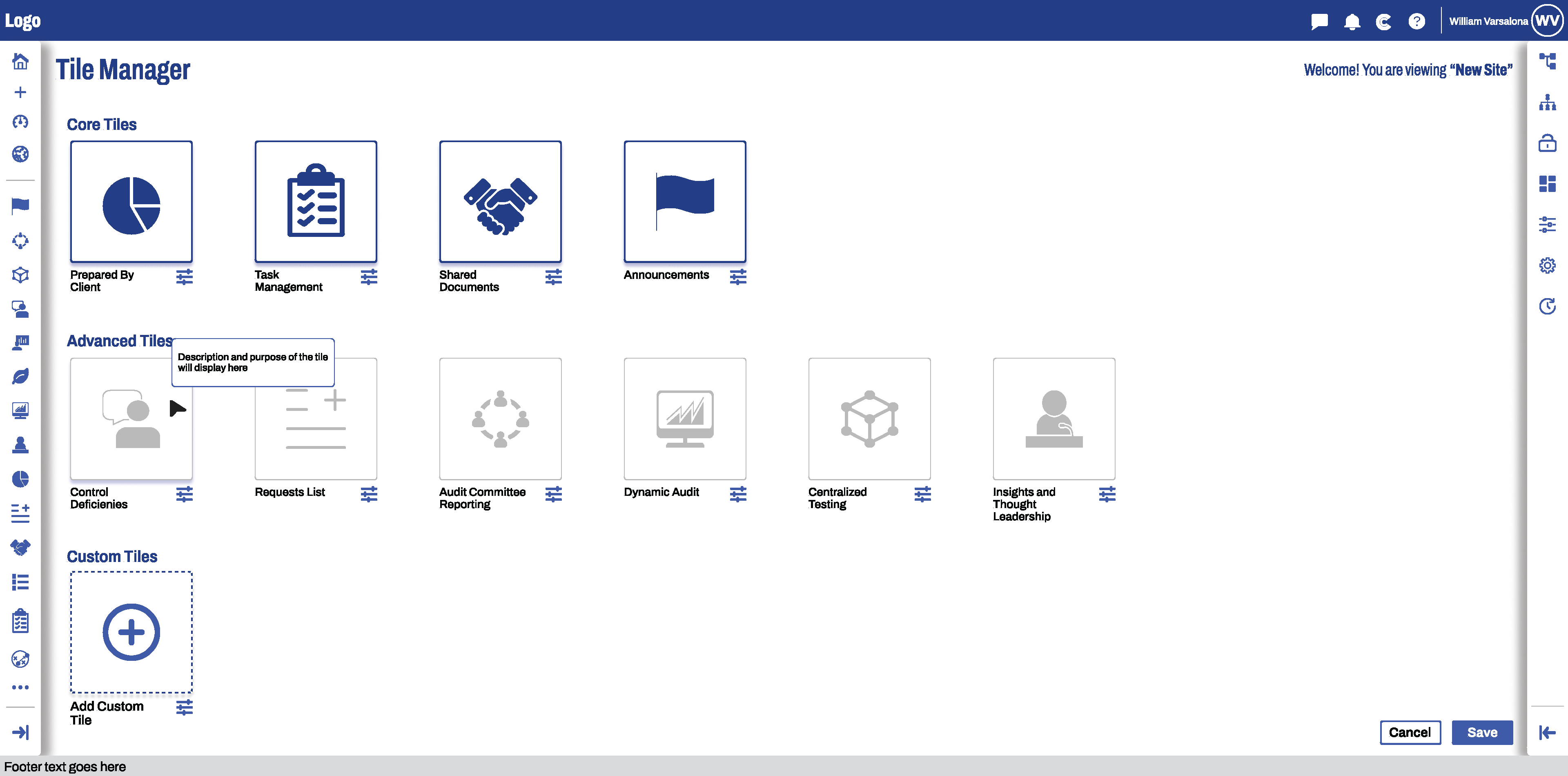
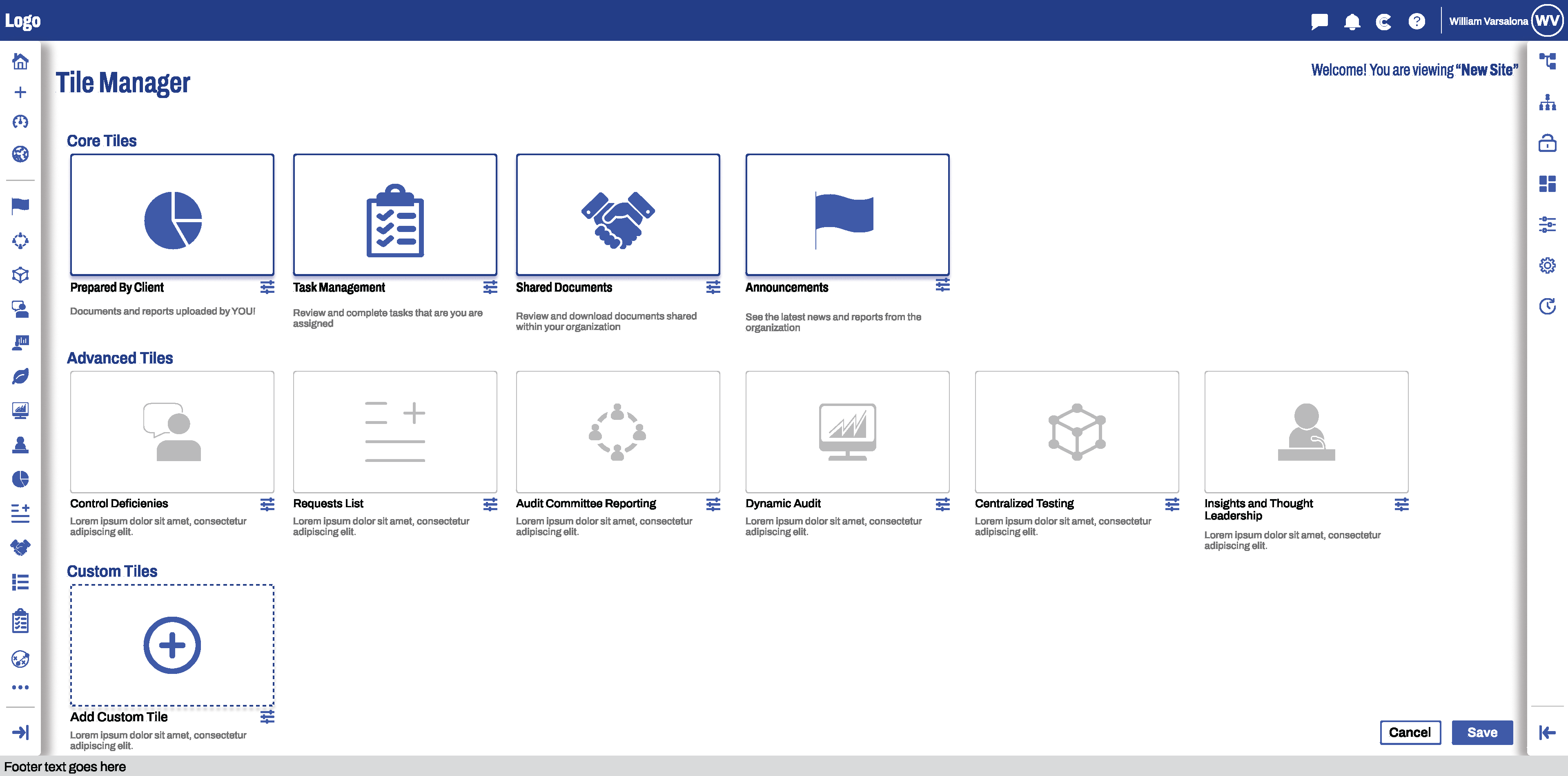
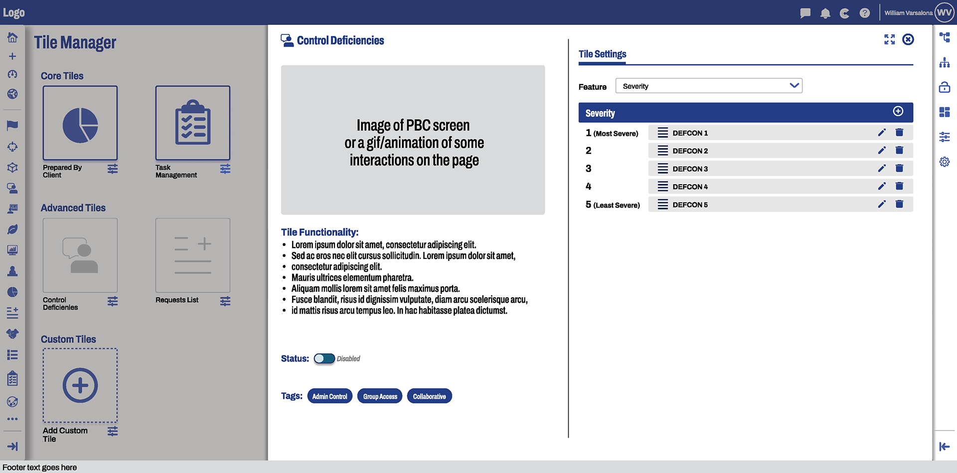
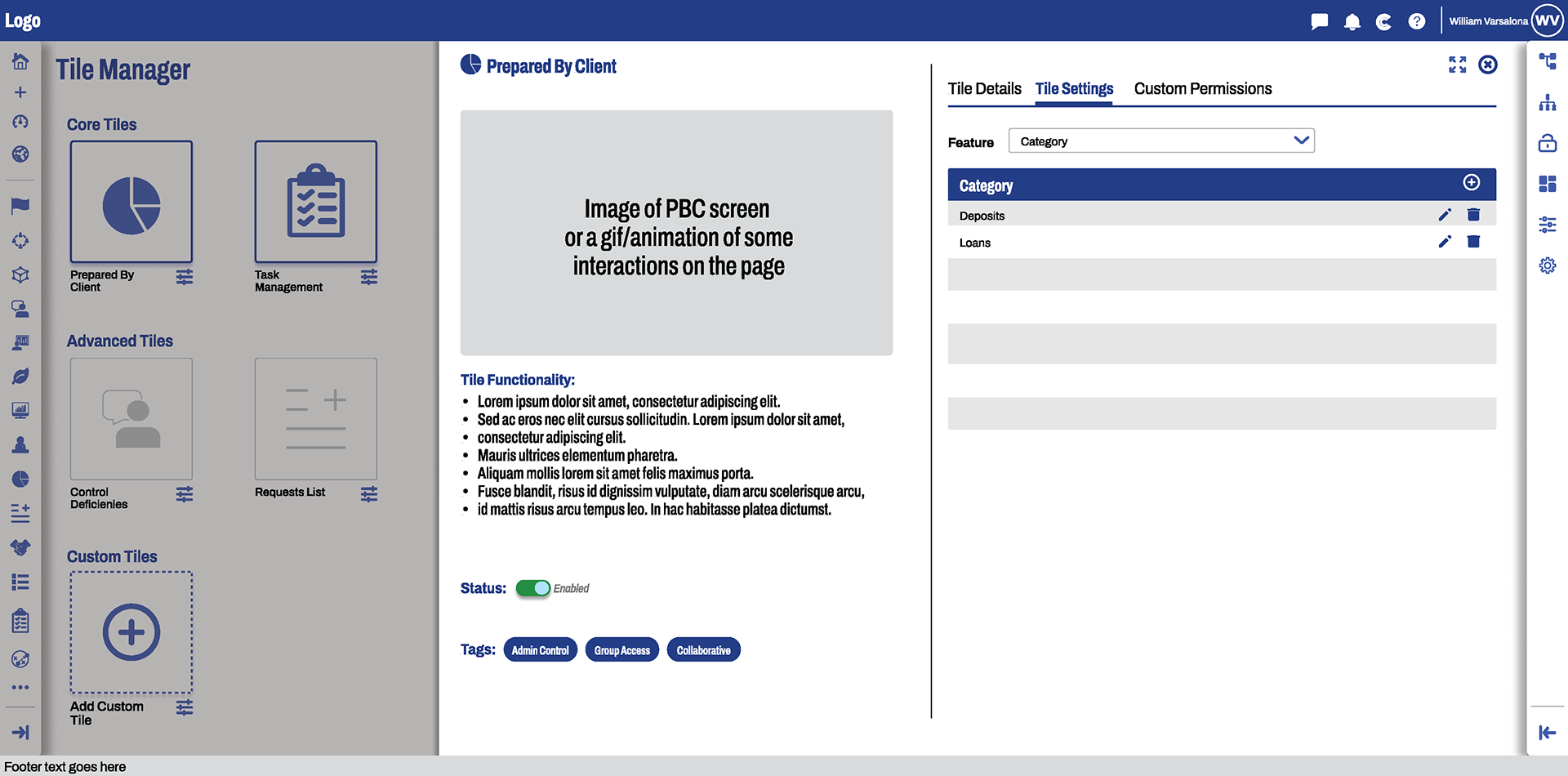
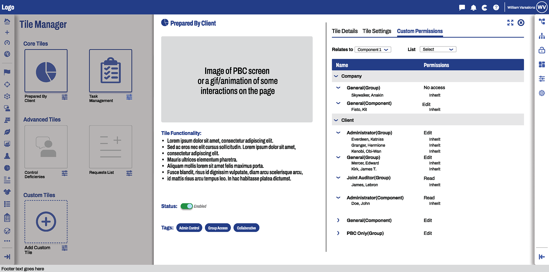
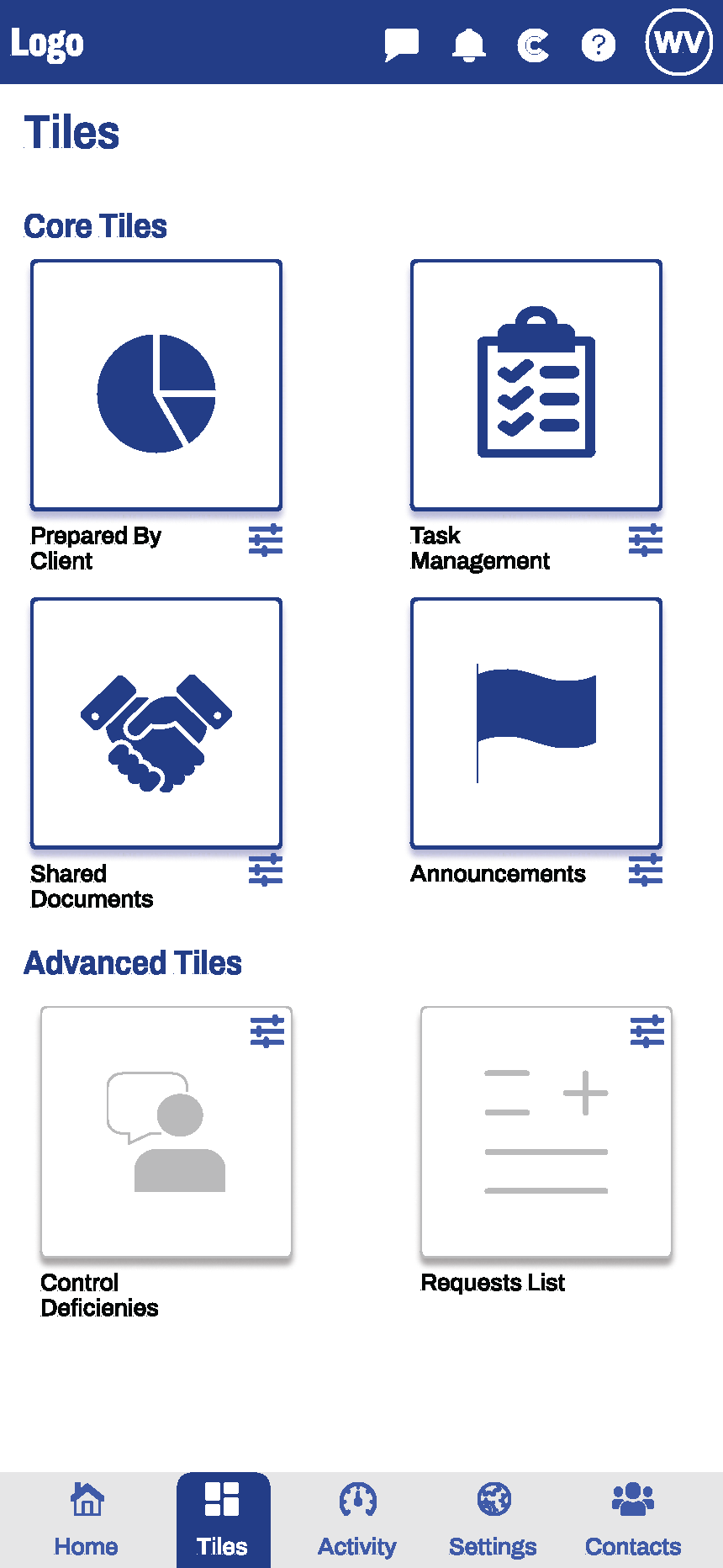
- Tile Manager: Redesigned tile manager to allow users to make informed decisions about what tiles to enable, added a slide in with the ability to edit tile settings and enable/disable tiles
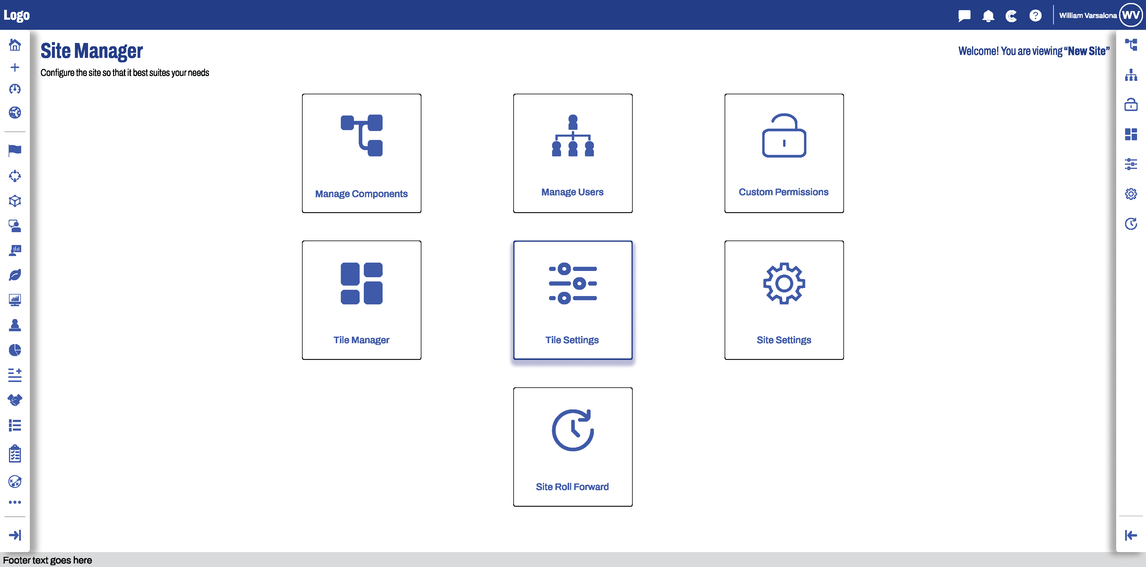
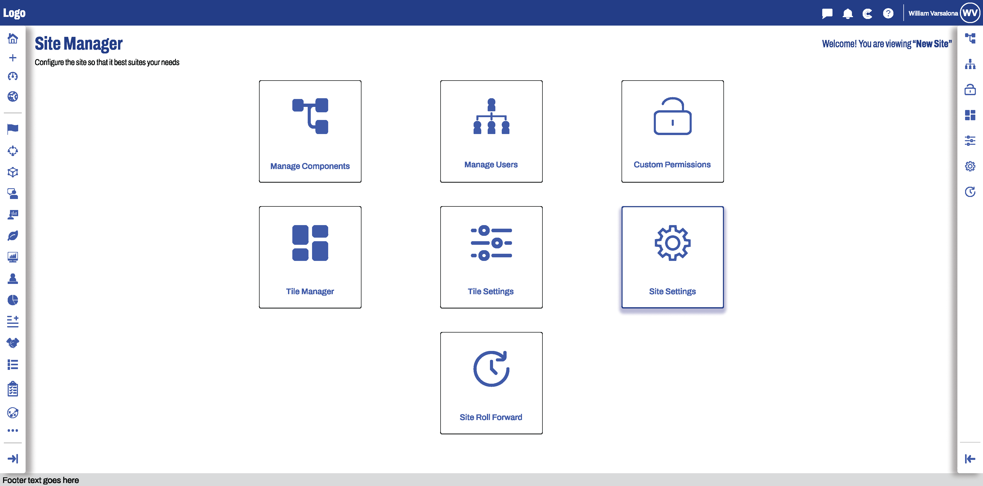
- Site Settings: Redesigned layout to a more familiar layout, made the page more responsive and improved visual design
Iteration and Collaboration:
- Applied agile design methodology, working in 2 week cycles meeting with stakeholders, product owners, and developers for rapid prototyping and align goals
- Incorporated feedback about new features, layouts, information architecture, and aesthetics
- Worked with managers to ensure UI fidelity and smooth handoff
Results:
- Increased discoverability of features
- Overhauled navigation to reduce friction and allow for seamless traversal
- Boosted design consistency by changing most of the UI elements with design system elements
- Increased brand identity by embedding branding into the design without overwhelming users
- Streamlined site set-up to reduce on-boarding time of new users
Post Mortem:
This project showed me how important clarity and discoverability is when designing features for a platform. Making interactions clear, navigation intuitivity, and a consistent visual design, allows users to get the most out of a product.
I wish I could have designed more of the mobile versions, incorporated other features into this design study and added more customization.


2. Quinnipiac University: Peer Catalyst
2020
My Responsibilities:
- Offered advice on course selection, study strategies, time management techniques, and campus resources
- Collaborated with faculty advisors to ensure alignment between mentorship activities, and students' academic objectives
- Participated in regular training sessions to enhance mentoring skills and stay updated on university policies or procedures
- Had personal office hours outside of class time where mentees could come and ask questions about their work or school
- Wrote weekly reports about what I did and how I made an impact in class
- This took place while Covid protocols were in place and the professor was Zooming in remotely, so I managed the classroom and students that came in to the room
3. Uncle Giuseppe's Marketplace: Cashier
Aug 2016 - Jan 2020
My Responsibilities:
- Maintain cash register to process customer transactions (cash and credit)
- When no other tasks are available I had to "red line" to bring customers to my check out line, help them find products, and answer any of their questions
- Keep register clean, candy and nuts stocked and organized
- I made sure every register was stocked with bags and paid stickers
- Maintain cafe cleanliness and organized with everything it needed to operate
- Assisted management with store displays, stocking shelves, and other store operations
- Assisted Pizza department with serving customer, processing transactions, and prep
- Pushed shopping carts ensuring the parking lot was safe and carts were stocked at the entrance
- Was awarded Employee of the Month in June 2018
- Covered candy department in serving customers and weighing product to package and price
- Assisted scanning department in making sure prices of items were accurate and updated for weekly sales
- Covered espresso bar frequently to make coffee and process transactions
4. Camp Nature: Counselor
Summer's 2012 - 2015
My Responsibilities:
- Leading children around and making sure they were taken care of and having fun.
- Come up with games to play with the campers
- Conflict resolution between campers
- Had to write a song each week to perform for the camp
- Made sure campers followed the rules when we had special events like Outraghiss Pets, Karate, and more
- I made sure kids with allergies got their own snack and made sure of no cross contamination.
- I also had to fulfill camp set up and clean up duties like packing up all the supplies at the end of the day, filling water balloons in the morning, and making sure the camp grounds were clean.